Data Visualisation – Stop Bad Design Ruining Good Data

Estimated reading time: 16 minutes
Key Takeaways
- Different data visualisation tactics serve specific analytical jobs, such as comparisons, trends, and outliers detection.
- Avoid wasting chart space; use position encodings strategically to enhance clarity.
- Data storytelling doesn’t work alone; pairing certain charts together creates helps answer questions more effectively that a singular one.
- An effective data visualisation approach tailors to the user’s familiarity, especially between B2C and B2B contexts.
Say you’re designing the account health screen for Northstar, a hypothetical (but still really cool) churn risk analytics platform customer success teams use to decide which renewals need attention this week. Forty accounts are flagged at risk. Do you show them as a pie chart split into risk tiers (low, medium, high), or as a bar chart ranking all forty by risk score, highest first? Same underlying data, same screen, same audience. Which data visualisation do you ship?
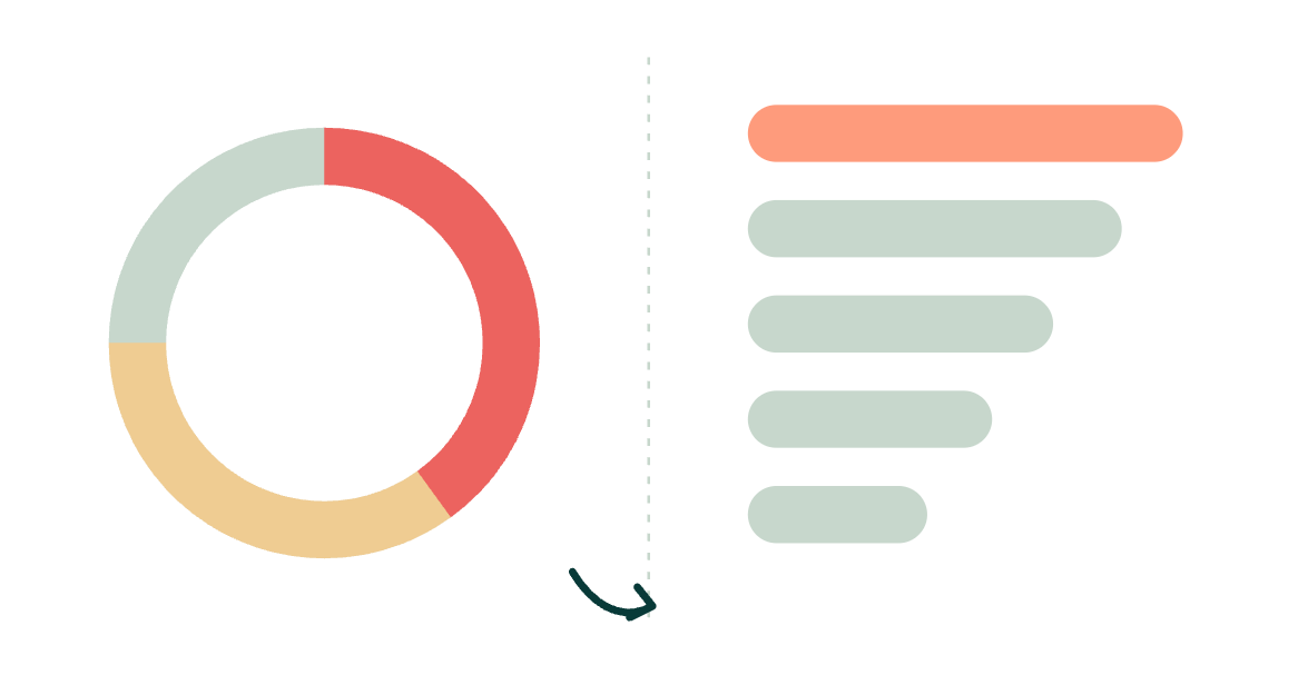
It’s a smaller question than it looks, and that’s exactly the problem. Ship the pie chart and your CS lead gets a fast read on how bad things are overall, useful for a Monday morning glance, but no way to tell which specific account to call first. Ship the bar chart and she can start working the list immediately, but loses the at-a-glance sense of whether this is a “five-alarm week” or a quiet one. Neither choice is wrong. They’re answering different questions, and the one you pick quietly decides what your product is optimised to help someone do, and how much your users trust the dashboard in the first place.
So what’s the process for picking out the right data visualisation? That, itself, is a question worth asking properly.
Digging into data UX

Data visualisation has a rare power; it can be the most effective content your interface can offer if executed correctly. It can answer questions with a few systematic glances. Get it wrong and it overwhelms. To put it another way, “An editorial approach to visualisation design requires us to take responsibility to filter out the noise from the signals, identifying the most valuable, most striking or most relevant dimensions of the subject matter in question.” Andy Kirk
The task before you and your team, and the one the Northstar pie-versus-bar chart call actually turns on, is what job is your data doing for the person reading it, and whether that’s the job they came to the screen for. Get that wrong often enough and you’re not just picking the “wrong” chart, you’re quietly introducing design friction into a screen someone relies on every day.
Borrowing a line that’s become something of a guiding mantra in this discipline: the right chart is the one that does its job. The same underlying dataset can have a dozen legitimate data visual representations, because the job changes: sometimes you need comparison, sometimes correlation, sometimes composition, sometimes a signal that something needs urgent attention.
Before we get into the practical chart-by-chart guidance your product roadmap actually needs, it’s worth spending a moment on the theory underneath it, because once you internalise it, you stop needing decision trees at all.
Let’s talk about encodings
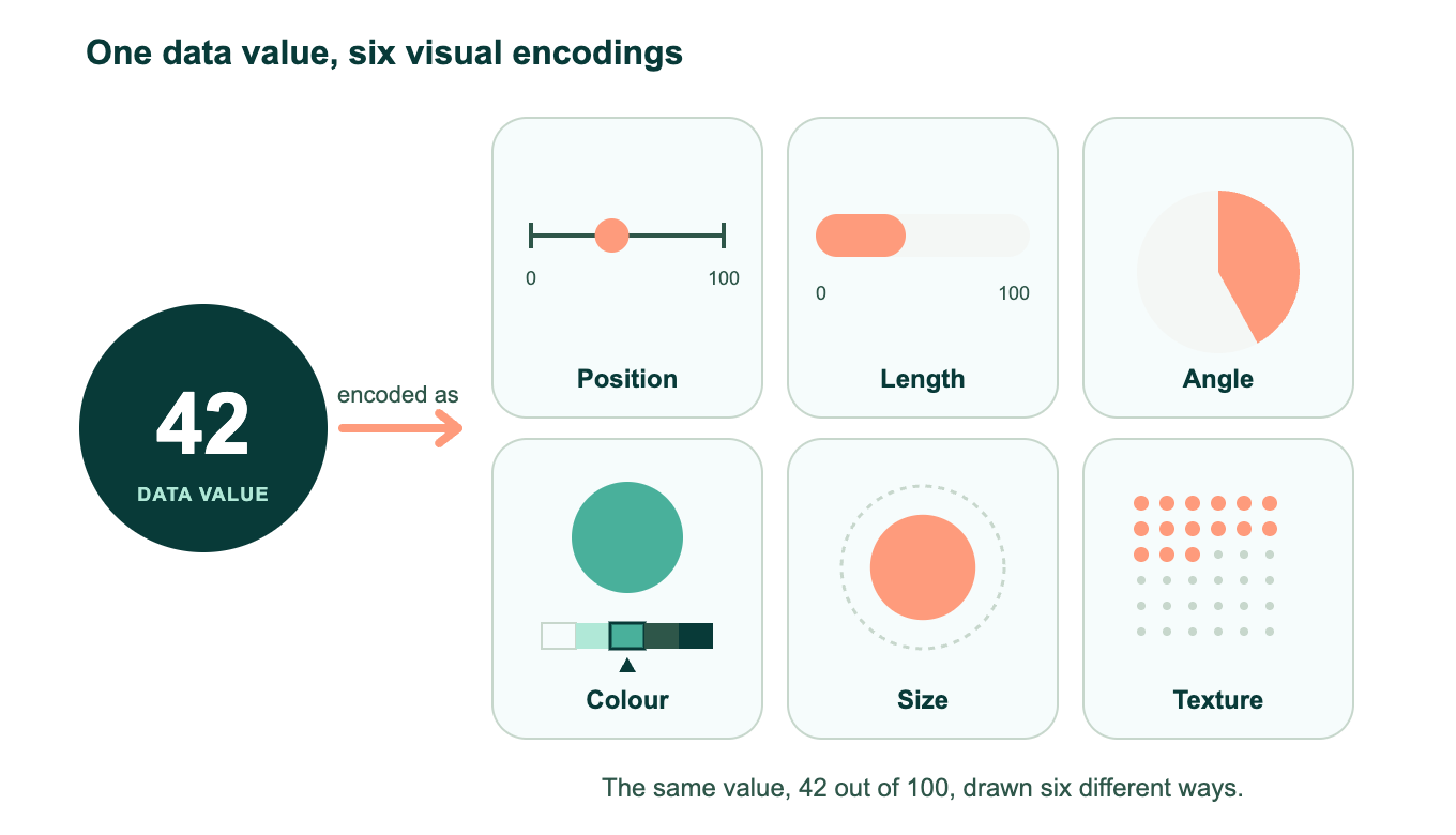
An encoding is the mapping between a data value and a visual property of a mark on screen: position, length, angle, colour, size, texture. A bar chart isn’t really “a bar chart”; it’s category encoded as position on one axis, and a quantitative value encoded as length on the other. A scatterplot is two quantitative values, each encoded as position on its own axis. Once you see charts this way, the fifty-odd chart types your BI tool offers collapse into a much smaller, much more manageable set of underlying decisions.
“An editorial approach to visualization design requires us to take responsibility to filter out the noise from the signals, identifying the most valuable, most striking or most relevant dimensions of the subject matter in question.” Andy Kirk
This distinction is also why tools like Tableau, D3js, ggplot2, and Vega-Lite are considered more powerful than templated tools like default Excel or out-of-the-box Power BI: they let you work directly at the encoding layer, rather than forcing you into pre-baked chart shapes. That distinction only gets sharper as more teams bring an LLM into the chart-generation loop, since a model that understands encodings can reason about a request, while one that only knows chart templates is stuck pattern-matching. If your product is genuinely “data-rich,” this is worth internalising at the design-system level. Build your component library around encodings, not chart templates, and your visualisation layer becomes vastly more flexible and future-proof.
To make a defensible chart choice, you need to evaluate three things:
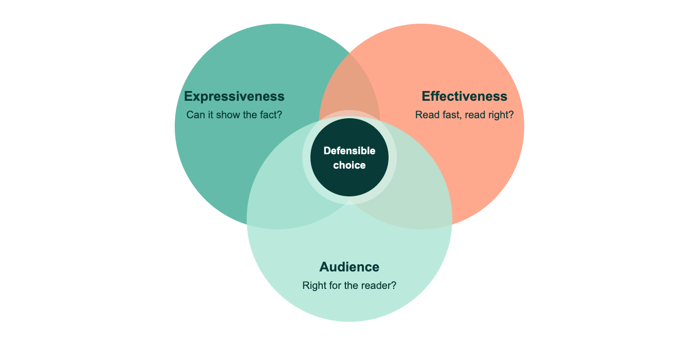
- Expressiveness: can this encoding even represent the fact you’re trying to show?
- Effectiveness: of the encodings that can express it, which is read most accurately and quickly?
- Audience: what’s the visual literacy of the person on the other end of the screen?
Data positioning is one of your most precious resources.
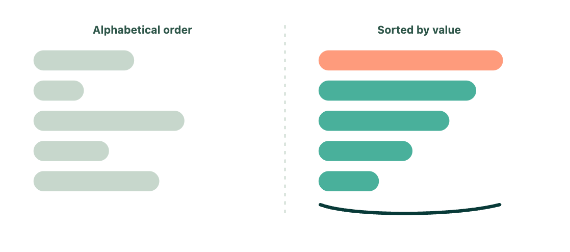
If you’re plotting a bar chart of accounts by name, sorting alphabetically (“Alabama first,” as it’s affectionately known) throws away free, high-fidelity encoding. Sort by value, by cohort, by lifecycle stage, anything meaningful, and you’ve quietly added a second encoding dimension for free.
Quantitative data wants position, length, angle, or slope.
This is your bar chart, your dot plot, your scatterplot, your line chart. Contrary to popular design folklore, humans are not categorically bad at reading angles (we read analogue clocks perfectly well), but angle and slope are consistently a notch below position and length in accuracy, so reserve them for change-over-time and rate-of-change stories specifically.
Categorical data wants position, colour hue, connection, or texture.
Colour hue is doing a huge amount of work in most dashboards, which is precisely why an undisciplined colour palette, one that hasn’t been thought through as carefully as the rest of your brand and interface, is one of the fastest ways to sabotage an otherwise well-built product.
Your practical chart library
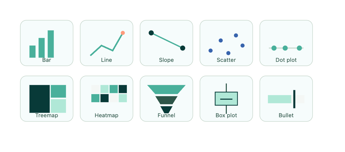
Rather than a chart zoo, here’s how to think about your core data visualisation components in a data-rich product, organised by the analytical job each one is actually suited to. (Worth pairing this with a look at some current dashboard examples to see these jobs in the wild.)
Comparison across categories: bar chart.
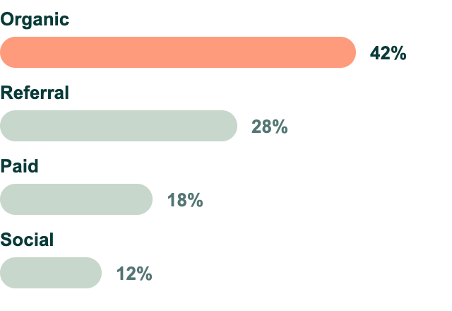
This is your workhorse, and for good reason: length is one of the most accurately read encodings we have, it scales gracefully from 3 categories to 30, and it tolerates a non-zero baseline poorly (never truncate a bar axis; you’re lying with length) but otherwise degrades gracefully. Horizontal bars are generally superior to vertical ones once category labels get long, which in B2B product data (account names, SKU descriptions, campaign titles) is nearly always.
Change over time: line chart.
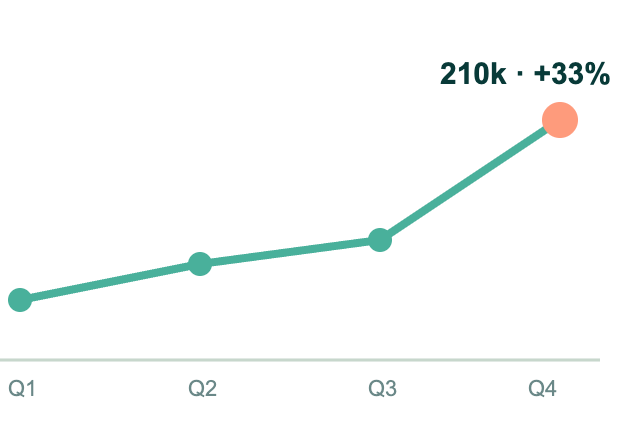
Reserve this exclusively for genuine time series data; using a line chart to connect categorical data implies a continuity and directionality that doesn’t exist, and it’s a surprisingly common misuse in dashboard templates. Angle and slope are how the line chart communicates rate of change, which is precisely why it’s the right tool for “is this trending up or down” questions and the wrong tool for “which of these five things is biggest.”
Comparing two points in time: slope chart.
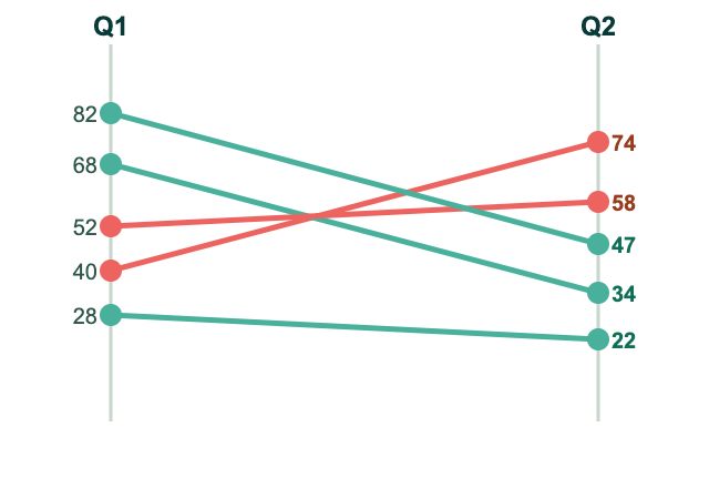
An underused gem for data-rich products: two vertical axes, one per period, connected by a line per category. It’s exceptional for “who moved up, who moved down” data storytelling (churn cohorts, ranking shifts, before and after states), and it outperforms a grouped bar chart for exactly this job because it puts change itself, not just the two raw values, directly into an encoding (slope).
Spotting outliers or relationships between two variables: scatterplot.
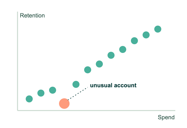
This is the correlation and anomaly detection tool. Position on two axes simultaneously is extremely high fidelity, which is exactly why it’s the right chart for “does spend correlate with retention” or “which accounts are unusual.” It’s also one of the least forgiving charts for a low-literacy audience, so gate it behind an analytical, self-serve context rather than an exec summary.
Ranking with an unstable baseline: dot plot.
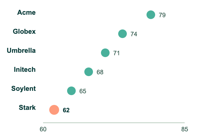
If you can’t honestly start your axis at zero (rates, indices, scores clustered in a narrow band), a dot plot lets you show position without the implicit “length from zero” promise that a bar chart makes. It’s an underrated tool for product teams who inherited “never truncate your bars” as dogma without a fallback option. This is the fallback.
Part-to-whole across many categories, or nested composition: treemap.
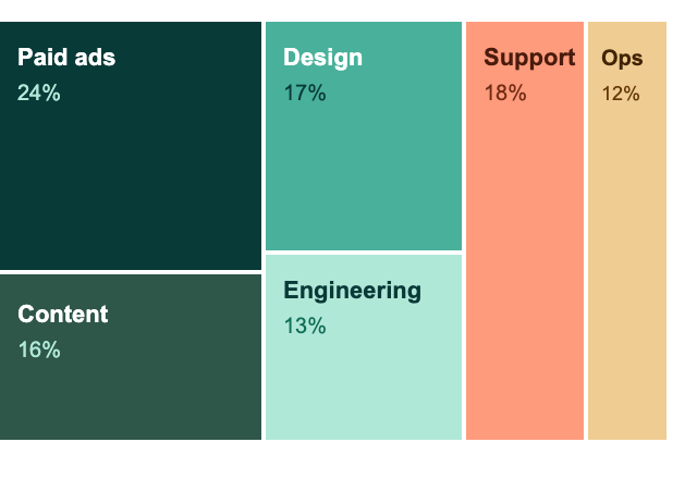
Where a pie chart falls over past five or six categories, a treemap can hold dozens, using area (a lower-fidelity but still expressive encoding) plus colour and containment to show hierarchy. This is the natural choice for “spend by category, then by sub-category” in a data-dense B2B reporting product, but be conscious that area comparisons are genuinely harder to read precisely than length. Pair it with a table or bar drill-down for users who need exact figures, not just shape.
Density and pattern across two dimensions: heatmap.
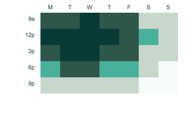
Colour saturation or hue mapped across a grid is extremely effective for spotting patterns at a glance across large matrices (usage by hour and day of week, cohort retention by month, feature adoption by segment). It’s a “spot the anomaly” tool first and a “read the exact value” tool a distant second, so pair it with an on-hover exact value and, ideally, a companion bar or line view for users who need precision.
Sequential process or conversion: funnel chart.
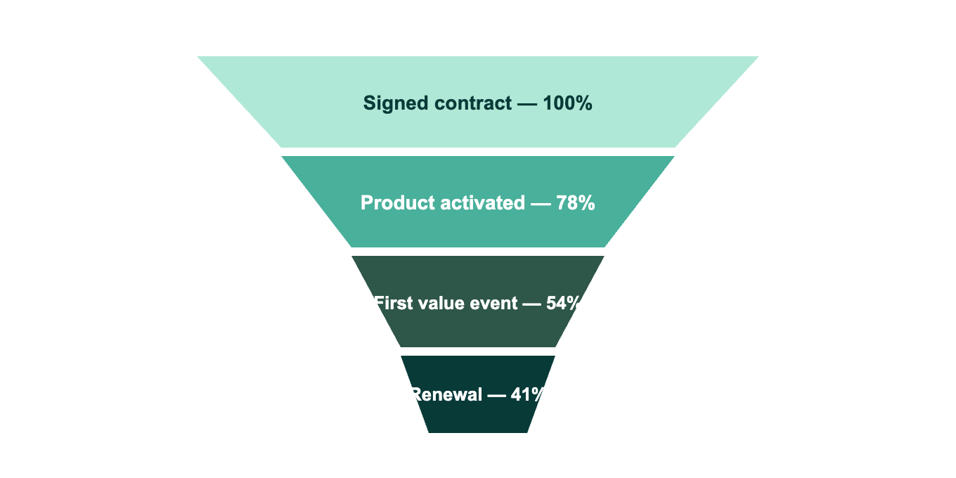
A specialised composition chart that’s earned its place in growth and product analytics tooling specifically because the job (showing drop-off at each stage of a defined sequence) is common enough and important enough to warrant a dedicated encoding pattern (decreasing length or area down a fixed sequence). This is the natural chart for Northstar’s onboarding screen: signed contract, product activated, first value event, renewal, each stage narrowing to show exactly where accounts are dropping out before they ever reach the risk-scoring stage at all, which matters just as much for customer acquisition as it does for retention.
Distribution and spread: box plot or violin plot.
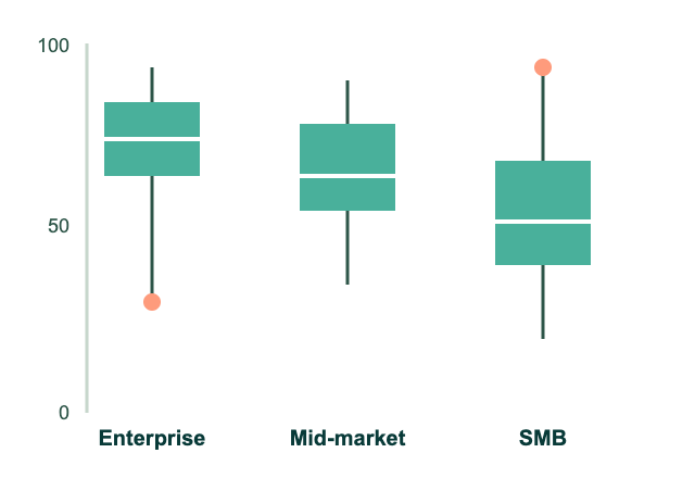
Reserve genuinely for analytically literate audiences: data science teams, product analysts. It’s an outstanding tool for the job (showing median, quartiles, and outliers in one compact mark) and a poor tool for anyone who hasn’t been taught to read a box plot, which rules it out of most executive-facing B2C-adjacent surfaces.
Flow and relationship volume: Sankey diagram.
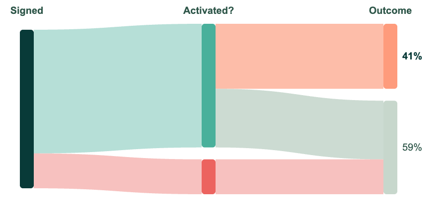
Genuinely powerful for showing how volume moves between states (user journeys, budget allocation, conversion paths with branching), but this sits firmly in “advanced technique” territory. If your audience doesn’t already trust and understand the visual grammar, don’t reach for it just because it looks impressive in a screenshot..
Single KPI against a target: gauge or bullet chart.
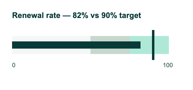
Gauges are popular and, frankly, overused; the classic semicircular gauge wastes an enormous amount of screen real estate to encode a single number, and angle is a mediocre encoding for the precision most KPI tracking demands. A bullet chart, Stephen Few’s bar-based alternative, achieves the same “value vs target vs threshold band” job using position and length instead, in a fraction of the space, and it’s the more defensible choice for any serious data-rich product.
No single chart carries the whole story: visualisation is a system, not a component
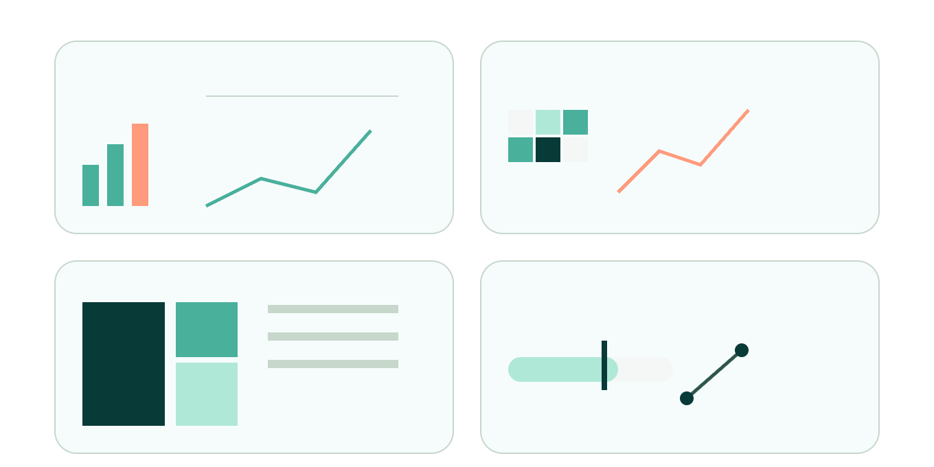
Here’s the point that gets lost most often in chart-selection debates: the question is rarely “which chart is the right one,” it’s “which combination of charts, working together, answers the full range of questions this user will bring to this screen.”
Charts are complementary, not competitive. A bar chart ranks your top accounts by revenue; it tells you nothing about whether that revenue is trending up or down, which is exactly what a companion sparkline or slope chart, sitting right beside it, is for. A heatmap flags where an anomaly in usage patterns is hiding across a cohort-by-week grid; it takes a line chart, drilled into from that exact cell, to explain what happened and when it started. A treemap shows you the shape of spend across categories; a bullet chart, sitting in the same panel, tells you whether that spend is on, over, or under target.
A few patterns worth building directly into your design system:
- Overview bar plus trend sparkline, side by side, for any ranked-list-of-entities screen: accounts, campaigns, SKUs, cohorts.
- Heatmap for pattern detection, paired with a line chart for the drill-down, once a pattern is spotted: density first, precision second.
- Treemap or stacked bar for composition, paired with a table for exact figures: shape first, numbers on demand.
- Bullet chart for target-tracking, paired with a slope chart for period-over-period movement: status first, trajectory second.
Treat your visualisation layer the way you’d treat any other part of your product architecture: as a set of composable, purpose-built components, each excellent at one job, wired together so the user’s analytical journey (glance, notice, investigate, decide) is supported end to end, rather than asking one over-engineered “hero chart” to carry every question a user might ever bring to the screen.
Bringing it together
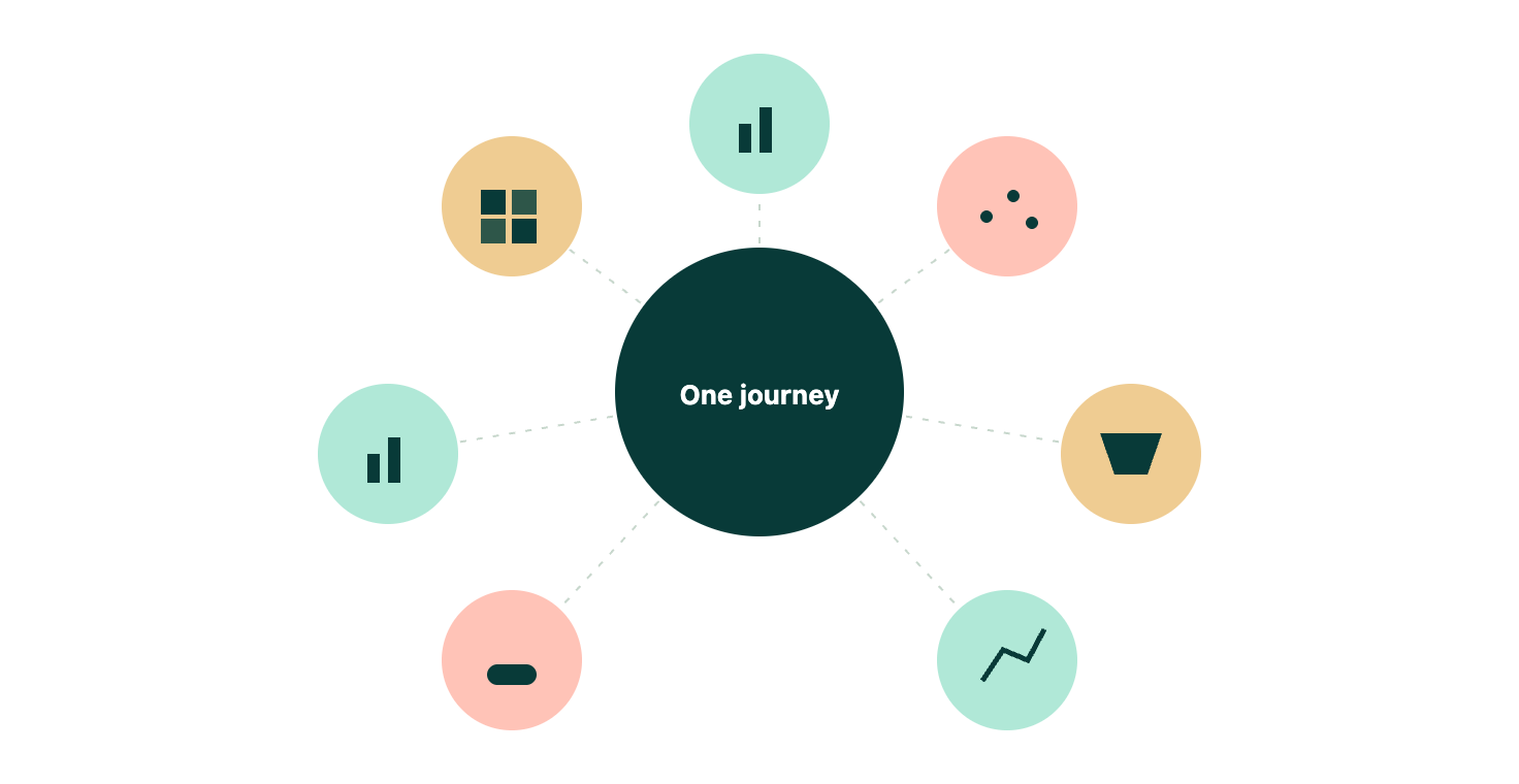
Chart choice, properly understood, isn’t a matter of taste or house style; it’s an evaluation of expressiveness, effectiveness, and audience, applied at the level of encodings rather than chart templates. To maximise your data visualisation and sata storytelling, position is your most valuable resource and should never be wasted on arbitrary sorting.
Quantitative data storytelling wants position, length, angle, or slope; categorical stories want position, colour hue, connection, or texture. Pie charts have a genuine, narrow, defensible use case (small counts, coarse comparisons, low-stakes glances), and a bar chart is very often the more honest and more scalable choice the moment precision or category count creeps up.
Audience is the variable that ties all of this together, and it plays out very differently depending on who’s on the other end of the screen. In B2C products, visualisation is almost always glanceable, low-frequency, and emotionally framed, closer in spirit to a well-designed sign-up form than an analyst’s workbench: simple, high-recognition encodings, generous colour and iconography, precision traded for immediate comprehension.
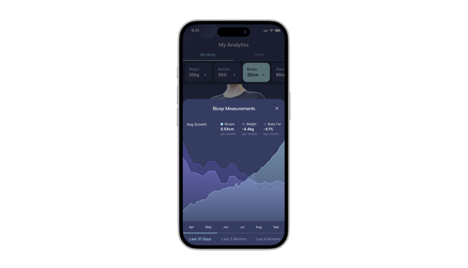
In B2B and data-rich SaaS products, the calculus flips. Northstar’s CS managers are in that account health screen every morning; they already know what a sorted bar chart of risk scores means without a legend, and a rigorous, encoding-led design system, the kind that serves beginners and power users alike without compromising either, pays compounding dividends for exactly that kind of daily returning user. The practical takeaway: audit your personas with the same rigour you’d bring to competitive research, and don’t force one visual language across both audiences.
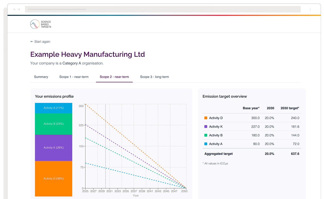
Layer that audience thinking into the conversations you’re already having with stakeholders and you’ve got a genuinely defensible framework, not a decision tree that snaps the first time your data does something unexpected.
Interested in learning more about data storytelling and dashboards? Check out the following links for more content.