Finding the Right Balance with Branding and User Interface Design
Introduction
I have never believed branding to be just a collection of visual elements – it is the character of the digital experience. It is that collection of tangible factors that helps the digital reach out from the pixel landscape and help create a connection. So it’s no small claim to say branding plays a crucial role in user interface (UI) design, as it helps create a cohesive user experience and helps you stand out from the crowd. A well-designed UI that effectively incorporates branding elements can significantly enhance brand recognition and recall among users. Whether you’re working on a UI redesign or designing from scratch, the successful integration of branding elements is essential for building trust, credibility, and emotional connections with users. In this blog post, we will explore the role of branding in UI design, focusing on key elements such as logo, colour palette, typography, imagery, and more, while providing real-world examples to illustrate best practices.
UI Redesign vs. Designing from Scratch
Redesign
When it comes to UI design projects, I always recommend carefully considering whether you’re working on a redesign or starting from scratch. In a UI redesign, you must carefully assess the existing brand guidelines and evaluate the current UI’s alignment with the brand. This process involves identifying areas for improvement while maintaining brand consistency. For example, when Airbnb redesigned their UI in 2014, they focused on simplifying the user experience while retaining their core brand elements, such as the colour palette and logo.
From Scratch
On the other hand, when designing a UI from scratch, you have the opportunity to establish new brand guidelines and define the brand’s visual identity from the ground up. This process involves creating a style guide that ensures consistency across all UI components, effectively building a cohesive design system. For instance, when Slack launched in 2013, they created a distinct brand identity with a playful colour palette, friendly illustrations, and a custom logo that set them apart from other communication platforms.
Key Branding Elements in UI Design
Logo

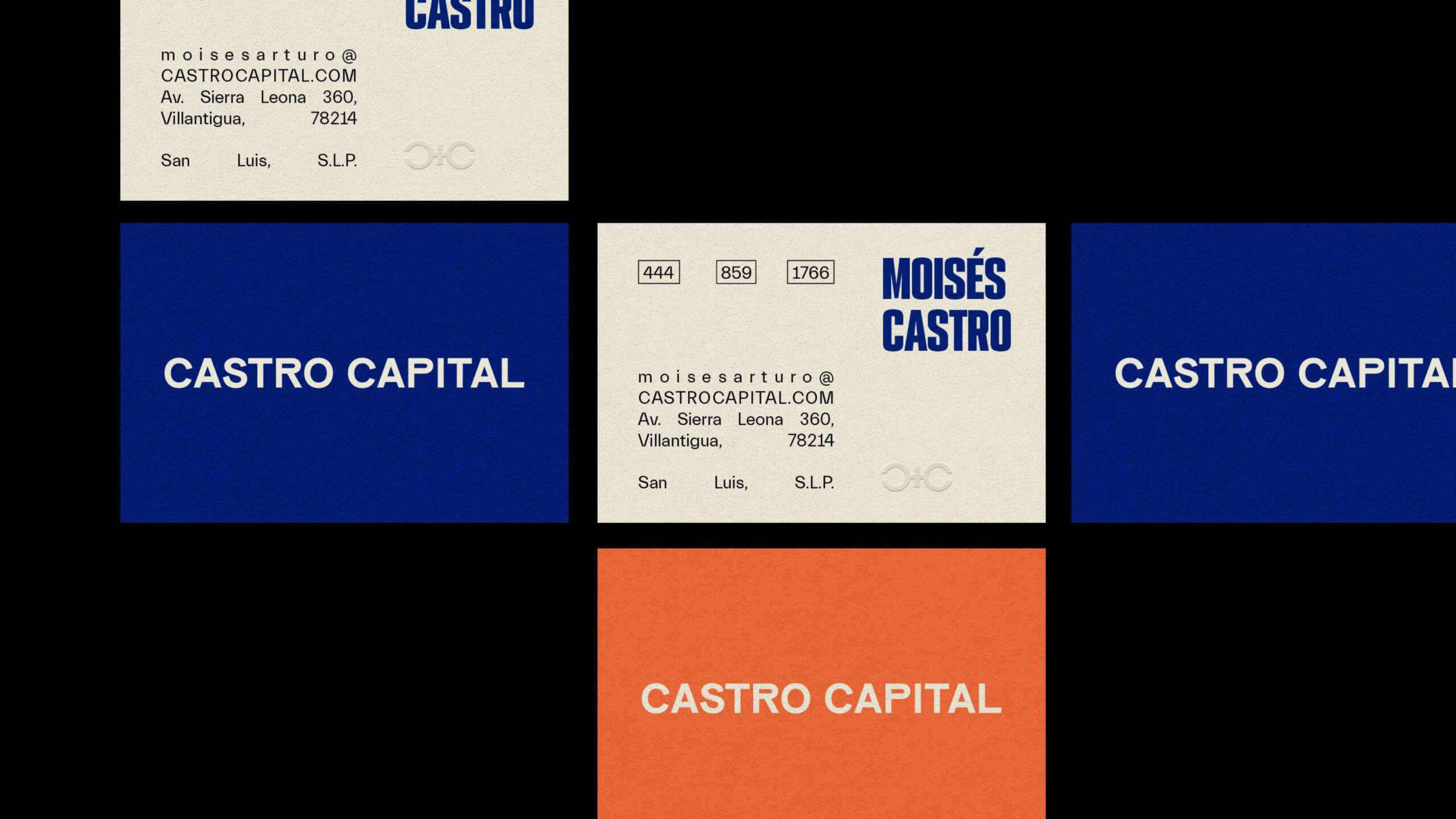
The logo is a crucial element of branding in UI design. It should be strategically placed, sized appropriately, and have variations suitable for different contexts (e.g., full logo, logo mark, favicon). For example, Dropbox prominently displays its logo in the top-left corner of its UI, making it easily recognisable and memorable. Without stating the obvious too much, a logo is the most recognised facet of a brand, practically the face of the brand, so it should be treated the most carefully. Its change should only be considered as part of a larger overhaul.
Color Palette
A well-defined UI colour palette is essential for creating a cohesive and engaging user interface. It should include primary brand colours, secondary colours, accent colours, and guidelines for colour usage and hierarchy. Spotify, for instance, effectively uses a green colour palette to create a distinct and recognisable brand identity across its UI.
Typography

UI typography plays a significant role in branding and user interface design. It involves selecting font families, weights, styles, sizes, and establishing a clear hierarchy. Shopify, the popular online e-commerce platform, uses a clean and readable typography system that aligns with its brand identity and enhances the user experience.
Imagery and Iconography

Imagery and Iconography UI imagery and iconography should align with the brand’s visual identity and maintain consistency throughout the user interface. In fact, I believe they plan one of the most important roles in the delicate balance between branding and user interfaces. When well executed, they help with the brand’s story telling and deliver information more effectively than words. Airbnb, an information-rich platform, heavily relies on iconography to make the experience more digestible. The simple, clear, and consistent iconography style has helped reduce the cognitive load with the limited pixel real estate, helping to make the screen more scannable in a shorter amount of time.
Voice and Tone
The brand’s voice and tone should be reflected in the product’s copy, ensuring consistency in writing style, terminology, and language. Mailchimp, the email marketing platform, is known for its playful and conversational tone, which is evident throughout its UI and helps create a friendly and approachable brand personality.
Rare opportunity via Market Expansion
When two companies merge, especially when one acquires a platform that opens up new market opportunities, it presents a unique challenge for branding and UI design. The newly merged entity must find a way to balance the strengths of both companies while ensuring that the resulting brand and user experience resonates with the expanded target audience. This often requires a strategic visual redesign that balances innovation with accessibility, appealing to both existing and new users.
In the case of PreAct Technologies, a smart camera technology and hardware business, the acquisition of a popular consumer-facing AI development and creation software platform in early 2023 positioned them as leaders in AI-enabled smart camera technology. This acquisition also enabled PreAct to reach new markets, including the general public. To successfully tap into this market, PreAct needed to revamp their strategy, ensuring that both the hardware and software were accessible to a wider audience, with a specific focus on ease of adoption and operation.
To help PreAct reach this broader consumer market, we worked with existing brand elements to give them a light-touch modernisation, elevating the overall look and feel while maintaining brand recognition. The design system was carefully crafted to strike a balance between cutting-edge innovation and intuitive simplicity, appealing to both tech-savvy early adopters and everyday users. By creating a modern aesthetic and ensuring accessibility and responsiveness, the redesigned UI seamlessly integrated with PreAct’s engineering team’s development processes.
Best Practices for Branding in UI Design

To effectively incorporate branding into UI design and create a cohesive design system, consider the following best practices:
- Conduct research to understand brand perceptions and user expectations. For example, before redesigning its UI & UX Netflix conducted extensive user research to gather insights and inform its design decisions.
- Collaborate closely with stakeholders to align branding and UI goals. When Microsoft redesigned its Office suite UI, they worked closely with various teams to ensure that the new design met both brand and user needs.
- Regularly review and update brand guidelines as the UI evolves to maintain a consistent design system. Google regularly updates its Material Design guidelines to maintain consistency and relevance across its vast ecosystem of products and services.
Conclusion
Branding plays a vital role in UI design, whether you are working on a UI redesign or creating a new interface from scratch. By carefully considering key branding elements such as logo, colour palette, typography, imagery, and voice and tone, and following best practices for research, collaboration, and regular updates, you can create a compelling and effective UI that resonates with your target audience and drives business success. A cohesive design system that incorporates these branding elements will help you build a strong, recognisable, and memorable user experience that sets your brand apart in today’s competitive digital landscape.