A UX Design Dilemma: Adapt Brand Guidelines or Start Afresh?
Whilst the dream for most designers is to start a new project from scratch and have all of the creative licence and control that comes with that, this unfortunately isn’t always the case. Putting aside those fun projects that you may do when starting out (anyone else guilty of designing multiple travel and adventure apps just for fun?), a large proportion of projects will be some form of a redesign or continuous improvement to an existing product or platform.
This is certainly more challenging and there is a lot to consider across all areas when it comes to the UX and UI design, not to mention the engineering. One of the many considerations we designers face is the use of the brand guidelines and their effectiveness and appropriateness for the job at hand. In this article, I’m going to discuss the two sides of the spectrum that we often face: adapting the brand guidelines vs starting afresh.

The challenge at large
Before I dive into the minutiae of brand guidelines, it’s worth touching on the challenge as a whole when redesigning platforms and why you’d need to consider a redesign in the first place.
Technology and design have developed at an unprecedented pace in recent years, resulting in many products and platforms becoming outdated fast, this of course causes issues across the entire customer experience. From outdated and inflexible technology to clunky and inaccessible interfaces, these outdated platforms end up and costing companies where it hurst the most, user traction and engagement. No one wants to lose out to a competitor platform.
Whilst a redesign can be considered costly, an investment into modernisation is just that, an investment, it can improve brand perception, increase productivity, enhance accessibility, plus create possibilities for continuous innovation and more. A company that turns its back on modernisation will be paying the price and may struggle to thrive in the constantly developing digital landscape we find ourselves in.
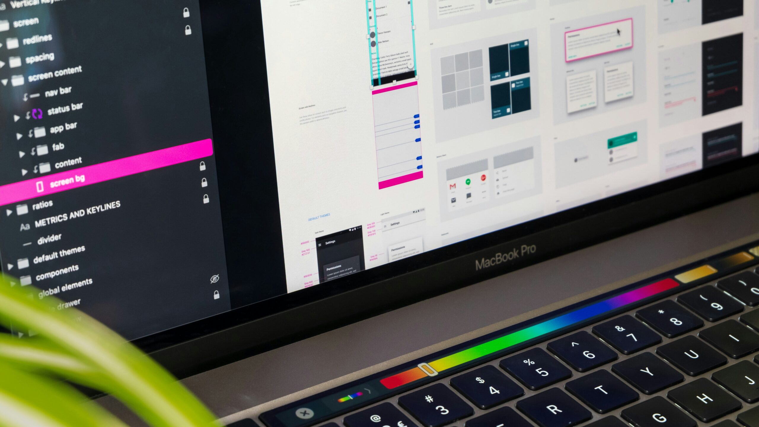
Whilst a redesign goes far beyond the design of the interface, it will usually consider all areas of the user experience, having said that the UI design is an essential aspect that will have a significant impact on the accessibility, overall usability and perception of the product or platform. This is where the brand guidelines come in.
The ideal scenarios
As a designer, there are two possible ideal scenarios when faced with redesigning a platform interface. One is that you are provided with incredibly thorough, thought-through, recent, carefully documented and digitally focused brand guidelines. The other is that you have to start completely from scratch. However, what is often the case is that you’re presented with something somewhere in the middle of these, something that perhaps has the basics, or wasn’t created with digital and UI design in mind. And even if you are that lucky designer who does get handed the wonderfully thought-through guidelines, there is still a good chance that some expansion upon it will be required for the purposes of the UX and UI design.
Guidelines aren’t the be-all-and-end-all
Before we answer the question at the beginning of this article, we must first take a look at the limitations of traditional brand guidelines, and why they are not the be-all-and-end-all for any redesign in the first place.
Your traditional brand guideline documents are in some cases created by brand and marketing teams who may not necessarily be familiar with the intricacies and requirements of how a digital platform operates. Usually, their primary focus is on laying out the brand language, visual identity and creating rules and guidelines for various possible design scenarios. They don’t tend to go into the complexities such as context, error and validation messaging, or provide the detail required for interactive elements and states.
Furthermore, you’ll be lucky if you’re presented with a colour palette or rules that has been developed with accessibility in mind. In fact, I have personally only come across a few traditional brand guideline documents that outline the colour contrast ratios of certain colour combinations from their palette. This isn’t to say that they’re not out there, it just means that what you are given to work with may well not have all of these bases covered.
In a perfect world, branding, design, marketing and product teams would all communicate wonderfully, creating a world in which brands are created with a digital-first approach, including all requirements and considerations for the UX and UI design, we might call this a design system. However, we don’t live in that perfect world and we often have to do the best we can with what we are handed.
Are they even relevant?
Another factor coming into play is this: How up-to-date are the brand guidelines that you’re being sent? After all, if they’re years old, they may no longer be fit for purpose anyway, and so a start-from-scratch approach may still be on the cards. That is, if you can clearly articulate the benefit of taking on what can be a much larger (and therefore, more costly) project.
At the end of the day, if a brand has recently been developed or re-designed then you’re in with more of a chance of it being fit for purpose. And if the brand hasn’t been touched in years, isn’t digitally focused and has significant gaps, then you’re going to need to take a deeper look before starting any UX and UI redesign.
Why you may want to adapt the brand guidelines
One benefit of adapting the brand guidelines for an interface redesign is that your users will be familiar with that certain look and feel, and so may find it easier to adapt to the new interface. After all, a radical and sudden change to the interface that both looks and works so differently from what the users are familiar with can cause great frustration, and in the worst-case scenario, abandonment.
We do see this happen with redesigns in many areas of design failing and causing huge amounts of financial loss and damage to the brand. From GAP’s rebrand in 2010 which cost $100 million to Twitter’s rebrand to X which is widely considered a failure, the examples are countless and act as a warning to all who attempt a rebrand or redesign. However, we can learn from others’ mistakes and are not doomed to repeat them.

Why you may want to start afresh
Whilst adapting brand guidelines may help users get to grips sooner with a redesigned interface, this isn’t to say that starting afresh will fail. If done well, and for the right reasons, it can be quite the contrary.
At the end of the day, if there is a genuine need to start afresh, and the usability will be greatly improved in doing so, then sticking to possibly outdated and ineffective brand guidelines is not worth it for the sake of familiarity. To soften the blow in terms of changes (as we all know that users, and people in general, don’t always like change), a gradual approach of continuous improvement can be taken, whilst being sure to test on real users throughout the process.
So, what’s my preference?
I would go as far as to say that for a UX and UI designer, a preference towards creating guidelines from scratch may be the most common. It certainly would be my preference as it means you can create it exactly how you think is best, exactly in line with the needs of the product and users, whilst being sympathetic to the brand at large.
But, at the end of the day, part of being a designer is being flexible and open to working in whichever way is necessary for a given job. If I’m handed brand guidelines to work through a redesign, I’ll make the best of it, but if I’m lucky enough to be able to start from scratch, that’s a good day all around, both for me and most likely for the interface too.
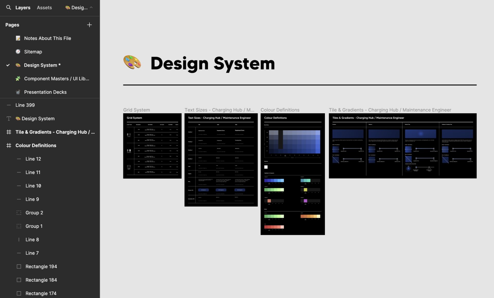
In the past, I’ve been given no more than two hex codes to work with. Given the autonomy to flesh out all styles necessary for the project, I was able to create a thorough and cohesive set of styles and interface components that worked for the brand and platform, whilst ensuring their usability, legibility and accessibility. Beyond this, it also meant that the styles and wider design system were all documented within Figma, alongside the design files and prototypes, resulting in an easy and efficient workflow between design and engineering.
With that said, if you’re anything like me, you may find yourself itching to make changes to the brand and certain styles throughout the design process, but I do believe that sometimes working within restraints and relinquishing some control can make you a better designer. After all, any UX/UI designer with a good understanding of branding can create a beautiful set of styles from scratch, but taking something that has been handed to you and making that work for the brand, business and user, well that is a true skill.
Thanks to Tirza van Dijk, NordWood Themes and Giorgio Trovato for the photos on Unsplash ❤️