Yes, typography can have a huge impact on UX
I find it fascinating how design can impact user experience. Adjusting interface elements even a tiny amount can have an immediate and measurable effect on how people use and feel about a digital product, website or app. Typography, in particular, has been shown to have a significant influence on user perception and engagement. In recent years, there has been a shift towards using lowercase typefaces in brand names and headlines, and this trend is supported by research that suggests that it can create a softer and more approachable aesthetic, ultimately leading to a more welcoming user experience that promotes engagement.
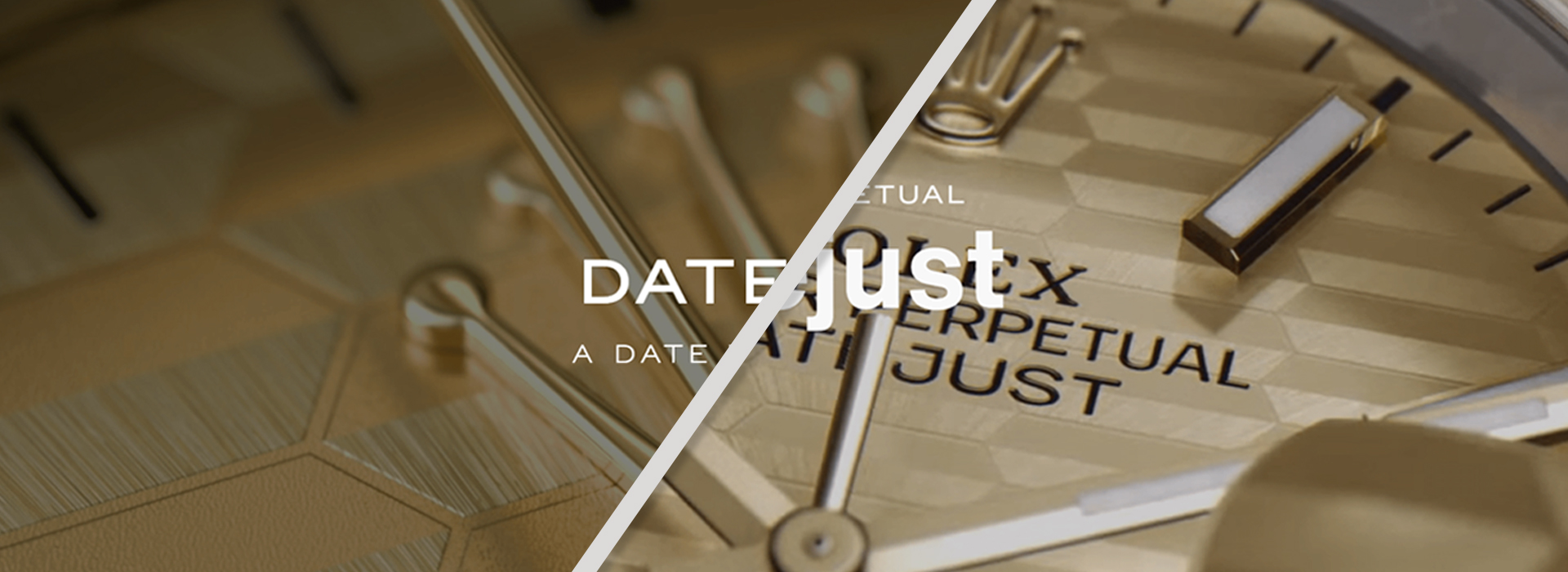
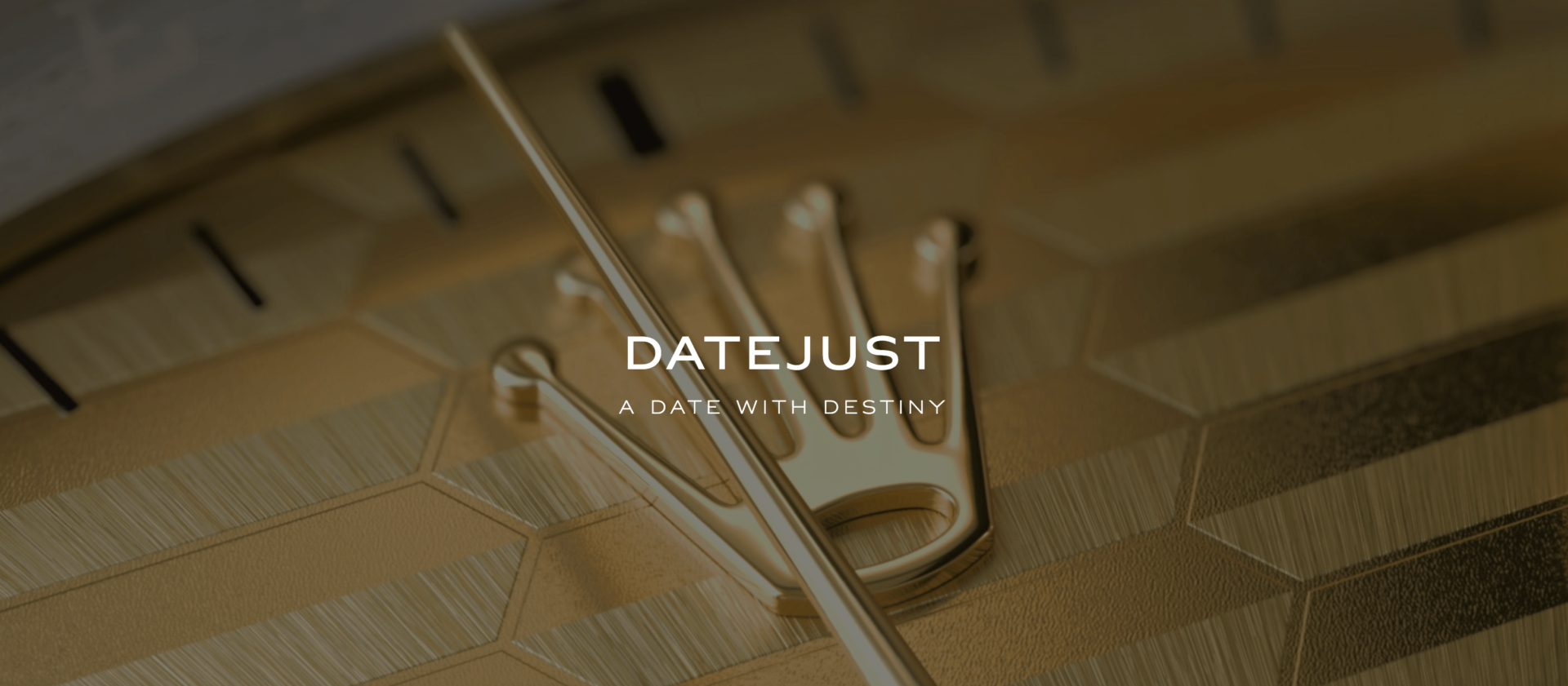
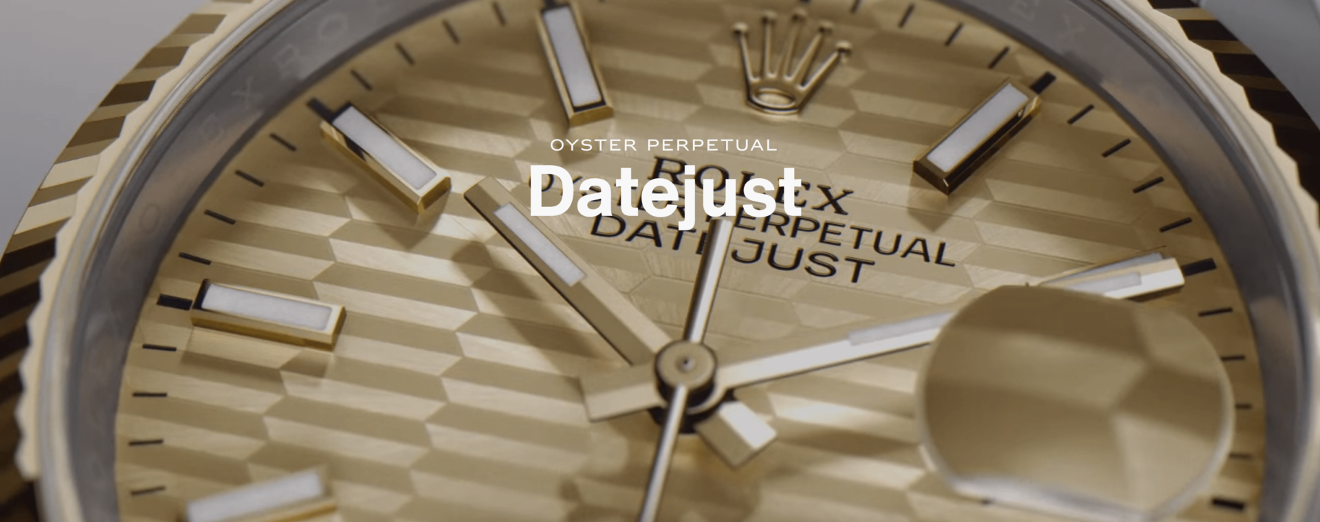
The recent relaunch of the Rolex website on March 27th serves as an excellent example of how a simple change in typography can drastically alter the overall look and feel of a website. The previous website design utilised ‘Helvetica Now’ in full capitals for headline statements, which gave off a bold and powerful impression. However, the redesigned website uses upper and lower-case headline statements, which creates a more refined and approachable aesthetic.
This change in typeface also aligns with a broader trend in design towards using negative space to create a more modern look. By incorporating more space around elements (thanks in part to the now smaller headlines), the new Rolex website looks more streamlined and organised, making it easier for users to navigate. The overall result is a website that feels more modern and welcoming, which despite the price point of their products I believe is a strategic move by the brand to appeal to a younger audience.
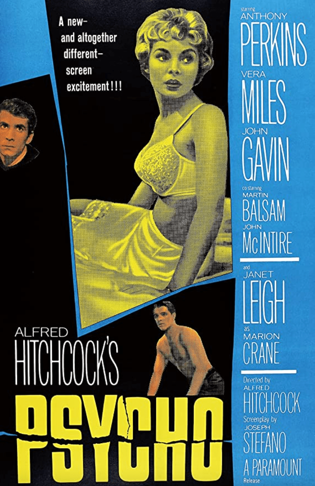
Of course, this is not the first time that typography has been used to create a specific look and feel. One of the most notable graphic designers to utilise typography in this way was Saul Bass. Bass was famous for his work on title sequences for films such as “Psycho” and “Anatomy of a Murder,” where he used typography to convey mood and tone. His bold and graphic typefaces set the stage for the films, drawing viewers in before the action even began.
Another influential designer who has used typography in unconventional ways is David Carson. Carson was known for his experimental designs, which often incorporated distorted and illegible typefaces. His work challenged traditional design conventions, and his designs were often controversial. However, they also served as a reminder that design is not just about aesthetics but also about communicating a message.
It is thought by cognitive scientists and typographers alike, that lower-case text is more legible than upper-case as the human eye can follow the contours and word shapes far easier. Yet lower-case letters are, on average, smaller in height and width than upper-case characters, which suggests an upper-case advantage. Studies have shown that the use of full uppercase typefaces can create a sense of authority, and even aggression or hostility, which can be off-putting to users – just think about those times you’ve had to apologise for sending a text message in FULL CAPS by mistake.
By using a lowercase typeface for headlines, designers can also create more negative space, making a design web or print page feel more modern and approachable, impacting user perception and engagement. By using a lowercase typeface, designers can create a more conversational tone that can make users feel more comfortable.
In conclusion, the recent relaunch of the Rolex website is just one example of how a simple change in typography can drastically alter the user experience. I believe that the use of lowercase typefaces is a trend that is here to stay, not only does it create a softer and more modern look and feel, but it also aligns with broader trends in design towards using negative space and simplicity. As designers, it is our responsibility to consider every detail in design and how it can impact the overall message that we are trying to convey.