Best Dashboard Designs & Trends in 2025

Estimated reading time: 7 minutes
Any one, or any organisation, can put together a dashboard. However a useful dashboards is a different story altogether. The most impressive dashboard examples of 2025 share key characteristics that make them stand out from the market. They present complex information through clean, intuitive interfaces that guide users naturally to the insights they need, fast. They do this by:
- Placing relevant metrics where they’re immediately visible
- Visualisations that give a speedy answer to mission critical questions
- Prioritising critical information that allows users to quickly assess key points and determine deeper trends
Note: some of these dashboards are customisable and that is a great quality depending on the industry and users. For example, a productivity centric product that best performs when customised to a specific user will need to focus on a less personal but more modular design. Long story short: A feature that is great for one dashboard may not be great for another depending on their industry/user base needs.
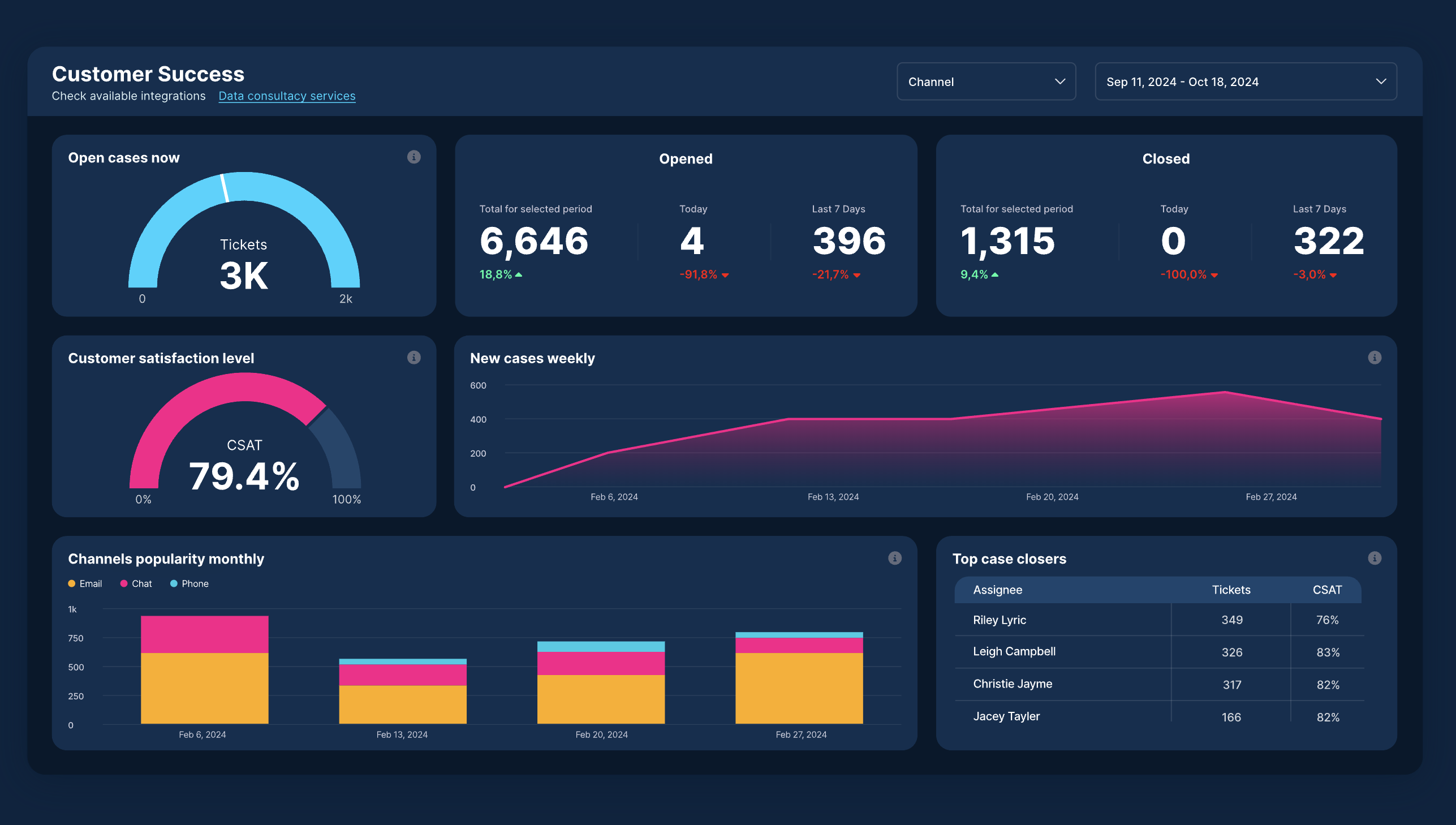
Hand picked by our team, the following showcase highlights some of the most innovative and effective dashboard designs from leading organisations across various industries. Each example demonstrates how thoughtful design choices create powerful tools that not only display information but empower users to understand it deeply and act on it confidently. Let’s explore these outstanding dashboard examples and what makes each one exceptional.
Top Dashboard Design Examples for 2025
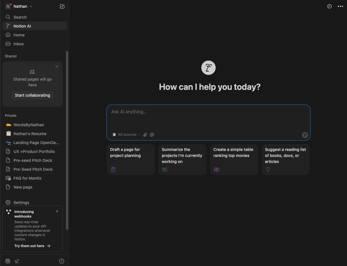
1. Notion
Notion has become a go to SaaS product for everything from documentation to team collaboration plays a massive role in its success.
- The dashboard uses empty states to invite action, not confusion
- Personalised templates are suggested based on workspace type
- Onboarding flows are built into the dashboard itself, subtle but helpful
Notion’s SaaS product dashboard is clean, focused, and flexible. It lets users explore at their own pace while gently nudging them toward their first task, whether it’s creating a note, importing content, or inviting a teammate.
2. Geckoboard
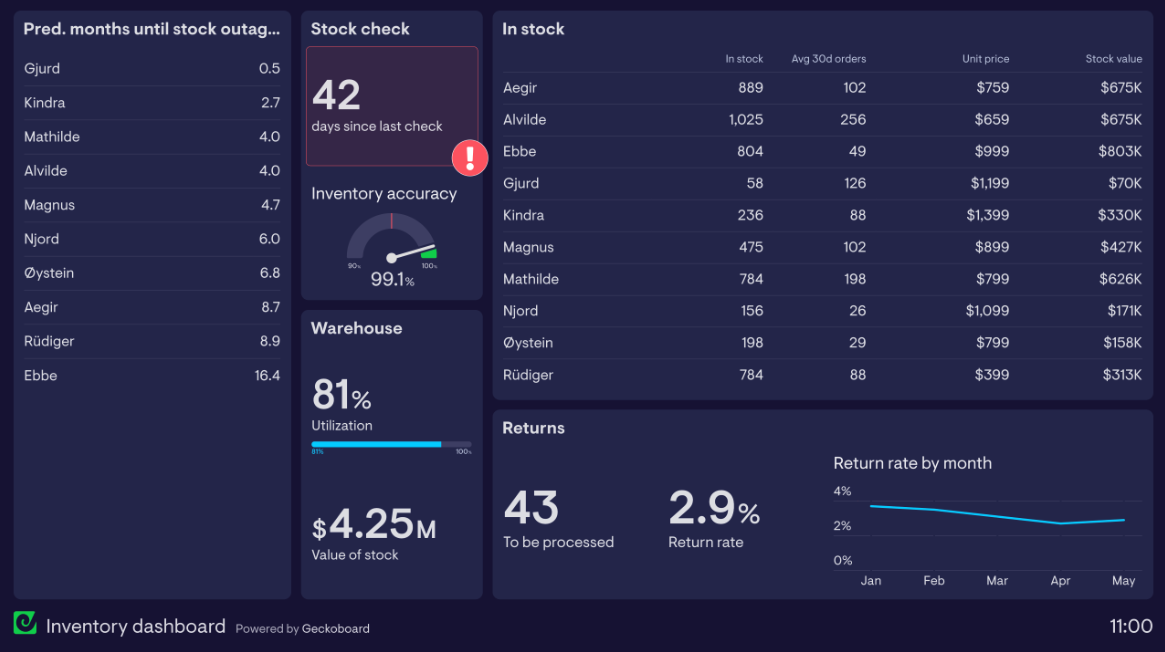
Geckoboard offers metrics monitoring software that showcases how goal based navigation can transform user experience. After identifying that new users struggled to create dashboards the first time, the company developed an innovative solution.
What Makes It Exceptional:
- Intuitive navigation that guides users through the dashboard creation process
- Clean visualisation of key business metrics including website sessions, units sold, and conversion rates
- Customisable displays that adapt to specific user needs and business objectives
- Problem solving approach informed by extensive user research
- Seamless onboarding experience that reduces friction for new users
Geckoboard’s dashboard exemplifies how understanding user challenges through both quantitative and qualitative research can lead to more effective design solutions. As their VP of Product noted, “Quantitative data shows where the problem is, and qualitative data tells us how to solve it.” This research driven approach helps create a user journey that works for all users in a scalable manner.
3. SEMrush Analytics Dashboard
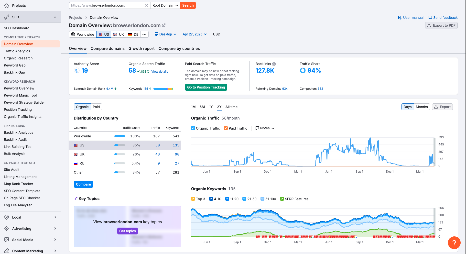
Organisation Background: SEMrush has established itself as the gold standard for SEO and digital marketing professionals, providing a comprehensive platform that centralises essential marketing data for agencies, in house teams, and solo marketers alike.
What Makes It Exceptional:
- Quick insights that deliver clear overviews of website performance, including organic traffic, keyword rankings, and site health
- Highly customisable widgets allowing users to tailor the dashboard to their specific workflow by rearranging elements and creating custom views
- Superior data visualisation through clear graphs and charts, with the ability to sort and filter by time period and geography
- Real time monitoring of SEO visibility, keyword positions, and competitor performance, empowering timely, data driven decisions
Despite its comprehensive toolkit of over 50 tools covering SEO, PPC, content marketing, and social media, SEMrush maintains intuitive navigation through a thoughtfully designed top menu and left sidebar structure. The platform excels in visual representations of complex data, offering innovative visualisations for keyword planning and backlink analysis that save time and provide actionable insights.
4. Health Tech
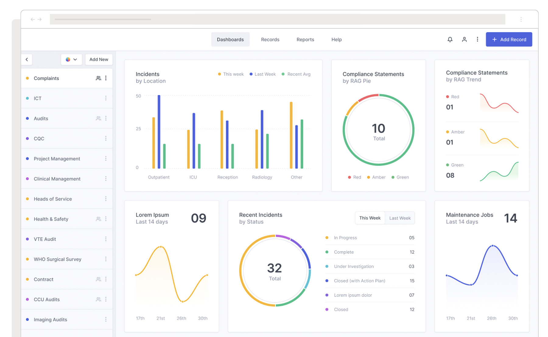
Organisation Background: Browser London redesigned a health tech compliance dashboard for a leading provider of healthcare software solutions. The client needed to update their platform’s UX and UI as they expanded into the North American market, with a particular focus on enhancing reporting capabilities for compliance officers and administrators.
What Makes It Exceptional:
- Role based personalisation that prioritises relevant data and tasks for different user types
- Intuitive query builder for generating custom reports with easy to interpret visualisations
- Strategic implementation of generative AI capabilities to help users quickly access needed data
- Simplified incident reporting workflow that minimises manual data entry through autofill and smart suggestions
- Thoughtful information architecture that allows users to navigate vast amounts of healthcare data efficiently
The redesign process began with comprehensive user research, including interviews with carefully selected participants to understand roles, workflows, and pain points. This research driven approach resulted in a dashboard that not only looks modern but truly enhances healthcare professionals’ ability to make data informed decisions efficiently, leading to better patient outcomes.
5. Power BI Analytics Dashboard
Organisation Background: Microsoft’s Power BI has become renowned for transforming complex, multi source data into interactive, visually compelling dashboards that are accessible to users of all technical backgrounds, from executives to analysts.
What Makes It Exceptional:
- Custom visualisations and interactivity through an extensive marketplace of visuals, drag and drop functionality, and advanced interactive elements like drill downs and tooltips
- Realtime data streaming from various sources, databases, cloud services, spreadsheets, with instant updates that empower organisations to monitor KPIs and spot anomalies
- Exceptional data connectivity and consolidation capabilities that aggregate information from disparate sources, creating a unified view of business performance
- Builtin AI and advanced analytics features that leverage Microsoft’s machine learning capabilities for predictive insights and pattern recognition
- Cloud based collaboration tools that enable secure sharing across teams and devices, with robust mobile access for insights on the go
Power BI’s versatility makes it particularly valuable for enterprises managing large, complex datasets across multiple departments. Its industry agnostic flexibility has led to successful implementations in healthcare, retail, financial services, and manufacturing. Regular updates and integration with the broader Microsoft ecosystem ensure that Power BI dashboards continue to evolve with the needs of modern businesses, maintaining their position at the forefront of data visualisation technology.
Dashboard Design Trends for 2025
As we progress through 2025, several trends are shaping the future of dashboard design:
- AI Enhanced Insights: More dashboards are incorporating artificial intelligence to highlight patterns and suggest actions users might otherwise miss.
- Personalisation: User specific dashboards that adapt based on role, preferences, and usage patterns are becoming standard.
- Story Driven Design: The most effective dashboard examples don’t just present data, they tell stories that guide users toward meaningful conclusions.
- Mobile First Thinking: As work becomes increasingly mobile, dashboards optimised for smartphone and tablet viewing are essential.
- Interactive Exploration: Modern dashboard designs empower users to explore data through filters, drill downs, and dynamic visualisations.
My conclusion
The most effective dashboard designs for 2025 aren’t just visually appealing, they’re incredibly useful tools that aide how organisations understand and use their data. By applying cognitive design principles, understanding user needs through research, and implementing thoughtful visualisation choices, organisations can create dashboards that truly empower decision making at all levels.
UPDATE 🚀
Check out our 2026 update post on this subject:
Best Dashboard Designs Every Product
Team Should Look at in 2026
Thanks to Daniel Korpai on Unsplash for the photo ❤️