Risk Intelligence Dashboard Design – A Guide for Product Teams
Estimated reading time: 10 minutes
Key takeaways
- Focus on workflow first; understand the decisions analysts need to make before designing the dashboard.
- Develop strong Key Risk Indicators (KRIs) that are measurable, predictive, and tied to business impacts for effective risk intelligence dashboards.
- Design interfaces for exploration, not just display; allow analysts to interact with data dynamically for deeper insights.
- Reduce cognitive load by structuring information effectively, using progressive disclosure to make data manageable for users.
- Integrate AI thoughtfully to enhance analytical depth without adding complexity; provide transparency to build user trust.
Risk data is only valuable if it drives decisions
For product teams working in insurance, security, defence, or financial services, the challenge is rarely a shortage of information. Moreover it’s building a risk intelligence dashboard that turns the complex, multi-source data into something an analyst and other members of an organisation can act on quickly and confidently.
This guide isn’t here to just say make pretty data visualisations but guide you through the principles, decisions, and common pitfalls that make up a successful risk intelligence dashboard based on our experience in this field.
Start with the workflow, not the data
Most product teams design around the data they already have, that’s the wrong starting point in my opinion. The right question is: what decisions does your analyst actually need to make?
Before any wireframe gets sketched, map the full workflow, find out where does a risk intelligence begin? Who feeds data into it? Who signs it off? What does the final output look like? What takes time? What doesn’t? Where are the quick wins?
Risk platforms usually serve several departments at once, and those departments don’t always agree, so it’s worth investing time in stakeholder alignment early in the process. Fixing those tensions in research is cheap. Fixing them after launch is not.
We spent months interviewing underwriters, analysts, and third-party operators for a risk intelligence provider on their Insights platform before touching a design tool. We mapped every step from client request to final report. Three problems kept coming up: data processing bottlenecks, friction in inter-departmental communication, data standardisation, and the manual effort involved in producing client-facing reports. Every design decision that followed solved one of those four things. If yours don’t, you may end up with a dashboard that looks impressive but gets ignored.
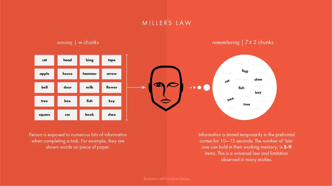
Build your KRIs before you build your interface
Typically a risk intelligence dashboard is only as useful as the indicators it’s built around. Key risk indicators, KRIs, measure and predict risks before they become real problems. They’re your early warning system.
Good KRIs share three traits. They’re measurable, expressed in numbers or percentages, not judgement calls. They’re predictive, flagging a trend before it becomes an event. And they’re tied to a clear business impact so that when a threshold is crossed, someone knows exactly what to do.
“Information is the oil of the 21st century, and analytics is the combustion engine.”
Peter Sondergaard, Senior Vice President, Gartner
KRIs tend to cluster into four areas: financial risks like budget exposure or acquisition activity; operational risks tied to process gaps and control failures; people risks covering employee retention and customer churn; and technological risks including system failures and data breach incidents.
A strong dashboard surfaces indicators from each category in one place. Analysts shouldn’t have to switch tools to get the full picture. Threshold-setting is the most overlooked part of KRI design, without a defined trigger level, a dashboard can display a great deal and prompt very little. If you’ve time, check out the ISO 31000 guidelines, they offer a useful baseline for structuring this kind of risk governance.
Design for exploration, not just display
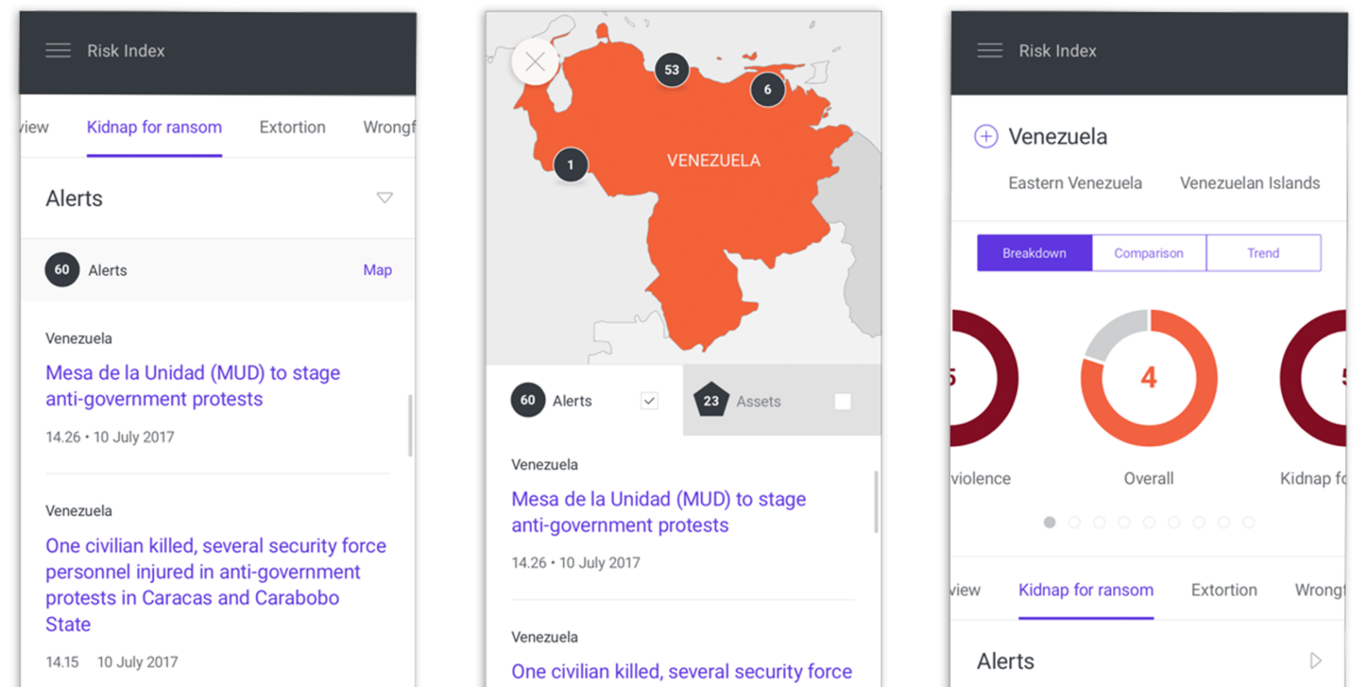
Risk analysis is not linear, analysts triangulate across datasets, compare regions, and look for patterns that aren’t immediately obvious. Your interface needs to support that exploratory behaviour, not just present pre-packaged views. The best dashboards feel like workspaces, not reports. For the Insights platform, that meant building three distinct feature areas.
- Charts let users layer information across multiple views, applying filters and templates to build up a risk profile.
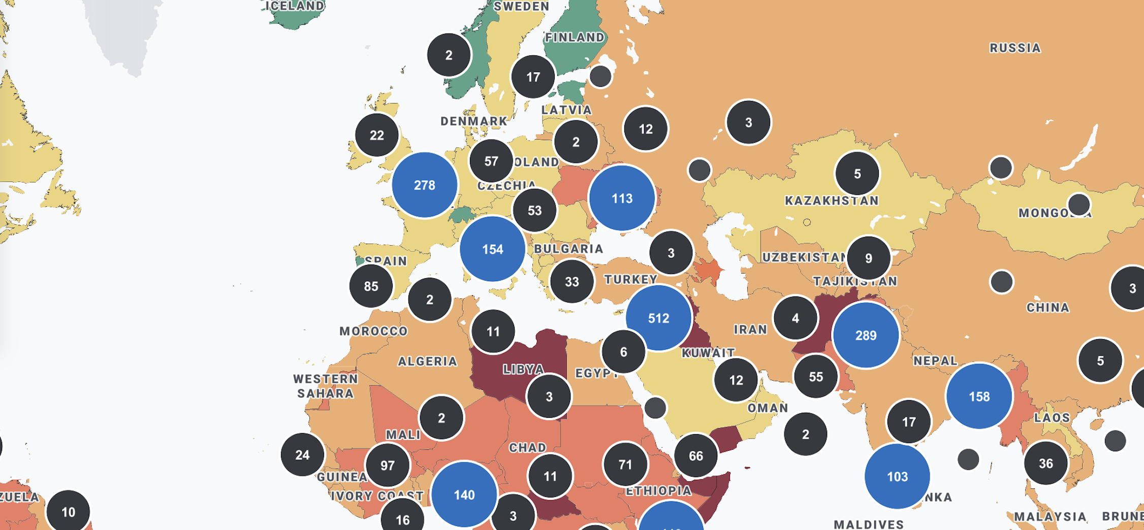
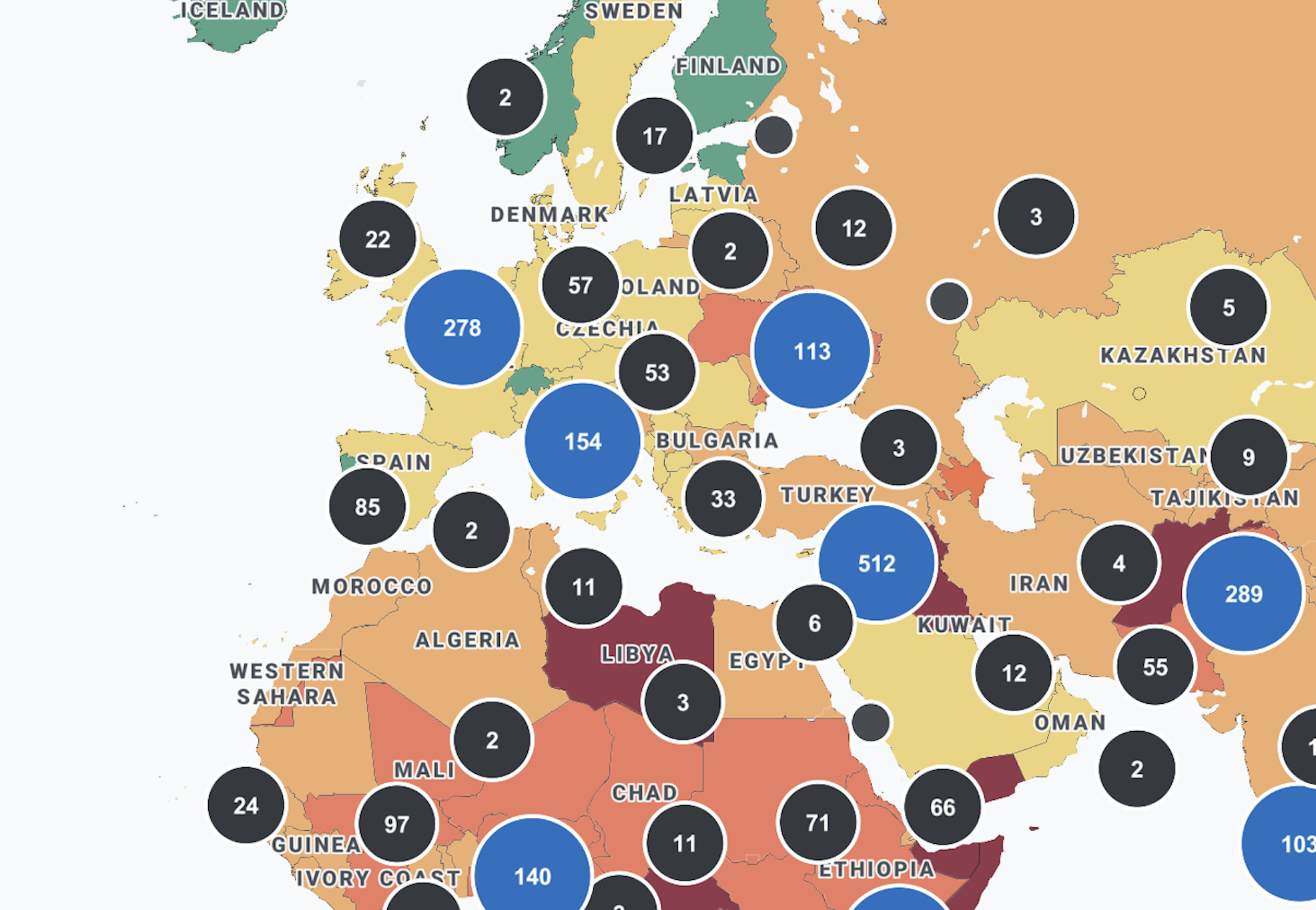
- Maps let analysts plot live risk reports onto geographic interfaces, pulling data dynamically from other modules or entering it manually.
- Reports let users package validated, categorised data for deeper regional analysis.
The principle is simple: good dashboard design isn’t about making everything visible at once. It’s about making the right thing available at the right moment in the right workflow. If you are unsure whether your current interface is achieving that, it is worth asking whether your UX is quietly affecting retention and drop-off before attributing those problems to the product itself.
Reduce cognitive load, not just data volume
Raw data doesn’t move anything on its own, what matters is how information is structured, sequenced, and surfaced, and how much effort it takes to interpret it. Most dashboard problems aren’t a data volume issue. They’re a friction issue. Understanding what great UX actually means in a data context is a useful starting point before evaluating where your current platform is falling short. That friction builds quietly: through poorly structured navigation, unclear visual hierarchies, and interfaces that force users to hold too much in their heads at once.
Progressive disclosure is one of the most effective tools available, instead of surfacing every data point immediately, show high-level indicators first and reveal detail only when the analyst seeks it. This matches how risk analysis actually unfolds, and it cuts the mental effort of using the platform significantly.
Risk dashboards serve a wide range of users, experienced analysts perhaps want granular control. Whereas senior stakeholders need a clear summary in seconds. Designing for both beginners and power users within the same interface is genuinely hard. Interactive filtering, dynamic visual hierarchies, and contextual drill-through all help by letting analysts move from the broad picture to granular detail without losing their place in the workflow. It is also worth considering how the future of user interface design is shifting expectations around personalisation and context-aware content, both of which have direct implications for how risk platforms surface information to different user types.
Heat maps make severity immediately legible by clustering risks by colour and intensity. Trajectory charts show whether a risk is escalating or being managed over time, both outperform static tables in most risk contexts. When the interface is working, analysts are thinking about risk, not about how to use the tool.
Integrate AI where it adds genuine analytical depth

AI has a legitimate role in risk dashboards, but only where it genuinely extends analytical capability rather than adding complexity for its own sake. If you are early in thinking through what this might look like for your platform, understanding what designing AI-centric products actually involves is a useful foundation before committing to a particular approach.
Natural language processing is one of the more proven applications: on the Insights platform, we integrated an AI-powered NLP system to validate and categorise incoming data before it reached the Reports module. This meant analysts were working with structured, pre-processed information rather than raw text, significantly reducing the time needed to prepare client-facing outputs. For teams looking to go deeper on how these models work before building with them, a grounded introduction to large language models from a design perspective is worth reading alongside your technical scoping.
The addition of AI support should reduce cognitive load, not increase it. Building user trust in AI-powered dashboards depends heavily on transparency, if your analysts need to understand how the model works in order to trust its output, the implementation has fallen short. Clear signposting of where AI-generated content has been used, and what confidence level sits behind it, is essential in any regulated or high-stakes environment.
Do not underestimate the handover
A well-designed risk intelligence dashboard that cannot be integrated into an existing technical ecosystem is a failed project. From the outset, your development approach should account for the fact that the platform will need to live within a broader digital environment, not replace it. Teams that approach this phase the way they would a pilot or MVP tend to surface integration problems earlier and at significantly lower cost.
At the point of delivering the RUSI cyber security platform, the final stage was handing a fully documented package to the client’s IT team, complete with release notes and one-to-one guidance sessions. The result was a clean integration with no lengthy back-and-forth, and a team that felt fully equipped to own and maintain what they had received. Documentation is rarely the exciting part of a project, but it is consistently the difference between a product that gets embedded and one that gets shelved.
Frequently asked questions
What is a risk intelligence dashboard? A risk intelligence dashboard is a centralised interface that aggregates data from multiple sources to help analysts identify, monitor, and respond to potential risks in real time. Rather than replacing human judgement, a well-designed dashboard supports it by surfacing the right information at the right moment in the analyst’s workflow.
What is the difference between a KRI and a KPI? A KPI measures performance against a business objective. A KRI signals exposure to potential risk before an adverse event occurs. Both are valuable, and the most effective organisations link them together so that performance management and risk management are part of the same conversation.
How many KRIs should a risk dashboard track? There is no universal answer, but more is rarely better. A focused set of high-value indicators tied to material risks will outperform an extensive library that dilutes attention. Start with the risks that could genuinely affect strategy or operations, and build from there.
What visualisation types work best for risk data? Heat maps, risk trajectory charts, and interactive geographic maps are among the most effective formats for risk data. Heat maps make severity hierarchies immediately legible. Trajectory charts reveal whether a risk is escalating or stabilising over time. Maps are invaluable when risk data has a regional or spatial dimension, which in most enterprise contexts it does.
When does a risk dashboard need an interactive map? Whenever the data has a meaningful geographical dimension. If regional comparison is part of the analyst’s workflow, a map will almost always outperform tables or charts as the primary navigational interface.
How do we handle data from multiple sources in a single dashboard? The goal is a single, unified interface where analysts do not need to know where data originates. This requires careful data architecture decisions early in the project, as well as a shared risk taxonomy across the organisation to ensure that data aggregated from different sources is genuinely comparable.
How long does a risk dashboard project typically take? Serious discovery and research, the kind that produces a platform people actually adopt and use, typically takes several months before design begins. Compressing this phase is the single most common cause of risk dashboard projects that look good in a demo but fail in the field.
How do we know if our current risk dashboard is underperforming? The clearest signal is behavioural: if analysts are exporting data into spreadsheets to do their work, the dashboard is not doing its job. Other indicators include low adoption rates, frequent requests for training, and a reliance on static reports alongside the platform rather than instead of them.