The UX Design Patterns Every Product Team Needs to Know for 2027
Key takeaways
- The UX design patterns that matter in 2027 share one goal: fewer decisions and fewer steps for the person using your product.
- Adaptive interfaces should change the content, never the map. Keep core navigation stable.
- Every AI feature needs a plain explanation, a way to switch it off and a route to a human.
- AI agents need review and approve screens, not just another chat box.
- Accessibility has to hold in every variant you ship, not just the default screen.
- Test each pattern with a small group of users and measure task completion, not clicks.
AI can produce a screen in seconds, yet Nielsen Norman Group called 2026 the year of AI fatigue, as users tire of sparkle icons bolted onto products that still do not solve their problems. The discipline is shifting from producing screens to making good decisions about them, which is why UX design is far from finished.
The design patterns below are not visual fashions. They are repeatable answers to the question every product team now faces: how do you adapt to each person without losing their trust?
1. Role based entry points
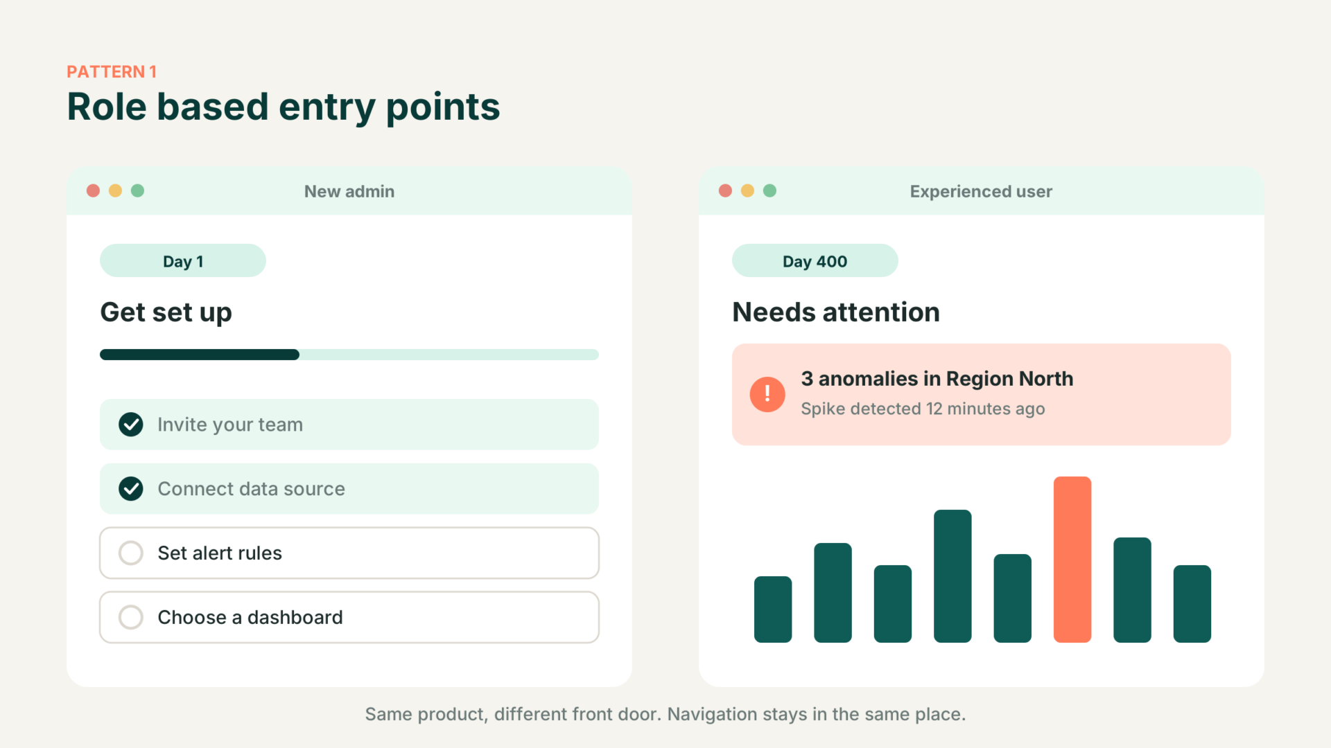
A new administrator lands on setup tasks. An experienced user lands on anomalies and exceptions. Same product, different front door. This pattern cuts time to first value because nobody scans menus that are irrelevant to them.
Watch out for: moving navigation. Change what is prioritised on the page, not where things live. Users forgive a changed recommendation. They do not forgive a missing menu item.
2. Explainable personalisation
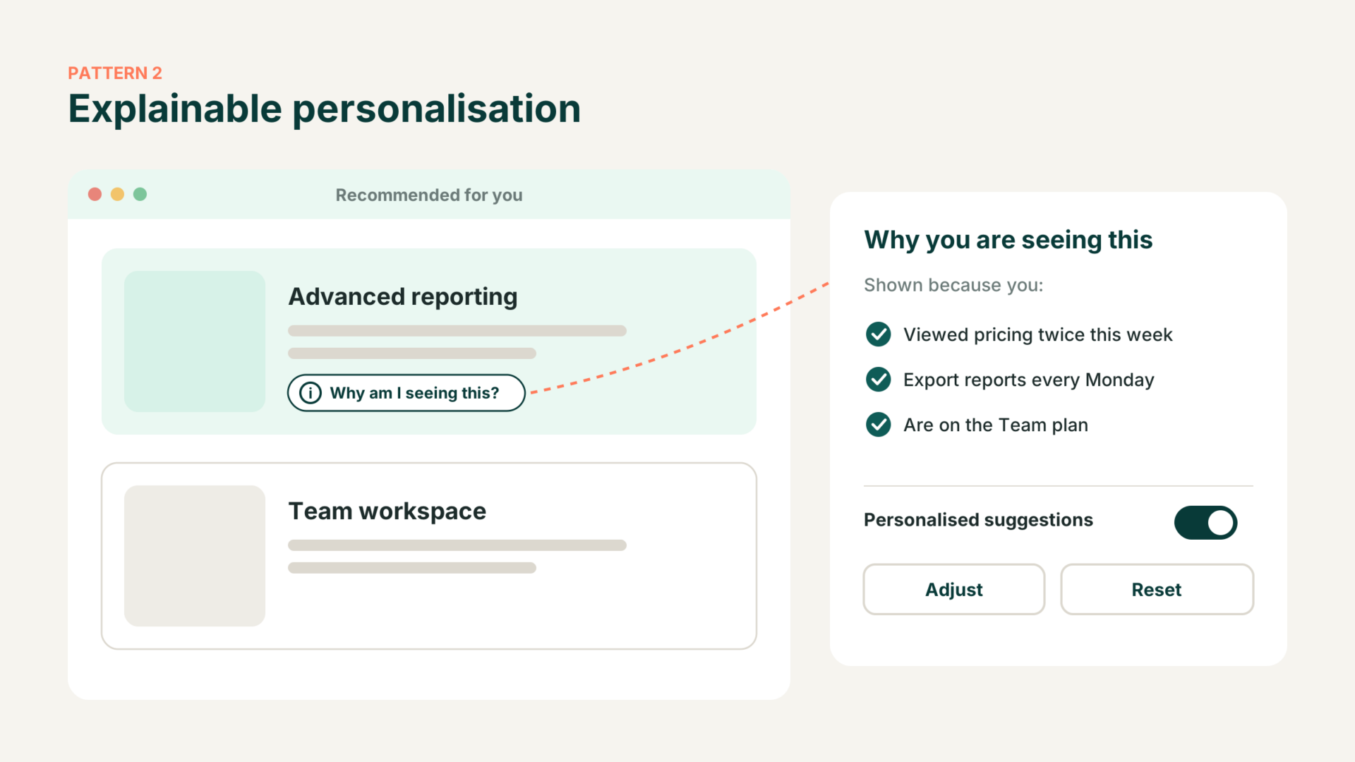
A small “Why am I seeing this?” link beside personalised content, with options to adjust or reset, turns a black box into something users can understand. Salesforce research from 2025 found 72% of customers want to know when they are dealing with an AI agent, and 64% believe companies are reckless with customer data.
If your team cannot explain an adaptive rule in one sentence, your users will not trust it either. The same applies to AI powered dashboards, where users need to know which figures a model produced.
3. Agent review and approve screens
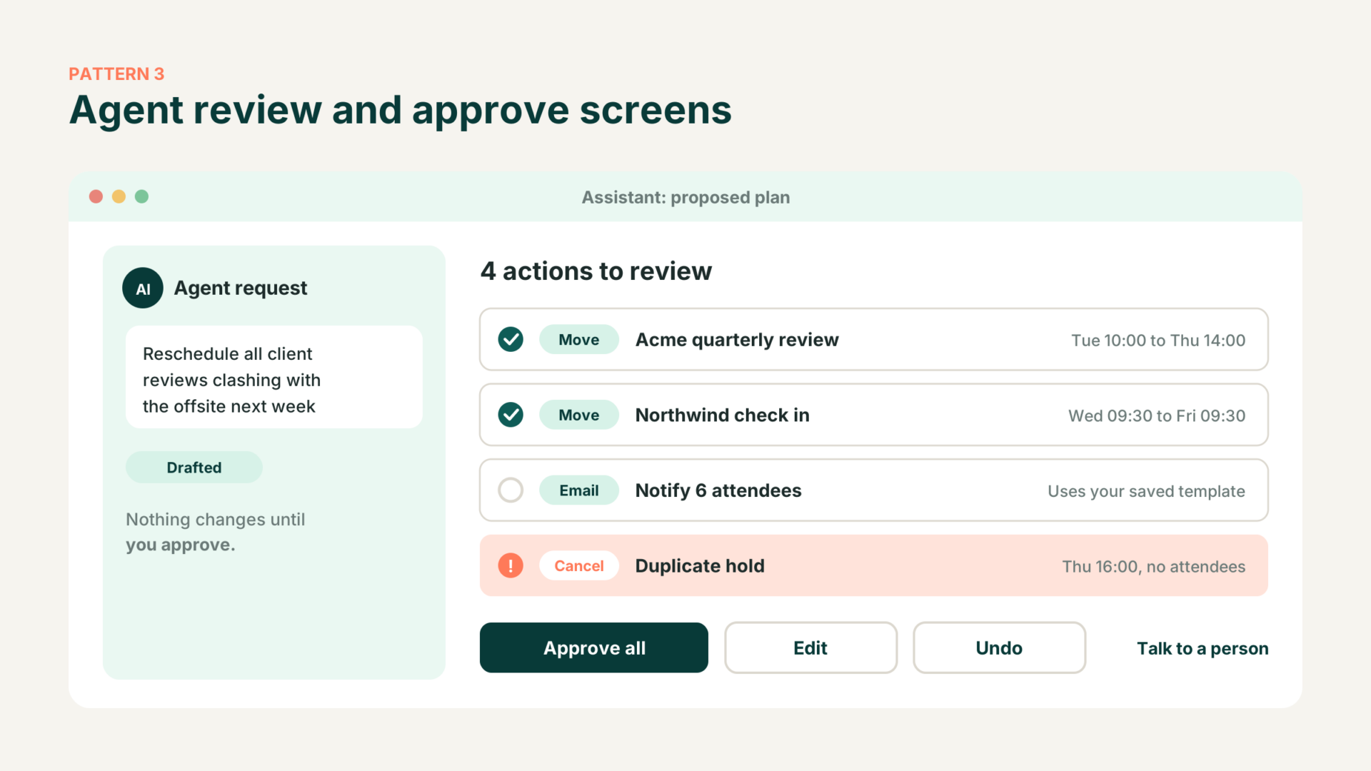
The inclusion of AI agents has changed UX design patterns. As AI agents complete more tasks on the user’s behalf, the interface becomes a layer for oversight. Show the agent’s plan, the exact changes it proposes, and clear controls to approve, edit or undo before anything happens.
Gartner predicts more than 40% of agentic AI projects will be cancelled by 2027, often because value and risk controls were unclear. A good review screen addresses both, and clarity matters most where AI sits between people and large collections of data.
4. Progressive disclosure by intent
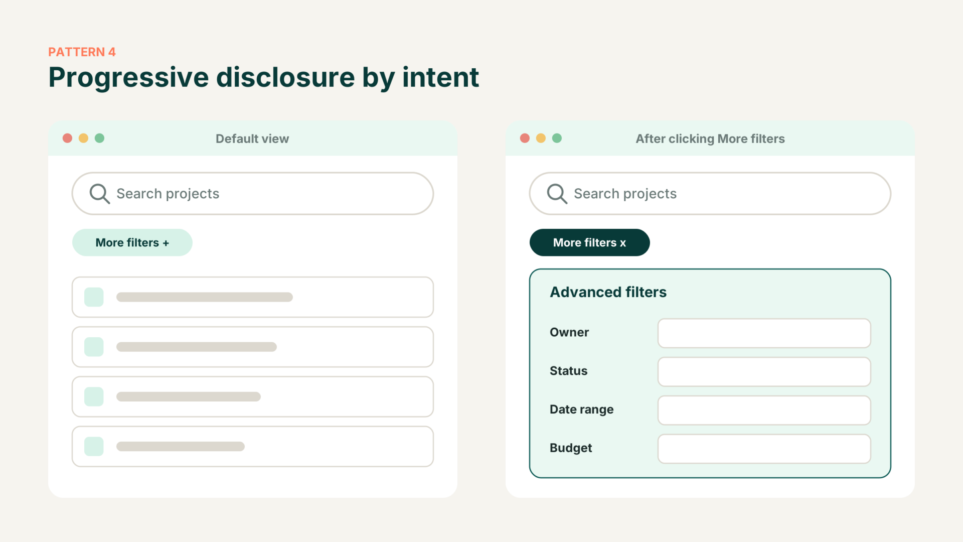
Keep the default screen calm. Advanced filters and settings stay tucked away until a user signals they need them. This protects newcomers from overload while keeping power features one click away for experts.
If your product has grown feature by feature, this is often the fastest fix, and it is easiest to tackle one flow at a time rather than attempting a full redesign.
5. Adaptive checkout and forms
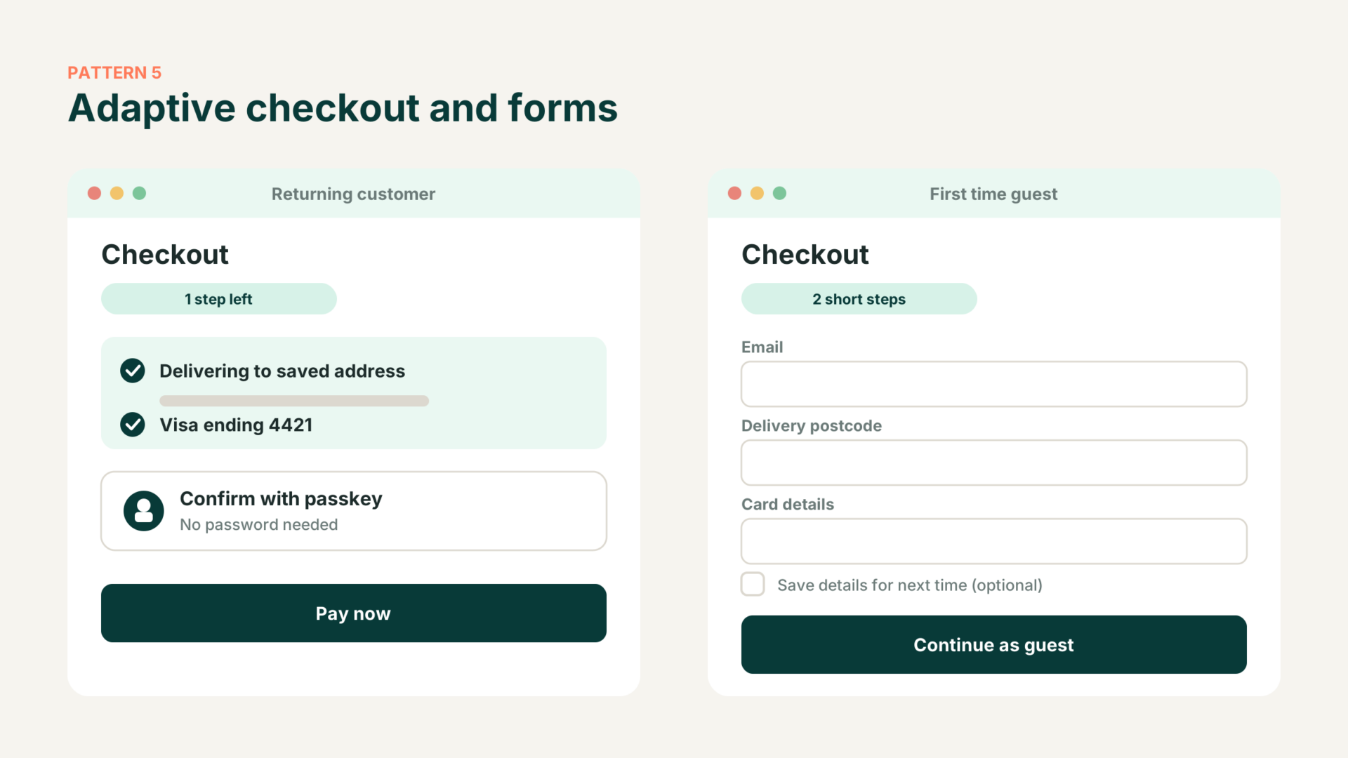
Returning customers see saved details and passkey sign in. First time visitors see a short guest path. The Baymard Institute puts average cart abandonment at 70.22% and estimates large sites can lift conversion by 35.26% through better checkout design alone. Strict password rules cause up to 19% abandonment among existing account holders.
Ticketing and booking journeys are a good place to start, as motorsport ticketing shows, because every extra field stands between a visitor and a sale.
6. Source and confidence cues
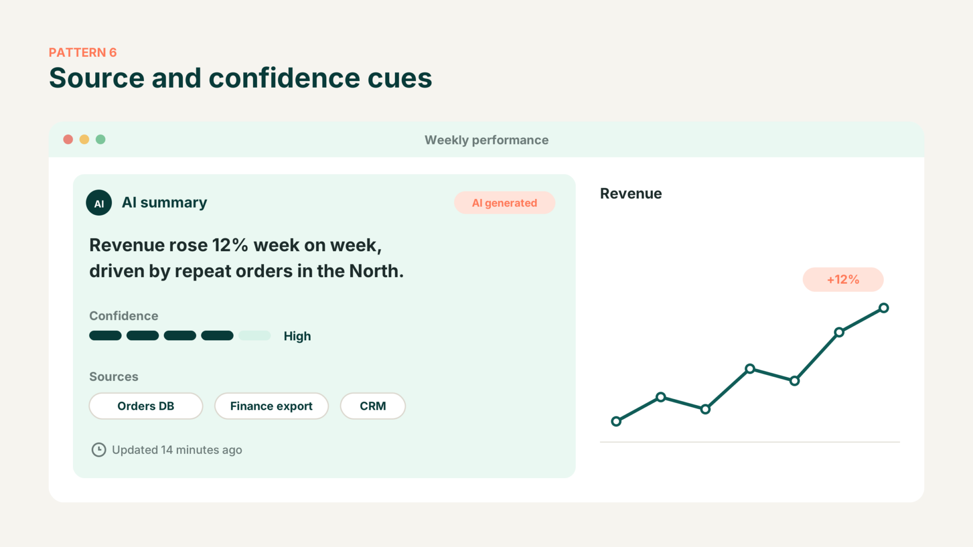
When AI summarises data, show where the answer came from, how confident the system is and when the data was last refreshed. These small cues let users decide how far to trust a figure before they act on it.
Clear visual hierarchy matters more than ever, because bad design can ruin good data, especially on high stakes screens such as risk intelligence dashboards.
7. Accessible by default components
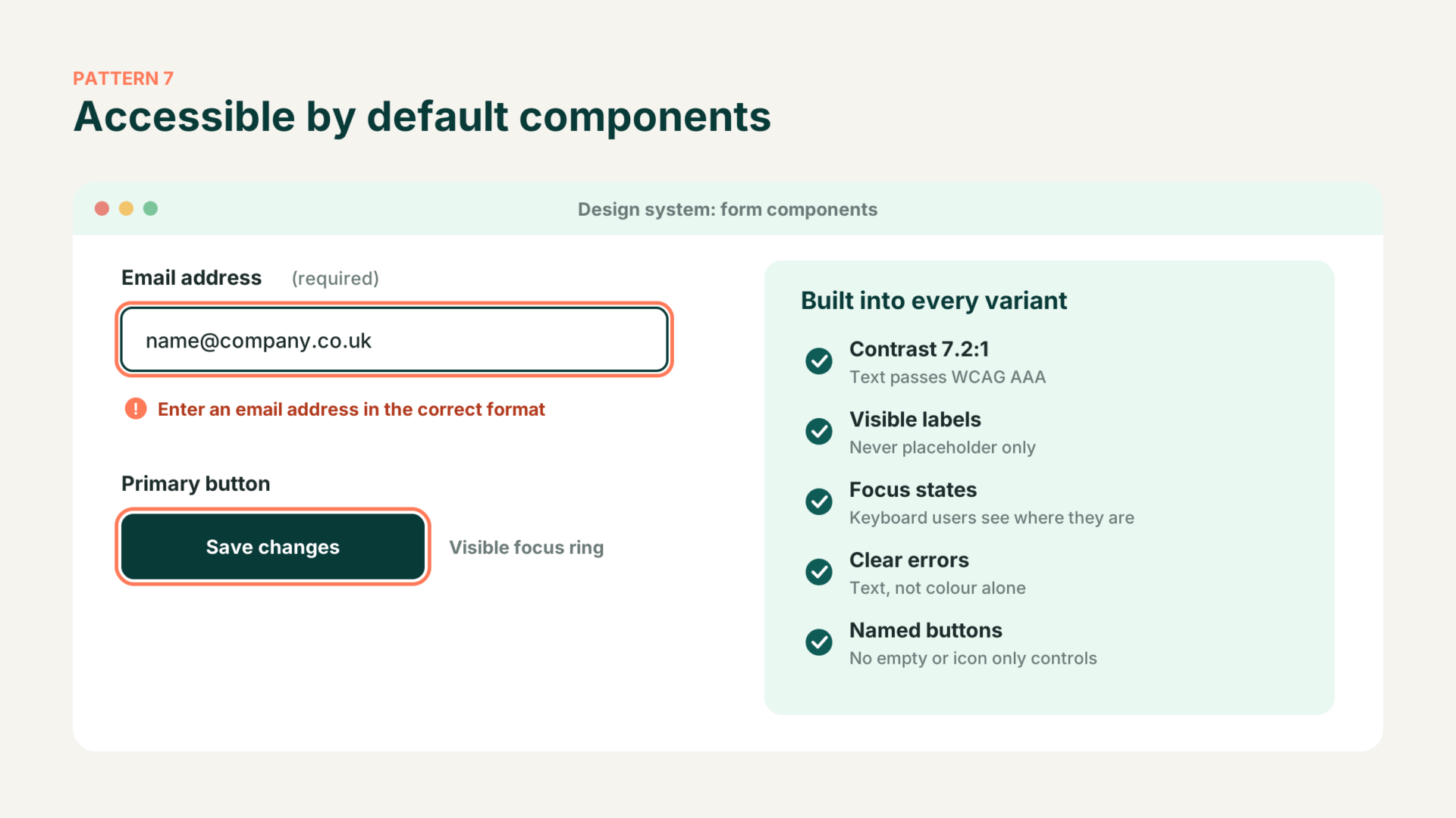
Adaptive interfaces multiply the number of screen states, and every one must work for everyone. WebAIM’s 2026 analysis found detectable WCAG failures on 95.9% of one million home pages, with errors per page rising to 56.1. Low contrast, missing labels and empty buttons top the list.
Build contrast, labels and focus states into your design system components so every variant inherits them. With the European Accessibility Act now enforceable, this is a commercial requirement as much as an ethical one.
How to put these patterns to work
Pick the pattern that addresses your biggest drop off, prototype it quickly and test it with real users. Rather than writing long specifications, build the brief as a working prototype and let users react to something tangible.
Roll each pattern out to a small group first, compare it with a control group and set a rollback rule in advance.
FAQ
What is the most important UX design pattern for 2027? Explainable personalisation. As interfaces adapt to each user, people need to understand why something changed and how to reverse it. Without that, every other adaptive pattern loses trust.
What is the difference between adaptive and responsive design? Responsive design resizes the same content to fit different screens. Adaptive design changes the content, order or flow based on who the user is and what they are doing. Most products need both.
How do we design for AI agents? Treat the interface as an oversight layer. Show the agent’s plan, the changes it will make and clear approve, edit and undo controls, plus a route to a human when things go wrong.
How do we know if a design pattern is working? Compare a test group against a control group. Track task completion time, conversion, support contacts and retention, alongside frustration signals such as rage clicks.
Do these patterns work for small product teams? Yes. Most need no new technology, just clear rules and good components. Start with the pattern that fixes your biggest drop off and test it with five or six users before going further.
Want to learn more about similar topics? Check out the following links below.
- https://www.browserlondon.com/blog/2024/11/18/improving-customer-acquisition-with-great-ux/
- https://www.browserlondon.com/blog/2025/01/06/how-underperforming-ux-may-be-affecting-your-customer-churn-rate/
- https://www.browserlondon.com/blog/2024/06/03/measuring-what-matters-the-science-of-ux-design/