Adding a Feature Isn’t the Same as Improving Your Product

Estimated reading time: 8 minutes
Key Takeaways
- Adding a feature is not the same things as improving the UX and or the UI.
- Reactive feature development weakens core value: responding to market pressure without a strategic filter produces products that do many things poorly.
- A feature belongs when it extends an existing user workflow, not when it introduces a new one.
If there is one thing I want to impress upon you it is this: adding a feature is not the same as an improvement. Improving a digital experience means recognising when the UX or UI needs updating to reflect a change in the user base, the market or the organisation’s capabilities. The most common mistake product teams make is treating new functionality as a sign of progress. Feature development can be successful, but only when done in a particular way; the real question is whether it extends the core value users already rely on. A feature that disrupts established patterns without genuine utility does not grow the product. It erodes it.
The right questions

Most feature decisions start with the wrong question: “Can we build this?” or “Should we respond to what competitors are doing?” The right question is simpler: “Does this belong here?”
Belonging is not about technical fit. It is whether the feature feels like a natural continuation of what users already understand and expect. If they have to learn a new mental model to use it, you have not added to your product; you have added onto it.
Most feature decisions start with the wrong question: “Can we build this?” or “Should we respond to what competitors are doing?” The right question is simpler: “Does this belong here?”
Belonging is not about technical fit. It is whether the feature feels like a natural continuation of what users already understand and expect. If they have to learn a new mental model to use it, you have not added to your product; you have added onto it.
Before a feature earns a place on the roadmap, it is worth drawing it. A simple flow diagram, showing where the feature enters an existing journey, what it depends on, and where it exits, surfaces most belonging problems before a single screen is designed. If a feature cannot be traced onto the flows users already run, it is likely not extending one.
Diagramming also forces good questions about UI real estate. Every pixel given to a new feature is taken from something already earning its place, whether that is navigation, whitespace or an established call to action. A feature that demands its own menu item, onboarding flow or persistent banner is rarely a small addition; it is a renegotiation of the interface’s whole hierarchy, and that should be visible on the diagram, not discovered after launch.
A product earns trust through consistency, the accumulated UX capital of every session and shortcut discovered. A poorly considered feature spends that capital carelessly, and the effect on churn is measurable.
No, you don’t have to copy your competitor’s UI

Market conditions change quickly. A competitor ships something, a new technology generates noise, and leadership asks why the product does not do that yet. Being responsive to the market is not wrong; treating every signal as a product instruction is. Reactive development treats the product as a container, dropping in capabilities on the assumption the market has already done the strategic thinking for you. The first task, always, is translation: what does this signal mean for the job users are trying to do? If it helps them do that job faster, that is a case for integration. If it opens an entirely different job, you are looking at a product decision that deserves its own business case, not a feature.
Skipping that translation step is how products end up with the Swiss army knife problem: technically impressive, experientially poor, capable of many things but none as well as a focused alternative. Your unique value proposition is the filter that protects the clarity users depend on, and the thing that tells you whether a competitor’s move signals a genuine shift in expectations or simply a bet they have made that you do not have to match.
The good news is that “does this belong here?” need not be answered on instinct alone. It can be tested, on two axes: whether the idea is right, and whether the execution is right.
Testing the idea, before anything is built, might mean a fake door test, shipping an entry point with no feature behind it to measure demand without engineering cost, or a concierge MVP, delivering the outcome manually to a small cohort to check the job is real before it is automated.
Testing the execution, once the build decision is made, might mean tree testing, checking whether users can find the feature within the existing information architecture, since a feature invisible in a stripped down tree is not extending an established pattern. Usability testing with first time users, observing behaviour rather than opinion, surfaces hesitation as the integration failing in real time, and a rollout to a control cohort should measure retention, not engagement, since engagement can spike on novelty alone while retention reveals whether a feature became load bearing.
Together, these tactics force the “does this belong” argument to happen before the code does, against evidence rather than conviction, the discipline the SBTi dashboard below was built under.
Real World Examples of Feature Introduction

Below are two examples of feature introduction, one done poorly and another done properly, the failure first to emphasise the importance of not just copying trends from the market.
LinkedIn Stories: A Feature in Search of a User Job
In 2020, LinkedIn launched Stories. By 2021, it had removed them. The market signal seemed clear: ephemeral, short form content was driving huge engagement on Instagram and Snapchat. But LinkedIn’s core value is professional identity, and users arrive with a deliberate mindset, projecting themselves to colleagues and employers. Stories are built for spontaneous, low stakes content, a pattern that made sense elsewhere but not here.
Stories did not extend any existing user workflow. It was a new job, imported from a different product category and welded onto a platform whose UVP had no room for it. Low adoption was not a distribution failure but users correctly sensing the feature did not belong. When LinkedIn removed it, the product felt cleaner, the clearest signal a feature had been occupying space rather than extending core value.

SBTi’s Emissions Reduction Target Dashboard: Solving One Job, Completely
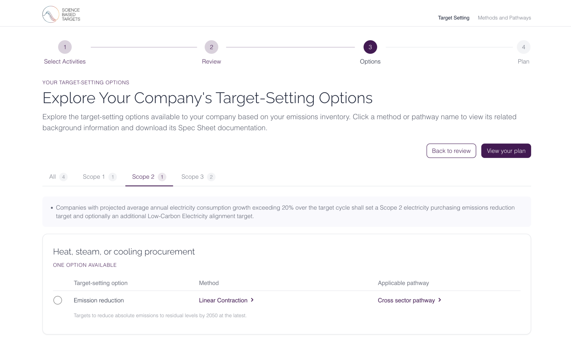
When Science Based Targets Initiative needed to help corporate sustainability teams understand their climate commitments, the temptation would have been to build a broad platform: reporting tools, benchmarking, document management, everything a team might conceivably need. Instead, the brief was held to a single job: take a company’s emissions data and return an honest picture of where they stand and what comes next.
The dashboard does exactly that and nothing more. Sector specific guidance appears automatically, recalculation responds to inputs instantly, and the interaction resolves in under thirty minutes. No feature was added that did not directly serve that job. The result is a tool that teams at 13,000 companies use without training, what happens when a feature’s scope matches the scope of the job.
What Every Feature Decision Comes Down To
Do not add a feature because you can, or because someone else has. Add one when it makes the thing users already come to you for demonstrably better, fits the patterns they have learned, and extends your core value rather than sitting alongside it.
Frequently Asked Questions
When is the right time to add a new feature? When users are clearly reaching the limit of what the product can do for them, and the capability resolves that gap within the established experience.
How do you know if a feature disrupts UX? Test it with users who have not seen it before. Hesitation, questions or navigating away signal the integration is failing. Observe behaviour, not opinions.
Should you always resist adding features in response to competitors? Only if the feature aligns with core value. The question is whether the move signals a genuine shift in user expectations or simply a bet your competitor has made.