Four Signs Your UI Needs a Redesign, One Flow at a Time

Estimated reading time: 10 minutes
Key Takeaways
- A UI redesign is almost always a UX redesign too. Visual changes that ignore a user’s existing mental model (e.g., Windows 8 removing the Start button) risk serious backlash, regardless of how polished the new look is.
- Diagnose before you redesign. Look for patterns across multiple signals (support tickets, A/B test plateaus, conversion drop-off) rather than acting on a single hunch or isolated complaint.
- Most weak-UI problems call for fixing one flow, not rebuilding the whole product. Targeted redesigns build more internal trust and deliver more external value than sweeping overhauls.
Even pixels age, or more accurately, they can become outdated. Interfaces that once felt sharp and modern can quietly turn into obstacles, frustrating the very users they were built to serve. Product teams rarely struggle to accept that a UI redesign will eventually be needed. The harder problem is spotting the moment it’s actually arrived, and building the internal case to act on it before the consequences become too costly. Researchers at Carleton University found that people form a lasting opinion of a web page’s visual appeal in just 50 milliseconds, long before they’ve read a word of copy or clicked a single link. A weak UI that causes UX friction isn’t just a cosmetic problem: it’s a compounding one, working against acquisition, retention, and valuation all at once.
When is it time for a UI redesign
The four clearest triggers for a UI redesign:
- It’s a UX problem disguised as a UI problem: a UI redesign that doesn’t address the deeper issues of users trusting the product’s ability to solve doesn’t solve your organisations UI issues.
- Product has outgrown its original shape: As organistation’s grow and change, the user interface needs to reflect the new capacities and capabilities of that change
- The market has shifted: Being and feeling outdated can creep into the cracks of your design
- A quietly rising Customer Acquisition Cost: proof that a weak UI is throwing away traffic your marketing has already paid for
Each signal rarely shows up alone, a dated UI produces a confusing UX, which shows up downstream as a rising Customer Acquisition Costs (CAC): one interrelated web, where addressing one signal can ease pressure on the others. But diagnosing which signal you’re looking at, and whether it calls for a redesign at all, requires context. Not every symptom below means “rebuild everything”; sometimes it means one flow, not the whole product.
Sometimes the evidence is overwhelming and the only thing standing in the way is bandwidth. More often, it’s subtler than that; it sneaks up on an organisation through slipping sales, signups, and conversions long before anyone names it a UI problem. A weak UI tends to announce itself through a widening gap between acquisition and retention, through support tickets raising the same navigation complaints quarter after quarter, and through A/B tests that keep returning diminishing results no matter how many button colours or headlines get tested. It shows up as a pattern across several signals at once, which is exactly why it’s easy to miss if you’re only watching one dashboard.
It’s More of a UX Redesign Than a UI Redesign
If you’re talking about a UI redesign, you’re almost always also talking about a UX change: the two rarely move independently. This might be the most common AND most important reason. Most teams keep the UI layer in reasonable shape as a matter of course: a clumsy colour or a cramped label tends to get caught and fixed long before it becomes a talking point. The signals worth planning a redesign around sit a level deeper, in the user’s mental model, the internal map people build of how a product should behave, based on every other product they’ve used before it. Relocating a button, or rebuilding a checkout flow, disrupts that map. It changes how someone actually moves through a task, not just how that task looks on screen, which is why the redesigns worth planning for are UX decisions wearing a UI coat, not the other way round.
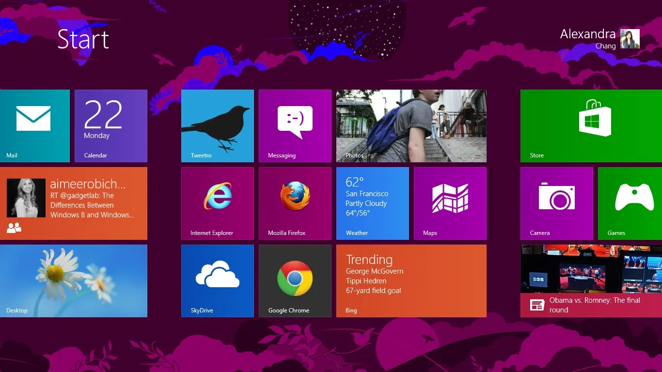
Microsoft’s Windows 8 is the textbook case of what happens when a redesign breaks a mental model without a bridge back to it. In 2012, Microsoft removed the long standing Start button entirely, replacing it with a full screen, tile based interface built for touch. Even experienced Window users struggled to even find their applications on the new desktop: a seventeen year old mental model, gone overnight, with nothing to replace it. The backlash was severe enough that Microsoft reinstated a start button within a year in Windows 8.1. The lesson isn’t that redesigns are risky; it’s that a redesign that ignores the mental model users already carry into your product is a UX decision as much as a visual one, and needs to be planned like one.
The Product Has Outgrown Its Original Shape
Perhaps the interfaces that were successful a few years ago no longer work now. But why? Products that succeed inevitably add capability, and every addition makes small compromises against the original information architecture. Over time those compromises accumulate into a weaker UI, where menus deepen, settings multiply, and features that once had an obvious home now live in awkward, tacked-on corners that even a single user type struggles to navigate, let alone two.
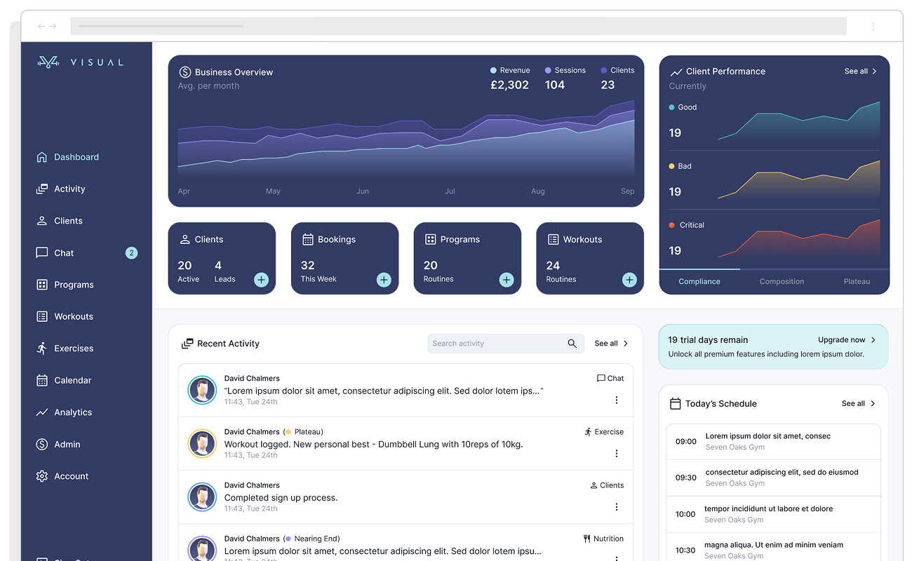
Visual’s Training App is a fitness product that has undergone a new approach for its business model. Its original HIIT and Gym workout app was built around one user tracking their own fitness. When the team set out to serve the personal trainer market too, that shape stopped fitting: trainers needed desktop analytics for managing multiple clients, while their clients still needed effortless mobile logging, two very different jobs for one interface to do. Rather than bolt a second audience onto the existing layout, the team ran a full UI redesign, restructuring the dashboard around daily tasks and moving the product’s 3D avatar from an underused extra to the centerpiece both user types now interact with first.
The Market and Platform Have Moved
Design conventions shift, and users absorb those shifts from the products they use daily even when they can’t articulate why. An interface that felt current five years ago can become a weak UI almost overnight once the platforms people spend most of their time in reset expectations, and operating system updates force the issue directly.
Note: shifts in the wider market shouldn’t automatically be treated as a signal to change your design, but they’re always worth watching.
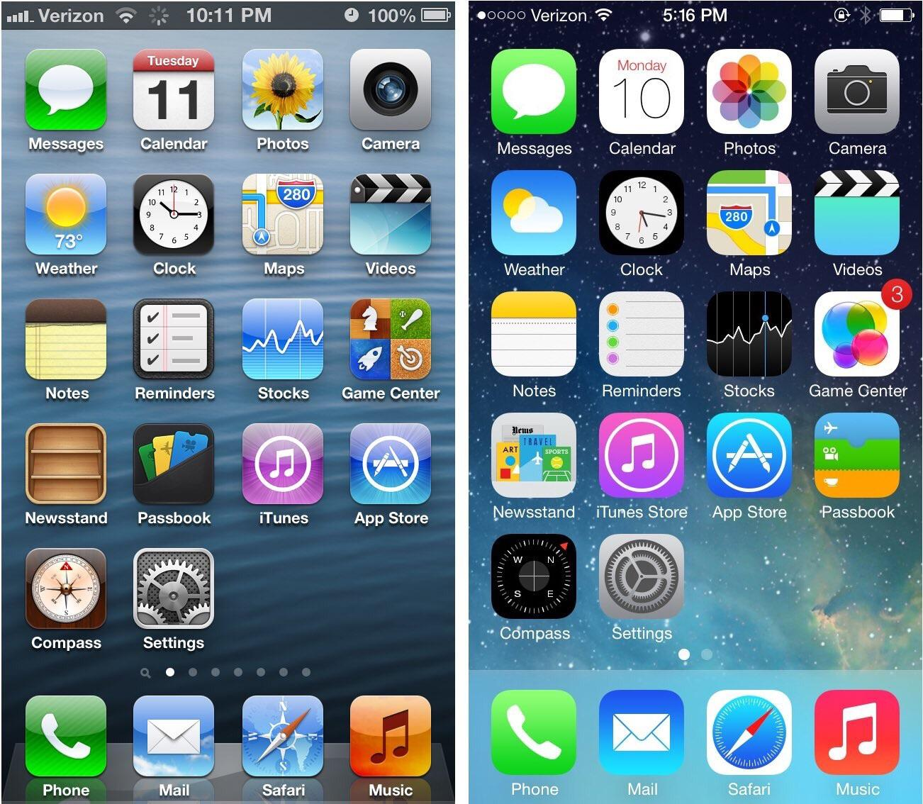
When Apple launched iOS 7 back in 2013, we wrote about the fall of skeuomorphic design, and how years of textured buttons and faux leather stitching, were being replaced with with a flat, typography led aesthetic. Established apps that didn’t follow suit within a year or two, including major names like Facebook and eBay, began to look visibly dated against the new system conventions, prompting swift UI redesigns across the App Store. Platform level shifts reset user expectations almost overnight, and products that ignore them accumulate a stale, weak UI that no amount of feature work will fix.
Your Customer Acquisition Cost Is Quietly Rising
I’ll admit that this particular signal is a bit misleading, an increase in customer acquisition costs (CAC) with little in return can be attributed to a number of UI related issues.
- Onboarding that front loads friction. Every extra field or unexplained step between signup and first value is a chance for someone you already paid to acquire to leave before they’ve experienced the product at all.
- A checkout that doesn’t help. No guest option, no visible delivery choices, no idea how many steps are involved, requires people higher cognitive costs, no clarity on cost until the final screen: friction introduced at the exact moment intent is highest. The Baymard Institute, which has spent over a decade studying checkout usability, found that 18% of US online shoppers have abandoned an order specifically because the checkout process was too long or complicated, and that the average large ecommerce site could see a 35% increase in conversion rate through checkout usability fixes alone.
- Content that doesn’t do the explaining. A pricing page, feature list, or product description that assumes context the visitor doesn’t have yet forces them to work for information marketing already promised them, and that work is often where they quietly bounce.
A weak UI can fail to convert the attention that spend is already buying, since traditional CAC formulas only capture campaign and sales overhead, not what happens after someone arrives.

A major online retailer couldn’t understand why so many carts were being abandoned at checkout, right after the point where marketing had already done its job and paid for the visit. The culprit turned out to be a single screen: new customers were forced to register an account before they could buy anything, and usability testing showed first time shoppers experienced that step as a wall, not a convenience. The team replaced the “Register” button with “Continue,” making an account optional rather than mandatory. Purchases rose 45%, adding $15 million in the first month and $300 million over the following year, all from a interface decision made downstream of every pound already spent on acquisition.
Conclusion
It’s worth resisting the instinct to redesign everything at once, the organisations that get the most value tend to scope the work around the specific weak UI they’ve identified, rather than pursuing a wholesale overhaul that risks disrupting flows that were never actually broken. Ultimately, the right time for a UI redesign isn’t a fixed interval on a roadmap; it’s the point at which the evidence, behavioural structural, competitive, or commercial, makes clear that a weak UI has become the ceiling on your product’s growth rather than the foundation for it.
Treat the signals above as a diagnostic, not a checklist to work through in order: a single strong signal, backed by data, is a better reason to redesign than three vague hunches combined. And once you’ve made the case, scope the fix to the evidence you actually have; a redesign that solves the specific problem you diagnosed will earn more trust internally, and deliver more value externally, than one that tries to fix everything at once.
Frequently asked questions
What’s the difference between a UI redesign and a UX redesign?
A UI redesign changes how a product looks: colour, layout, typography, iconography. A UX redesign changes how a product works: the flow someone follows to complete a task. In practice the two are rarely separable: most UI redesigns worth doing are UX decisions expressed visually, which is why the signals in this piece focus on behaviour and outcomes rather than aesthetics alone.
How do I know if I need a full UI redesign or just incremental fixes?
Look for a pattern across multiple signals rather than a single metric. If the problems are isolated to one flow, incremental changes are usually lower risk and just as effective. A full UI redesign is worth the disruption when the underlying information architecture itself can no longer support the product, when isolated fixes have stopped moving the numbers.
How long does a UI redesign typically take?
It depends heavily on scope. A single flow redesign (an onboarding sequence, a checkout) can often be scoped and shipped in weeks. A full UI/UX redesign spanning an entire product, with new user research, IA, and design system work, more commonly runs several months.
What’s the first step in deciding whether to commit to a UI redesign?
Gather the evidence before committing to a solution: conversion data, support ticket themes, A/B test history, and direct user research. A UI redesign scoped around solid evidence is dramatically more likely to succeed than one driven by a hunch that the product “looks old.”
Photo by Melanie Deziel on Unsplash ❤️