CSS Container Queries: Revolutionising Responsive Web Design

In the ever-evolving landscape of web development, staying abreast of the latest and most efficient coding practices is paramount, we discussed how responsive web design has evolved in our 2019 article ‘Should we still be selling Responsive Web Design‘.
Now among the plethora of CSS advancements, one topic back in 2021 ignited the interest of developers worldwide: CSS Container Queries. At the time, Robin Rendle at CSS Tricks wrote a nice introduction titled ‘Say Hello To CSS Container Queries‘. This innovative feature transformed how we approached responsive design, promising a level of flexibility and precision previously unattainable with traditional methods.
The dawn of a new era?
Historically, responsive web design has hinged on media queries that respond to changes in the viewport size, while media queries are of course effective, this approach has its limitations, particularly when dealing with complex components and layouts that require more nuanced adaptability. Whilst CSS Container Queries allowed developers to style elements based on the size of their parent container rather than the viewport, not necessarily a new era, but it made everything a touch more succinct.
Understanding container queries
The introduction of container queries marked a significant shift from the viewport-centric design philosophy. By focusing on the container, developers can create truly modular components that maintain their design integrity regardless of where they are placed on the page. This level of component-based design was of course a significant gain, especially in the era of web components and design systems. The Mozilla Developer Network (MDN) provides an authoritative overview of Container Queries, including syntax, use cases, and browser support information.
How do container queries work?
At its core, Container Queries leverage the @container rule, which applies styles based on the conditions met by a container’s size. For instance, a card component could be styled to display its content in a single-column layout when in a narrow container but switch to a multi-column layout in a wider container.
For a simple explanation, below is an example code snippet demonstrating how to use a CSS container query, as you can see it’s pretty simple. This example will show how you might style a component differently based on the width of its container. The goal is to create a card component that adapts its layout based on the container’s size. For this example, let’s assume we want our card to display its content in a single column when the container is less than 500px wide and switch to a two-column layout when the container is wider.
First, we define the container in our HTML:
<div class="container">
  <div class="card">
    <img src="image.jpg" alt="An interesting image">
    <div class="content">
      <h2>Title of the Card</h2>
      <p>This is some description text that goes inside the card. It's more detailed when the card is wider.</p>
    </div>
  </div>
</div>
Next, we apply CSS for the card, including the container query:
.container {
  /* Define the container as a container query container */
  container-type: inline-size;
}

.card {
  /* Initial single column layout */
  display: block;
}

.card img {
  max-width: 100%;
  height: auto;
}

.card .content {
  padding: 1rem;
}

@container (min-width: 500px) {
  .card {
    /* Two-column layout for wider containers */
    display: grid;
    grid-template-columns: 1fr 2fr;
    gap: 1rem;
  }

  .card img {
    /* Adjustments for the image in a two-column layout */
    max-width: none;
    width: 100%; /* Adjust to fill the column */
  }
}
In this example, the .container class is designated as a container query container by setting container-type: inline-size;. This tells the browser that styles inside container queries should be applied based on the inline size (typically width) of elements with this class.
The @container rule checks if the .container is at least 500px wide. If so, it changes the .card layout to a two-column grid layout. The image and text content inside the .card are automatically arranged into these columns, demonstrating a responsive design that adapts to the container’s size rather than the viewport size.
This approach allows for more modular and reusable component styles, making it easier to maintain a consistent look and feel across different parts of a web application, regardless of the surrounding layout.
For an in-depth look, the Mozilla Developer Network (MDN) provides a comprehensive overview of Container Queries which includes syntax, use cases, and browser support information should you need it.
The impact on responsive web design
In the real world, the introduction of container queries is more than just a technical update; it represents a paradigm shift in responsive design.
Ultimately responsive web design (RWD) is centered around ensuring that web pages function well on a variety of devices and window or screen sizes. Typically, it relies heavily on media queries that apply styles based on the viewport size. Here are a few ways it’s reshaped the landscape since it became popular back in 2021:
- Enhanced Modularity: Components can now be designed in isolation, with their responsiveness encapsulated within. This leads to more reusable and scalable codebases.
- Simplified Layouts: The complexity of managing responsive designs across various viewports is significantly reduced, as the focus shifts to the container level.
- Improved Performance: By reducing the reliance on JavaScript for layout adjustments and minimizing the need for media query overrides, Container Queries can lead to more efficient and faster-loading web pages.
Of course, when integrating the concept of responsive web design with container queries, like in the example provided below, you gain the ability to create components that are not only responsive to the viewport but also adaptable to their container’s size. This dual approach enhances the adaptability and reusability of components across different contexts within the same webpage.
To illustrate how responsive web design might affect and work alongside the container query example, let’s extend the previous code to include viewport-based media queries. This will ensure our web page content is responsive not only to its container size but also to the overall viewport size, providing a more comprehensive responsive design.
Extending the Example with Viewport-Based Media Queries
We’ll add some media queries to adjust the overall layout and font sizes based on the viewport size, complementing our container query setup:
/* Base styles */
body {
  font-family: 'Arial', sans-serif;
  margin: 0;
  padding: 1rem;
}

.container {
  container-type: inline-size;
}

.card {
  display: block;
}

.card img {
  max-width: 100%;
  height: auto;
}

.card .content {
  padding: 1rem;
}

@container (min-width: 500px) {
  .card {
    display: grid;
    grid-template-columns: 1fr 2fr;
    gap: 1rem;
  }

  .card img {
    max-width: none;
    width: 100%;
  }
}

/* Responsive Web Design adjustments */
@media (max-width: 600px) {
  body {
    font-size: 14px;
  }

  .card .content {
    padding: 0.5rem;
  }
}

@media (min-width: 601px) and (max-width: 1200px) {
  body {
    font-size: 16px;
  }
}

@media (min-width: 1201px) {
  body {
    font-size: 18px;
  }

  .container {
    max-width: 800px;
    margin: 0 auto; /* Centering the container */
  }
}
In this extended example, we’ve added viewport-based media queries that adjust the body font size and the .card .content padding based on the viewport width. This ensures that the text is readable and the content is comfortably spaced on devices of all sizes, from small mobile phones to large desktop monitors.
The combination of container queries and viewport-based media queries allows for a highly flexible and responsive design. The container queries focus on the component’s responsiveness within its immediate context (the container), while the viewport-based media queries handle global page layout and typography adjustments based on the overall window size.
This dual approach leverages the strengths of both methods, providing fine-grained control over component layouts in different contexts and ensuring the page is optimized for readability and usability across all devices.
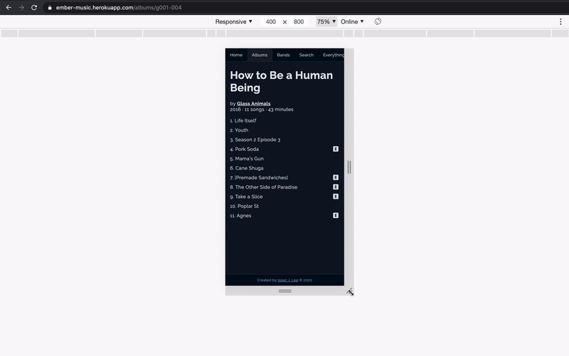
As a final note on this, Isaac Lee created a series of examples highlighting responsive container queries using Percy.io for visual regression testing. It serves as a good example of use with basic data. You can check out his Ember Container Query page, or check Isaac’s Github repo for reference and documentation.
The challenges and the considerations
Despite their potential, container queries introduce new considerations for developers, especially when it comes to implementation:
- Browser Support: As with any new technology, browser support is gradual. Developers must consider fallbacks for unsupported environments.
- Learning Curve: Adopting a container-centric approach requires a shift in mindset and potentially rethinking existing design patterns.
- Performance Implications: While Container Queries can improve performance, misuse or overuse can lead to complexity and unintended consequences.
Looking ahead
As the web continues to evolve, so too do the tools at our disposal. CSS Container Queries are just the beginning of a new chapter in responsive design, offering a glimpse into a future where designs are more adaptable, efficient, and user-centric than ever before. The journey of exploring and mastering Container Queries will undoubtedly be filled with learning opportunities and creative challenges, but the potential rewards for developers and users alike are immense.
Thanks to Pankaj Patel on Unsplash for the header photo ❤️