User experience design basics, and how to get them right
The user experience design basics are perhaps second nature to teams who work in the web industry, but to the general public, many of our clients and graduates looking to enter the web industry they’re perhaps somewhat of a mystery. User experience design is sympathetic to all parts of the design process and aims to enhance user satisfaction by improving the usability, accessibility, and simplicity of the interaction between the user and the product.
“Design is not just what it looks like and feels like. Design is how it works” – said the late and great Steve Jobs.
Indeed, both the way a product looks and the way it works have to align in order for a product to truly fulfil its objectives – for example, the aesthetics serve just as an important purpose as the performance. So to cast light on the subject and our approach here at Browser I’ve listed my thoughts on the basics of user experience design and how to get it right.
Address the ‘user objectives’ first
Allowing users to fulfil their objectives as quickly as possible should always be at the forefront of our minds. Fulfilling user objectives will result in a product that will quickly gain traction, have high user retention and allow the product to grow organically. This can be addressed by minimising excess noise and focusing on allowing users to fulfil their primary objective and engage with the core functionality as soon as possible and without interruption.
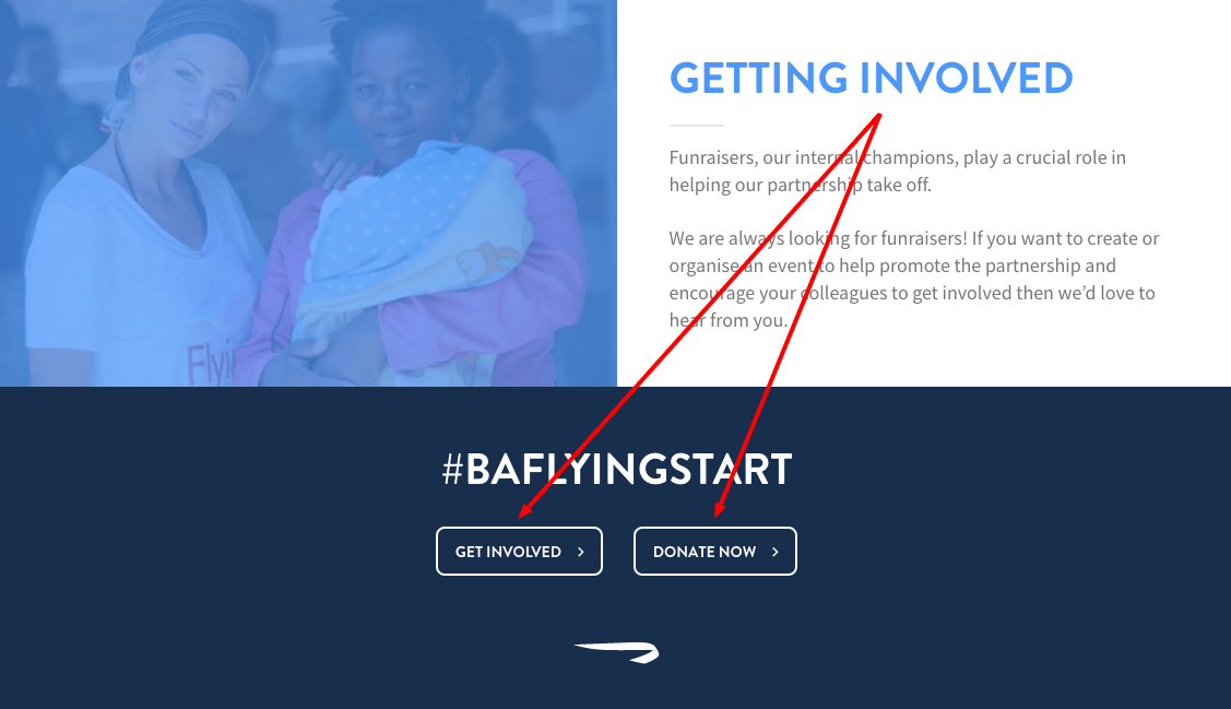
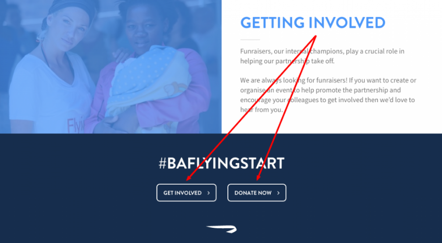
Our work for British Airways ‘Flying Start’ campaign is a great example of getting the user experience design basics right. The page has a clear set of easily accessible call to action buttons that address key user objectives, allowing users to engage quickly and with ease.
Encourage interaction
Encouraging interaction by highlighting and prioritising valuable content and functionality will help promote a good user experience. Firstly try focusing on visual consistency and ensuring users can quickly familiarise themselves with the product without the need for assistance.
Secondly, clearly structured signposting and navigation will help users explore and fulfil objectives. Thirdly and most importantly, highlighting useful relationships between content and functionality will result in an experience that will not only fulfil user objectives but hopefully exceed their expectations too.
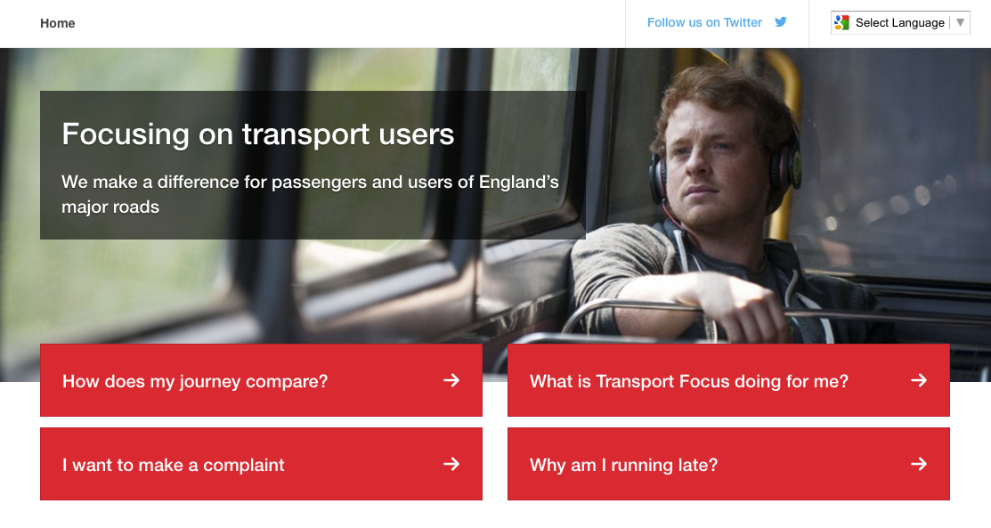
When designing the new Transport Focus website, our research and analytics indicated that the majority of visitors were looking for one of four main areas. Thus, when designing the site, we made those four areas very easy to find (as shown above). Clear signposting and linking useful relationships between the content and functionality has helped to vastly improve interaction and engagement with the product.
The right tone of voice
The tone of voice should be empathetic to your product market, generally speaking, communication should be colloquial rather than authoritative. I encourage the use of everyday terms and simplifying the language used as suggested by the Government Digital Services Plain English guidelines. Experience has shown that using the right tone of voice helps to alleviate any apprehension or mistrust that users have about a new product. The three factors to always remember are:
- Use simple words and phrases
- Avoid industry buzzwords and unfamiliar terminology
- Be clear and concise, keep it simple
A consistent visual language
Retaining consistency through design allows users to familiarise themselves helping to promote a good user experience. Visual language that is inconsistent will cause confusion. Market research can help with providing insights into this, but factors such as the subtle use of colour, shapes and negative space (the micro-elements) can help define the way a user navigates through a product which encourages users to participate, share content and most importantly leave users wanting to return.
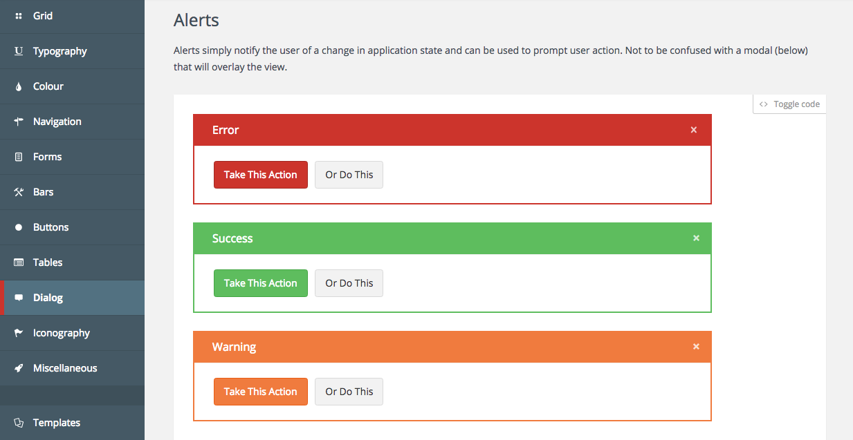
Style guides and pattern libraries are essential to ensuring consistency. The NetLab pattern library we created for telecoms company NetCall was an extensive web guideline resource for the organisation to build their suite of digital tools and applications.
Clear signposting and prioritisation of content
Clear and concise signposting will assist usability and avoid misinterpretation. Prioritising content, using semantics and ensuring you’re using the right tone of voice will also help users quickly get to the content they want and avoid frustration. Efficient page structure and good SEO means that users who search for specific information (via search engines) will reach content that is relevant to their search.
To improve the user experience further I also suggest signposting and prioritising the content layout based on a mobile-first approach. This means organising the page content in a hierarchical order of importance to the user. An example of this is positioning primary content (e.g. an article) at the top of a page with secondary content (e.g. related articles) below on a mobile device – allowing the user to access the content they wish to view as quickly as possible and without interruption. There are three factors that I believe will help assist with this:
- Page structure should be uncluttered and valuable content prioritised
- Navigation and call to actions (CTA’s) should be clearly worded and easy to find
- It should be immediately obvious to users how to access the content they are looking for