How to Design Data Platforms That Serve Both Beginners and Power Users

Picture this… you and your organisation have put in tremendous effort in to delivering a new-to-market business-ready platform along with a UX focused dashboard. We’re talking about some painstakingly pixel pushing here. And the result is a dashboard experince that would make Michelangelo weep tears (of joy).
Not only is the user interface beautiful but the user experience is flawless… for the majority of your users that is. See, the achilles heel for your new dashboard (and therefore an achilles heel for your organisation’s growth if not survival) is that the dashboard only taps into perhaps one type of your potential user. Designing and building data platforms that handle complex datasets, you may face a common challenge: your audience spans from curious newcomers to expert researchers, each with completely different needs and experience levels.
Get this wrong, and you’ll either frustrate beginners with overwhelming complexity or limit experts with oversimplified tools – balancing this is no easy task. Here’s how to design something that successfully serves both.
Understanding your user spectrum
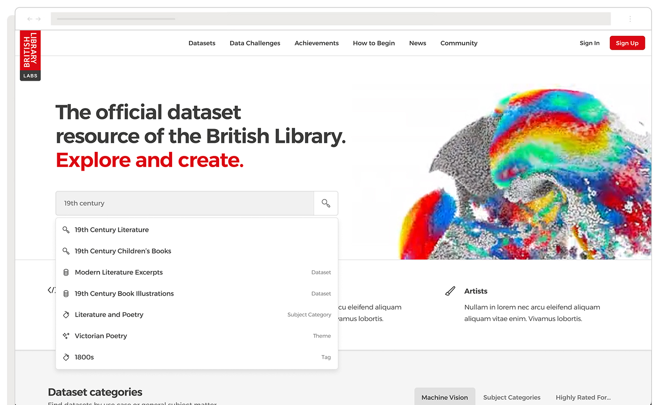
The British Library faced this exact challenge when redesigning their digital research platform. Their collection houses centuries of historical materials, but their audience ranged from casual visitors tracing family history, teachers putting together materials for better lessons plans, to computational researchers running advanced data analysis. A genealogy enthusiast browsing old census records approaches the platform with a visual, exploratory mindset. One set of users expects a more clearly marked path whilst another set of users is looking for the destination, not the journey, as quickly as possible.
The mistake most platforms make is designing for the middle ground. This satisfies no one. Instead, you need to embrace these differences and design for them deliberately.
User research that reveals true behaviour
Design divorced from research is an invitation to waste everyone’s time and a lot of money. So start with user research to uncover behaviour, not to validate assumptions. Here’s where things get tricky and it’s important to be crystal clear about this now: designing for your different types of users isn’t the same thing as designing for “everyone.” Dashboard products must reflect user capabilities and behaviour patterns.

During our work with British Library Labs, we learnt that experienced researchers had developed sophisticated mental shortcuts, heuristics built over years of working with complex archival systems compared to new users, however, struggled with these same interfaces. They needed clear signposting, familiar navigation patterns, and visual cues that matched their experience with modern digital products. What worked for experts actively hindered beginners. Turns out you can’t just slap a “for dummies” sticker on a power tool and call it beginner-friendly. Who knew?
The entry level – simplified discovery for new users
For first-time users or casual explorers, design clear entry points that don’t require prior knowledge. Visual navigation patterns should feel familiar from consumer platforms users already know, whilst guided pathways suggest logical next steps. Reduce cognitive load by initially hiding advanced options, and provide examples and templates that demonstrate what’s possible. The British Library’s homepage exemplified this approach with clean, simple design and video elements that immediately communicated what users could achieve without requiring technical expertise.
The advanced level – powerful tools for expert users
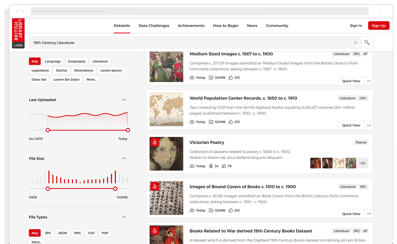
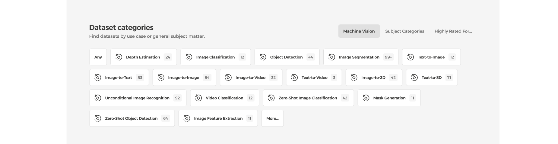
As users become more invested in their research, progressively reveal more sophisticated capabilities. Detailed metadata controls enable precise filtering, whilst bulk download options support dataset extraction. Advanced search operators allow complex queries, and export functionality supports external analysis workflows. Have features emerge naturally as users demonstrate readiness, this prevents overwhelming beginners.
Progressive disclosure creates a natural evolution path. Even amongst serious researchers, people work in two fundamentally different modes: some pursue visual, discovery-based journeys whilst others want direct access to structured datasets. Your platform must accommodate both exploration and extraction, allowing users to fluidly switch between these modes as their research demands change.
Implementation – building progressive user pathways
Our strategy for the British Library centred on progressive pathways, but this north star guided two key interconnected design decisions that made the dual-track experience possible.
We mapped detailed user journeys for each segment, the genealogist, the academic researcher, the computational analyst, identifying friction points where their mental models diverged. This information architecture work revealed critical insight: end goals differed dramatically, yet many wayfinding patterns overlapped early on. We built unified navigation for shared touchpoints and branching patterns where needs diverged. The taxonomy allowed materials to surface through exploratory browsing or precise querying, serving both discovery-driven and goal-oriented behaviours.
Flexible filtering served both behaviour types effectively. We designed a search interface with progressive disclosure at its core. The initial state presented a single search field, reducing the barrier to entry. Beneath this simplicity lived a sophisticated query builder that revealed itself through user interaction. As researchers added filters, the interface expanded to show metadata facets, Boolean operators, and date range controls. This adaptive UI revealed advanced options only when users demonstrated readiness. Power users could bypass the stepped approach entirely through keyboard shortcuts and direct URL parameters.
The outcome – adaptive platforms that scale with user needs
The British Library’s progressive funnel approach successfully served radically different user groups within a single platform. It also created a foundation that could evolve with user needs and emerging technologies.
This approach puts adaptation on the platform. The system meets each type of user where they are and grows with them. IF the research reveals a spectrum of users, endeavor to serve that entire spectrum.
The key is recognising that serving everyone well means designing systems intelligent enough to recognise who’s using them and adapt accordingly. (Spoiler alert: the “average user” is about as real as a unicorn riding a hoverboard.)