Science Based Targets initiative – SBTi
A self-service carbon emissions data dashboard built around clarity, not complexity

The Science Based Targets initiative (SBTi) is a global corporate climate action organisation that enables companies and financial institutions such as AstraZeneca, Salesforce, Sony, and Kingspan to play their part in combating the climate crisis.
SBTi’s potential clients had a problem. At a surface level, many organisations simply lacked clarity around their emissions reduction obligations, how their existing data aligned with climate targets, and what the next step looked like internally. Our challenge was to help SBTi remove that uncertainty through a self-service dashboard product that allowed companies to explore and compare their position against sector-specific climate targets.
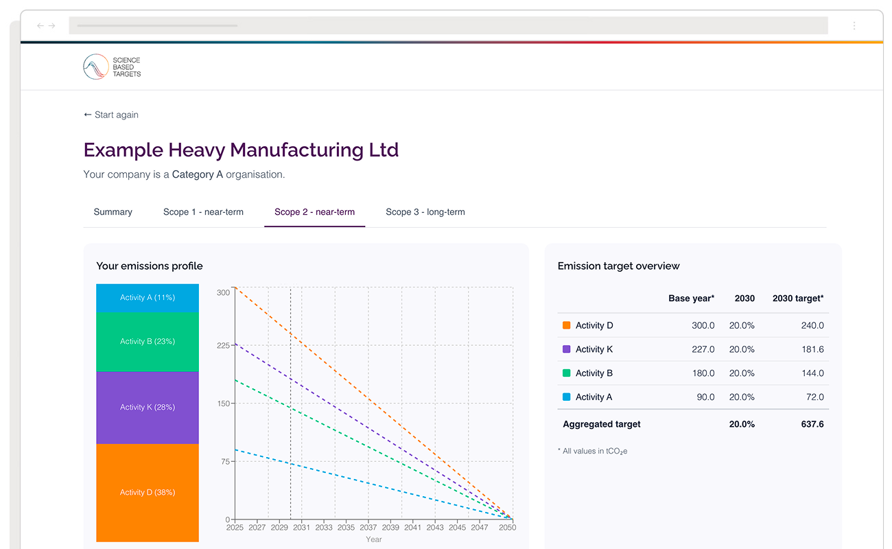
The result was a data-led dashboard that combines industry-specific measurement, future emissions pathways, and climate target modelling to give organisations an honest picture of where they stand against science-based climate commitments, and what actions come next.
The data exists. The clarity doesn’t.
SBTi’s Target Dashboard tracks more than 13,000 companies with validated targets or formal commitments. Thousands more already hold Scope 1, 2, and 3 emissions data without knowing how it positions them relative to 1.5 degree climate pathways, sector-specific requirements, or their peers.
Through discovery we uncovered that most sustainability teams are not resistant to formal commitments. They are uncertain about whether their data is ready, what the process involves internally, and how aligned they are with SBTi criteria. One of the key goals of the dashboard was to remove that uncertainty in under 30 minutes.
The delivery process
The process was deliberately lean and sequential, with each phase producing something testable before the next began. That approach allowed the dashboard to move from concept to its first production deployment in under two weeks.
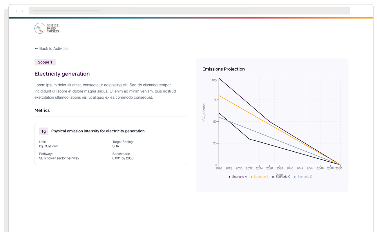
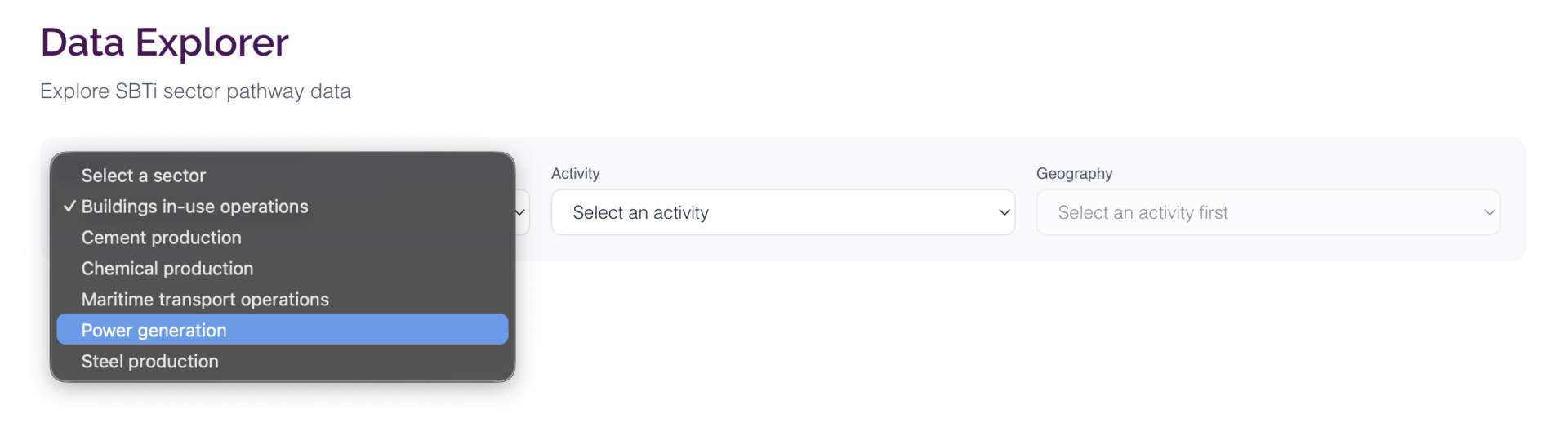
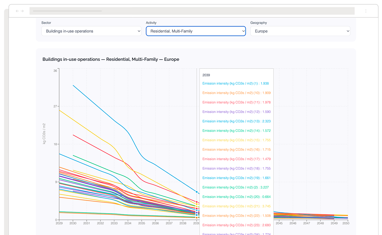
The initial step focused on familiarisation with the underlying data, schema, and SBTi’s methodology for presenting sector-specific emissions criteria. Each sector contained its own variables and emissions pathways, allowing users to tailor inputs to their organisation and explore how outcomes changed over time in the lead up to 2050.
- Step 1. Figma design sprint, days 1 to 3
UX strategy, wireframing, and journey mapping to ensure stakeholders were aligned from the outset. SBTi’s existing design language was applied directly into the UI direction, with daily stakeholder reviews throughout our design sprint stage rather than after development.
- Step 2. Database schema, days 2 to 4
The schema was structured to mirror SBTi’s data dictionary and sector logic. Emissions reduction rules were codified into queryable logic before the front end touched the data layer.
- Step 3. React build, days 4 to 9
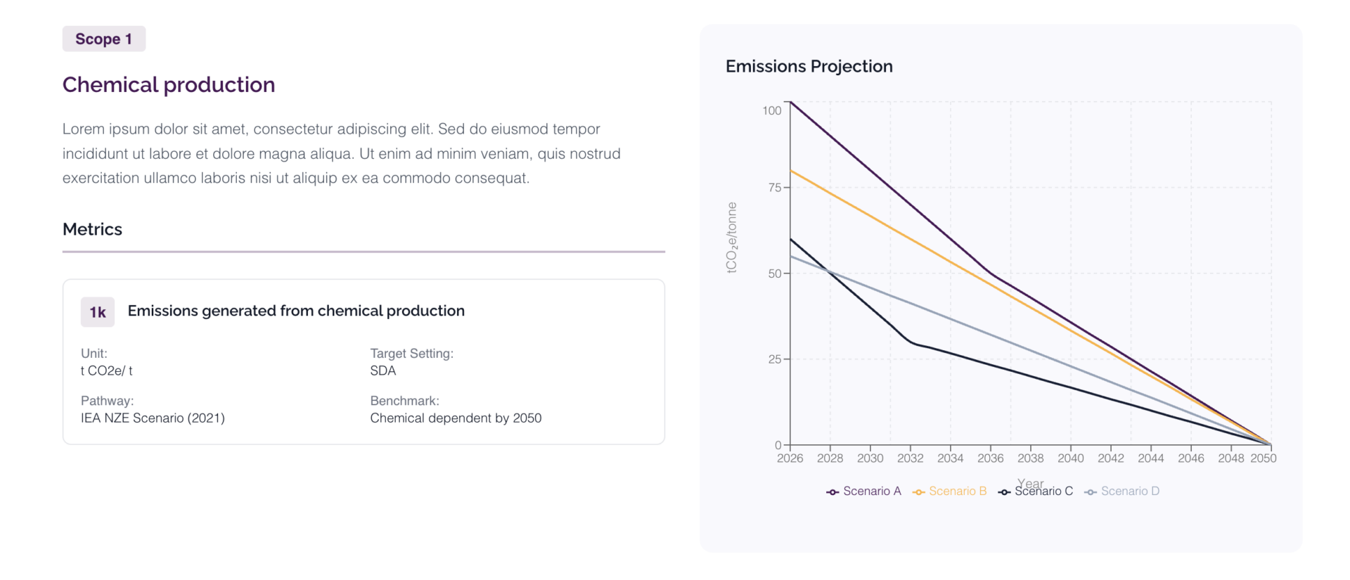
The approved Figma UI designs were translated directly into React tokens and components. As users adjusted variables, the dashboard recalculated emissions pathways and updated visualisations in real time.
- Step 4. API integration, days 7 to 11
The front end was connected to the logic layer, with SBTi’s sector-specific criteria applied server-side. Structured outputs drove all dashboard rendering and scenario calculations.
- Step 5. QA and deploy, days 10 to 13
Outputs were validated against publicly available SBTi company data as a ground truth reference. Once approved, the application could deployed directly into SBTi’s existing website.
Our approach was product-first, meaning stakeholders reviewed a functioning product rather than a specification document or static prototype. Once the data and logic were validated, deployment followed immediately.
From one dashboard to a suite of experiences
Delivering the first dashboard was the starting point, not the finish line. Following launch, we continued developing variations of the product to support different types of users and different stages of decision-making.
The second variation introduced a guided decision tree, a structured question-and-answer flow that helped users identify the emissions pathways and target examples most relevant to their organisation and sector. Testing showed this worked particularly well for users who were unsure where to begin.
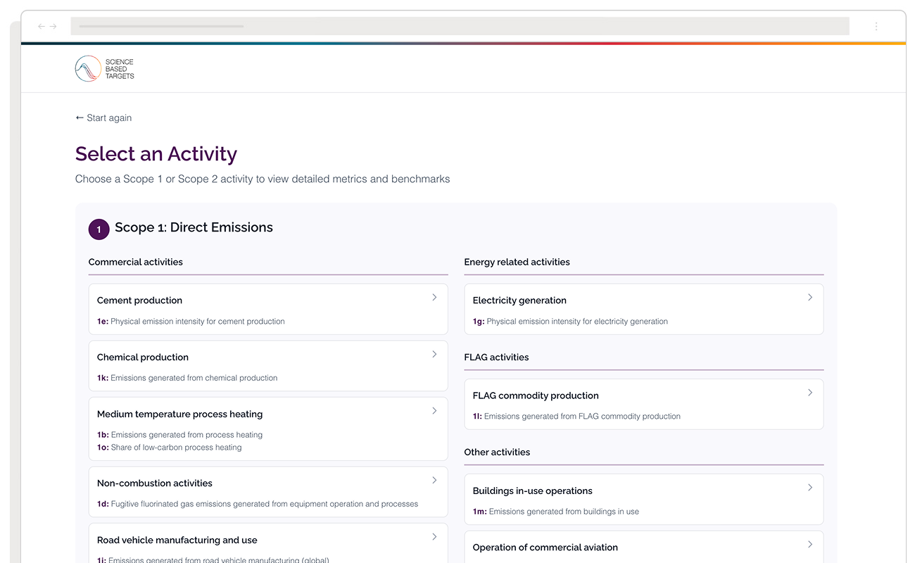
Alongside this, we built a third simpler interactive layer, a sector and business type selector that lets users orient themselves with just a couple of clicks, without needing to work through a full decision tree. Both variations sit alongside the original variable-input dashboard, giving users three distinct entry points into the same underlying data depending on how much they already know and how they prefer to explore.
Together, these three interaction modes, guided decision tree, sector selector, and variable-input dashboard, were packaged into a single tightly integrated ReactJS application, built to be embedded directly into SBTi’s own systems and published on their website without friction.
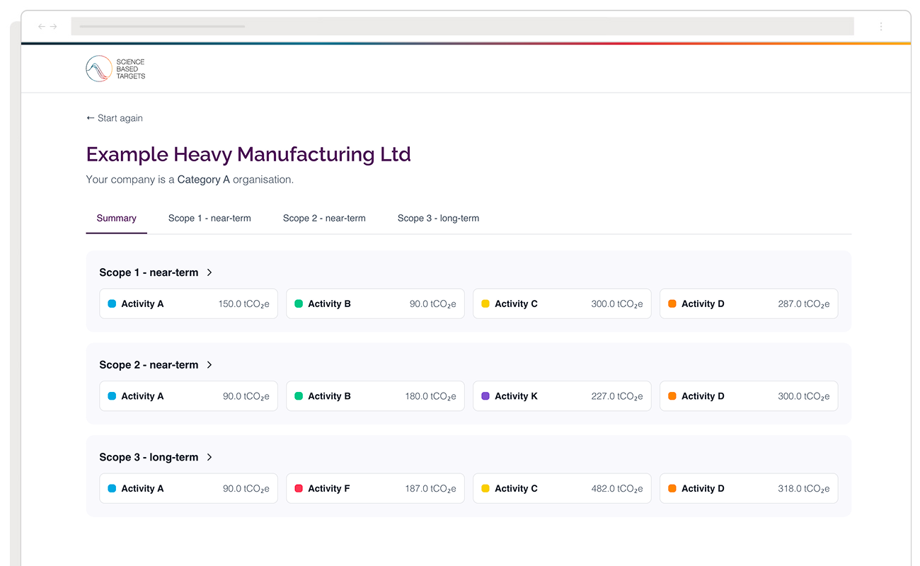
Design and data sharing
The dashboard became the first step for companies beginning their emissions reduction journey, allowing them to arrive at SBTi’s validation process already understanding what they were committing to and why their emissions data supported it. The data entered into the dashboard also created a natural starting point for structured follow-up conversations, with no cold outreach required.
Our rapid delivery model allowed SBTi to observe and record real usage patterns for research purposes, while also giving SBTi the ability to iterate on the UX and data visualisation before committing to deeper integrations.
Most corporate sustainability teams are not resistant to climate commitments, quite the opposite. They are uncertain about whether their emissions data is ready. The dashboard was designed to remove that uncertainty in under 30 minutes.
Built to be maintained without us
We also integrated the application with Supabase,, giving SBTi’s IT department direct access to update the underlying database and emissions standards on an ongoing basis.
As sector criteria evolve and new processes or materials are introduced, particularly in areas like manufacturing, the team can update logic and datasets themselves without needing to refer back to us. That independence was a deliberate design goal, not an afterthought.