Best Dashboard Designs Every Product Team Should Look at in 2026
Most roundups of “great dashboards” are really roundups of great screenshots, celebrating dark mode gradients and glowing KPI tiles while saying nothing useful about whether those dashboards help anyone make a better decision. This article defines what great dashboard design actually requires, highlighting five underappreciated product dashboards, measuring them against the criteria that define a good dashboard experience.
What Makes a Dashboard Great: Five Criteria
These aren’t abstract principles. They are testable questions you can ask of any dashboard you’re building or evaluating. Note that all five criteria are connected, designing well for one tends to lay the groundwork for the others. But maximising all five simultaneously is difficult and can arrest organisational momentum. A conscious trade off that doesn’t jeopardise the core UX and organisational health won’t be the end of your dashboard.
1. Does it answer one clearly defined question?
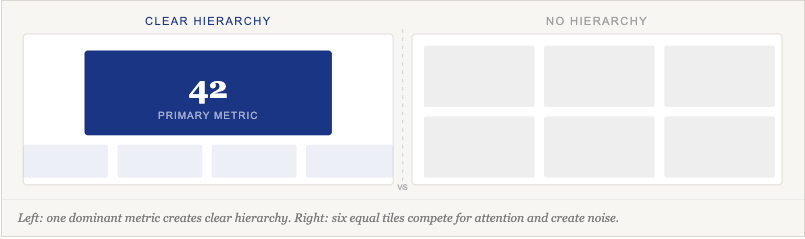
A dashboard should have a primary user and a primary job. One of the hardest skill in dashboard design is hierarchy, deciding what matters most and making that decision visible in the interface. If you can’t write one sentence describing who this dashboard is for and what question it answers, the design process hasn’t started yet.
2. Does it minimise cognitive load?
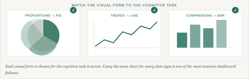
Information and insight are not the same thing. Cognitive load is reduced not just by showing less, but by choosing the right visual form for each type of data, so users don’t have to translate what they’re seeing before they can act. Understanding UX friction is key to knowing which complexity is a design failure and which is a genuine requirement of the task.
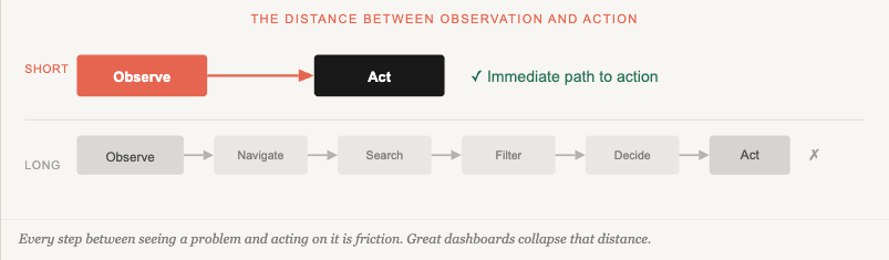
3. Does it enable action, not just observation?
Observation without a path to action is just a report with a nicer font. The closer the distance between seeing a problem and acting on it, the more useful the dashboard. Dashboards that do this well are closely related to improving customer acquisition and retention, users who know what to do next keep coming back.
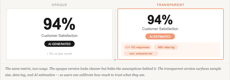
4. Is it honest about what the data can and can’t tell you?
Every dashboard makes implicit claims about its data — and most of them go unstated. Sample sizes, data freshness, collection methodology, estimated versus measured figures, and the scope of what is included or excluded all shape what a number actually means. Visualisation is only as trustworthy as the transparency of the data behind it: presenting a number without its context is a form of misrepresentation, even when unintentional. This obligation applies whether the figure comes from a live database, a rolled-up aggregate, a user survey, or an AI model. Building user trust in AI-powered dashboards raises the stakes further — but the underlying principle applies to any dashboard claiming to inform a decision.
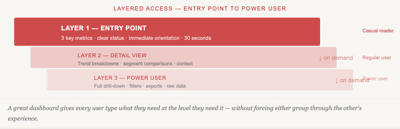
5. Does it offer appropriate depth without overwhelming the entry point?
Casual readers need a clear headline; power users need a path to drill down. Great dashboards serve both without making either wade through the other’s experience. This is deeply connected to understanding what job users are hiring your product to do in the first place.
This Text is for Spacing
Five Dashboards Worth Studying
1. Visualising fitness journey – Training App
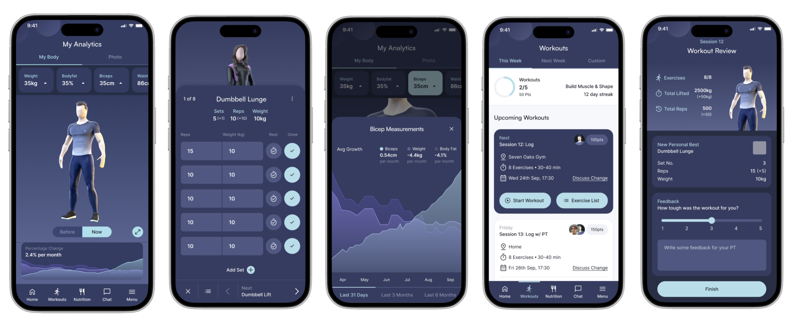
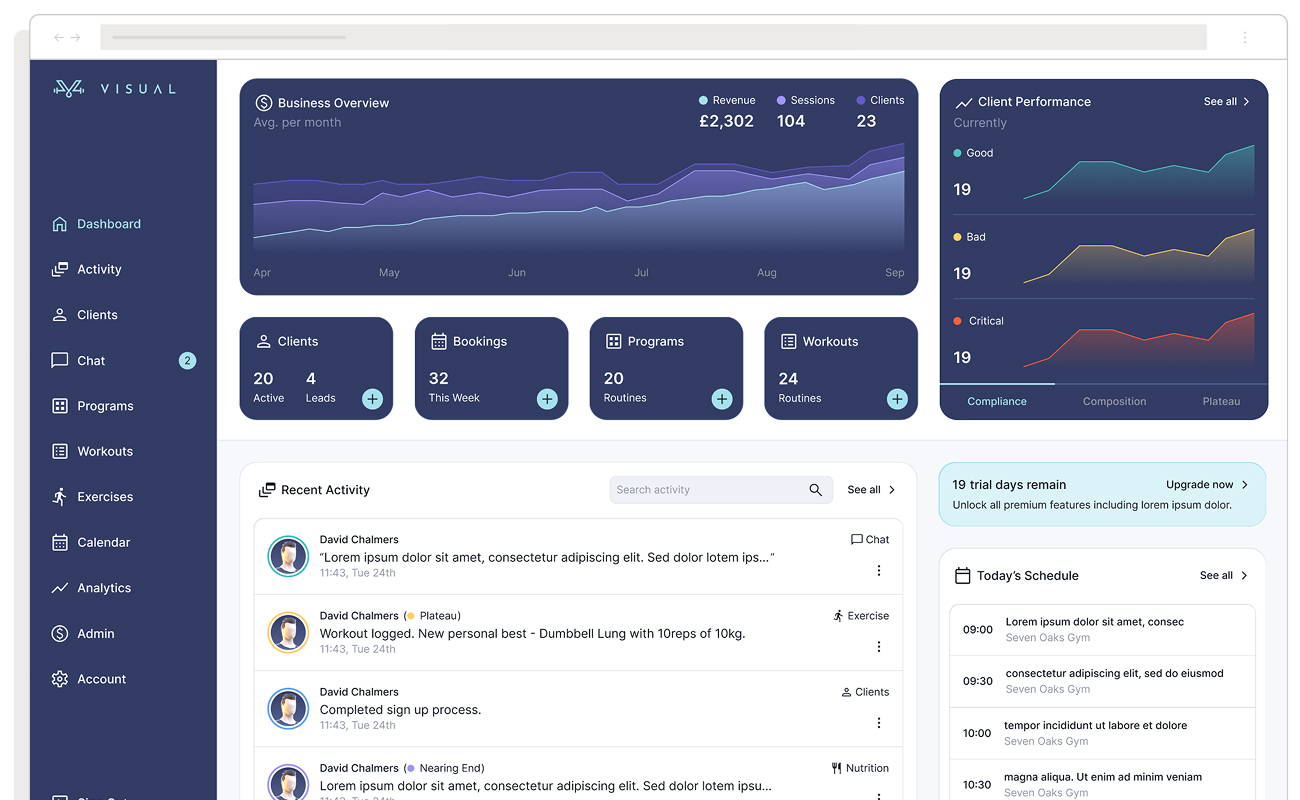
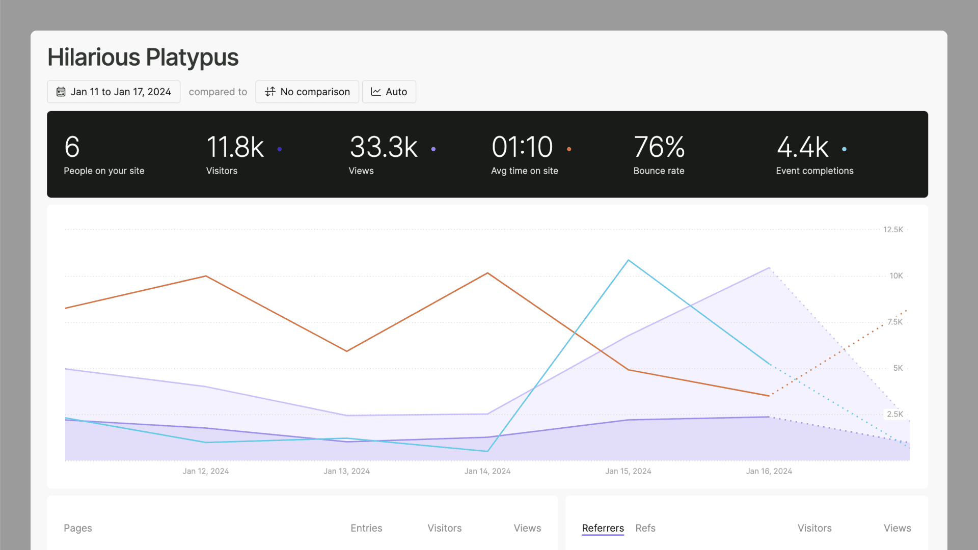
The Visual Training App is a fitness platform built for two distinct user types: personal trainers who need analytical tools to manage multiple clients and adapt programmes, and those clients who need a frictionless mobile-first experience centred on motivation and daily logging. The dashboard design challenge, designing for two separate but integrated experiences across web and mobile, makes it one of the more instructive examples of designing around distinct user needs in the same product.
The most significant design decision was moving the 3D avatar from an underutilised feature to the centrepiece of the client dashboard. On login, users see their avatar immediately, communicating body measurement progress through a before/after switch rather than text-heavy stat tables. For personal trainers, the web dashboard surfaces business development tools integrated with client management, using Jobs-to-be-Done research to separate what trainers need analytically from what clients need motivationally. Quick-log buttons for food and liquid sit directly on the client dashboard, so users can record a meal in seconds without navigating away from their primary task.
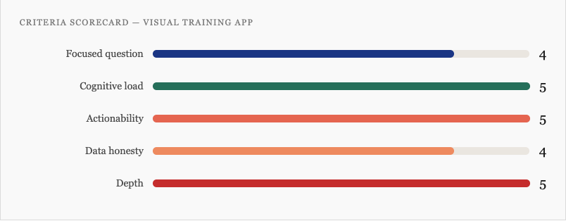
- Focused question: Sharp for both user types. Trainers ask “how are my clients performing?” Clients ask “how am I progressing today?” The web/mobile split keeps each question from compromising the other.
- Cognitive load: The avatar replaces text-heavy metrics with a visual body representation that communicates naturally. Positioning “next workout” at the top and quick-log buttons on the dashboard surface eliminates menu-diving friction entirely.
- Actionability: The client dashboard is built explicitly around reducing the distance between intention and action. Logging, scheduling, and workout execution are all reachable within one tap of the primary view.
- Data honesty: Progress data is measured (actual body measurements), not projected, so there’s no significant trust gap to manage. The avatar’s before/after switch communicates change clearly without inflating it.
- Depth: The trainer web app provides deep analytics for power users; the client mobile app keeps the entry point clean. Neither group has to navigate through the other’s experience. A research insight guided this: onboarding starts at a 90/10 trainer-to-client workload split, settling to 70/30 over time, this asymmetry is built directly into the dashboard’s information architecture.
Visual Training App Dashboard Scorecard
The lesson: The avatar-centric approach works powerfully for clients motivated by visible body changes, but early in a fitness journey, before results appear, the hero element risks feeling demotivating. The gamification layer (customisable avatar) partially compensates, but requires careful onboarding framing. More broadly: moving a product’s USP from a peripheral feature to the dashboard centrepiece lets both users quantify their efforts. It pays off when the feature genuinely earns attention every session.
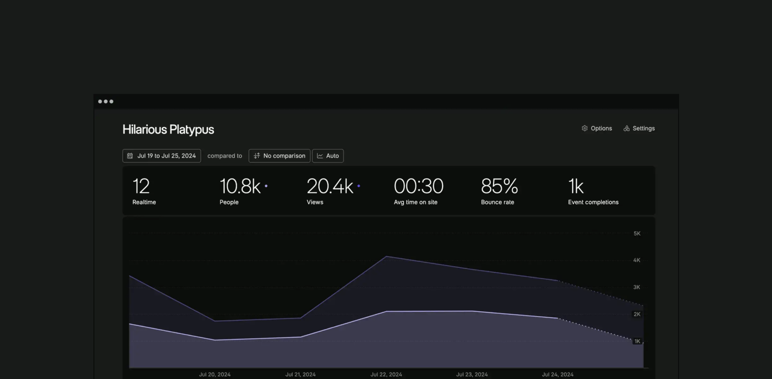
2. Fathom Analytics – Privacy-First Web Analytics
Fathom is a privacy-first analytics tool built by a tiny founding team as a deliberate rejection of Google Analytics’ complexity. The entire product is a single dashboard screen. There are no sub-menus, no custom report builder, no drill-down views, and no configuration required. It answers exactly one question, “what is happening on my site right now?”, and refuses to answer any other. In March 2026 Fathom rebuilt its entire analytics engine from scratch, with smarter query routing and pre-aggregated historical data so that “All Time” views load as fast as “Today.” That engineering decision is itself a dashboard design decision: the perception of data freshness is part of the user experience.
Fathom was built on the conviction that most analytics users need to answer a handful of simple questions quickly, and that every additional feature makes those simple answers harder to reach. That’s a harder product position to hold under competitive pressure than it sounds. Understanding what competitors offer and choosing not to match it is a legitimate design strategy, not a limitation.
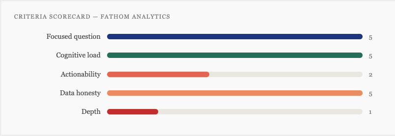
Focused question: Near-perfect. The dashboard answers “who is visiting my site, from where, and what are they doing?” for a single primary user, the website owner who wants insight in under 60 seconds.
Cognitive load: The single-screen constraint eliminates navigation overhead entirely. Users never have to decide where to go next, because there is nowhere else to go. Every metric visible is a metric worth seeing.
Actionability: The weakest criterion by design. Fathom shows what is happening but makes no suggestions about what to do. That’s an intentional trade-off but a real one.
Data honesty: Excellent by architecture. Cookieless, no sampling, no modelling, no AI-generated insights. What you see is a direct reflection of real traffic with no assumptions baked in.
Depth: Deliberately minimal. Power users who need funnel analysis, cohort breakdowns, or session replay will hit the ceiling quickly.
Fathom Analytics Dashboard Scorecard
The lesson: Fathom proves that the “focused question” criterion can be taken further than most product teams are willing to go. The single-screen constraint isn’t a feature gap, it’s the product philosophy made visible. Teams building analytics tools tend to add features under competitive pressure; Fathom shows what happens when you hold the line. The trade-off is real: users who outgrow simple traffic stats will leave. Knowing exactly who you are not building for is one of the sharpest design questions you can answer.
3. Linear Dashboards – Project Management Analytics
Linear launched its Dashboards feature in mid-2025 and did something unusual: they published a detailed best practices piece based on real usage data from their own customers, including the uncomfortable finding that the median workspace creates just two dashboards, and that adoption drops off sharply beyond that. They used their own internal dashboards as examples and named the failure modes directly: dashboards without owners go stale, configurability without purpose generates noise, and the number of dashboards created rarely reflects the number actually used.
The dashboards themselves reflect a sharp understanding of audience layering. Linear describes three distinct use cases explicitly: a glanceable operations dashboard for a data manager (short, focused, checked weekly), a team-meeting dashboard built around recurring discussion topics (granular, individual-level, wrong for execs), and a metric-comparison dashboard that pairs each KPI with this week, last week, and trailing highs and lows so that anyone, regardless of context, can immediately see whether a number is good, bad, or normal.
- Focused question: Handled at the platform level through strong defaults and explicit guidance on dashboard purpose, “decide which type you’re building before you start” is the first published principle. Individual dashboards are expected to answer one question.
- Cognitive load: The metric-paired-with-context approach (this week vs. last week vs. trailing range) is a smart cognitive load decision. It converts a number into a signal without requiring the user to remember historical context.
- Actionability: Dashboards can drill directly into the underlying issues and take action, assign work, update statuses, triage, without leaving the dashboard view. The distance between seeing a problem and resolving it is genuinely short.
- Data honesty: Operational data only, no AI predictions, no modelling. The published data on dashboard staleness is itself an act of honesty, the team is transparent about how the feature is actually used, not just how it’s intended to be used.
- Depth: The clearest strength. Linear’s published documentation explicitly articulates different views for managers, individual contributors, and executives, and builds the product to reflect that layering. The “drill into issues” capability means entry-point clarity doesn’t come at the cost of power-user access.
Linear Dashboard Scorecard
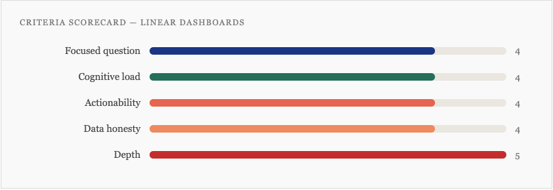
The lesson: The closer a dashboard gets to recommending specific actions, the more it depends on data quality and integration to deliver on that promise. In a well-integrated ATS, this approach is powerful. In a product where data comes from disconnected systems, the dashboard design can’t paper over the architecture. Underperforming UX often traces back to data architecture decisions made long before the design phase.
4. Oura App Redesign – Consumer Health Wearable
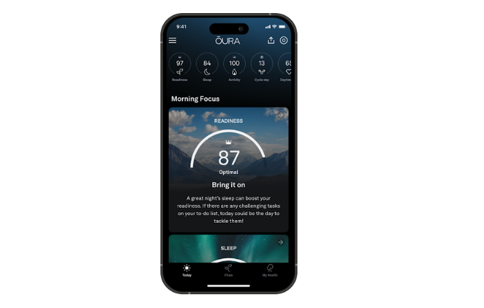
Oura’s November 2025 app redesign is worth studying for two specific decisions that most consumer health dashboards don’t make. The first is structural: rather than surfacing all health scores simultaneously, the redesigned Today tab leads with a single priority, described by the team as “one big thing, the most critical score or insight you need right now.” Every other metric is available, but it is not competing for attention. This is the focused question criterion applied at the daily session level, not just the product level.
The second decision concerns data interpretation. Most wearables benchmark your metrics against population averages. Oura’s Vitals tab instead anchors every metric to your own personal baseline, what is normal for you, not for a 35-year-old with similar demographics. This is a meaningful shift in data honesty: rather than comparing users to a population they may not resemble, the dashboard communicates change relative to your established pattern.
- Focused question: The “one big thing” decision is the clearest example in this article of a product team making an explicit hierarchy call at the session level. The three-tab structure (Today, Vitals, My Health) maps to three distinct questions across different time horizons.
- Cognitive load: The personal baseline approach removes a translation burden that most health dashboards impose, users no longer need to decide whether a metric is good or bad relative to an abstract population norm. The visual colour system signals body state against your own history.
- Actionability: The Today tab is designed to surface a direct recommendation. Sleep Debt, Cumulative Stress, and Readiness scores each translate to a specific suggestion. The Advisor can be prompted for a plan. This is closer to a decision-support tool than a reporting dashboard.
- Data honesty: Stronger than most consumer health apps. The Advisor cites studies; the personal baseline framing avoids spurious population comparisons. The gap is that the Advisor’s AI recommendations don’t yet fully surface confidence intervals or model limitations, the score looks cleaner than the underlying certainty warrants.
- Depth: Handled well. Today provides a 30-second orientation. Vitals and My Health offer progressively deeper data. The tab architecture serves casual and engaged users without either group wading through the other’s view.
Oura App Dashboard Scorecard
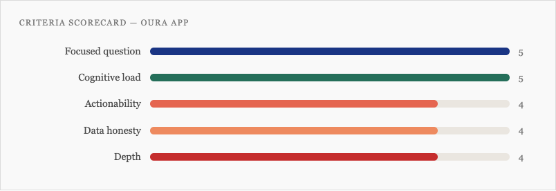
The lesson: The personal baseline approach solves a problem that most health dashboards don’t even acknowledge, that population norms are often the wrong comparison point for individual users. It’s also a data honesty decision: it stops the dashboard from implying more certainty than the data supports. The gap is the AI Advisor, where recommendations can appear more confident than the underlying model warrants. In 2026, as more consumer products embed AI-generated guidance, the obligation to surface model limitations follows directly from the power of the recommendations.
5. Monzo – Consumer Banking
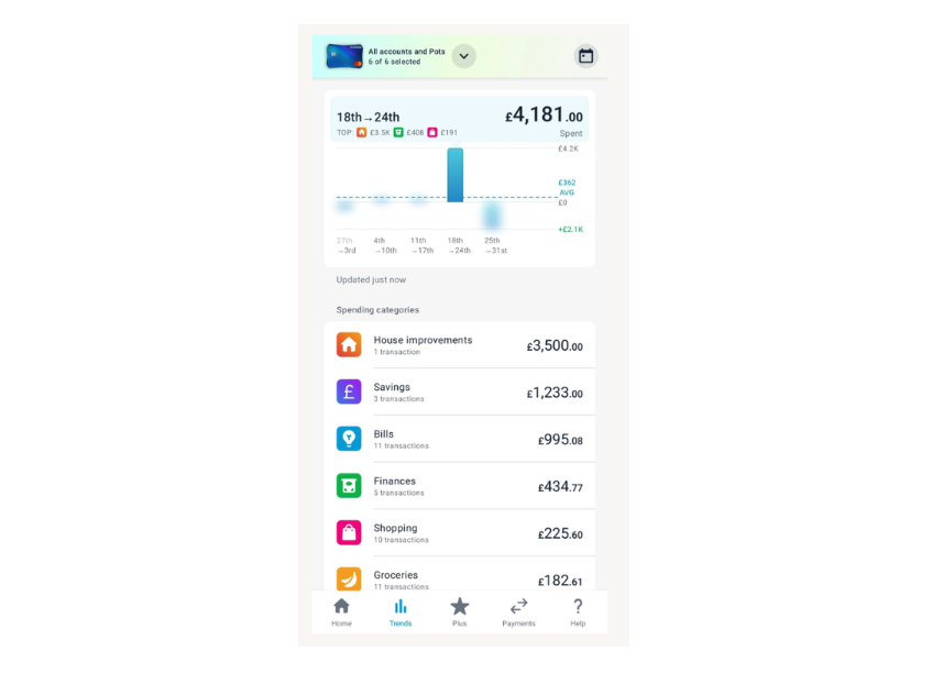
Monzo surfaces your financial picture, spending, pots, credit, and subscriptions in a single view. The trigger for the 2023 redesign was a candid internal diagnosis: the app had outgrown its own design. After launching Monzo Plus, Monzo Premium, Flex, Instant Access Savings Pots, and expanded budgeting tools, the original architecture couldn’t hold the accumulated weight of features. Users struggled to see their full financial picture and couldn’t discover the products available to them. The design team heard from more than 1,000 customers throughout the project.
The redesign’s answer was a card-based architecture that replaced the original layout with a modular hierarchy, each financial product gets its own card, the most important information is dominant on each card, and the structure scales as the product grows without requiring another full rebuild. This is the information architecture question as a maintenance problem: not just “what does this dashboard show?” but “how will this dashboard hold its hierarchy as the product adds features over the next three years?” Good UX design anticipates that question from the start.
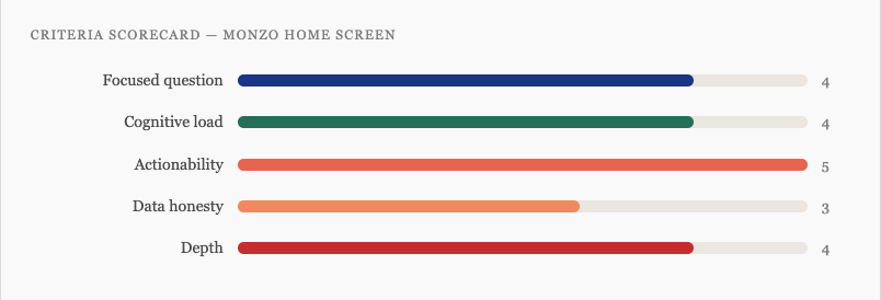
- Focused question: Clear, “what is my full financial picture, and what do I need to act on today?” The card structure makes the answer scannable rather than requiring the user to navigate across tabs to assemble it.
- Cognitive load: The card-based hierarchy did real work. Where the previous design had accumulated equal-weight elements competing for attention, the new structure re-establishes priority. Each card has one dominant piece of information and secondary context below it.
- Actionability: The strongest criterion. Every financial action, paying, saving, sending, managing a pot, is reachable in one tap from the home screen. The distance between seeing a balance and doing something about it is as short as the design can make it.
- Data honesty: Operational data only. No forecasting, no modelling, so no significant trust concern to manage. The one tension is that predicted spend and savings projections, where they appear, could be clearer about their assumptions.
- Depth: The home screen is designed for a 10-second orientation. Each card is an entry point to a deeper product view. The architecture explicitly carves out space for future features without forcing another redesign when they arrive.
Scorecard for this dashboad
The lesson: Monzo’s redesign is instructive precisely because the trigger was honest: the product had outgrown its design, and the team said so publicly. Most products accumulate UX debt through a hundred small decisions that each feel justified, then discover the hierarchy has collapsed when users can no longer find the most important thing. Building with a modular card architecture from the start, rather than retrofitting one later, is the version of this lesson worth applying before the redesign becomes necessary.
Building Better Dashboards: A Starting Framework
If you’re planning a new dashboard or auditing an existing one, these five questions give you a practical lens. If they’re hard to answer, that’s diagnostic information, the work is still in research and discovery, not the design phase. The quality of your questions at this stage determines the quality of everything that follows,.
- Who is the primary user, and what single question does this dashboard answer for them?
- What are the three most important things they need to see, and what are you cutting to get there?
- What action does a user take immediately after looking at this dashboard?
- Where does our data have limitations or uncertainty, and how does the design communicate that?
- What does a power user need that a casual reader doesn’t, and how do we serve both without compromise?
The dashboards worth learning from in 2026 aren’t the ones that look best in a Figma file. They’re the ones built by teams who understood their users well enough to know exactly what to leave out, and had the conviction to leave it out.
Most roundups of “great dashboards” are really roundups of great screenshots, celebrating dark mode gradients and glowing KPI tiles while saying nothing useful about whether those dashboards help anyone make a better decision. This article defines what great dashboard design actually