CRO for Mobile – How to Optimise Mobile Conversion Rates
If possible, take out your phone right now. Notice where your thumb naturally rests, how you’re holding it, where your eyes focus first. That natural posture and those instinctive movements are the foundation of your mobile CRO strategy. Yet most businesses still treat mobile CRO as a desktop experience squeezed onto a smaller screen. This approach misses a fundamental truth: mobile users aren’t just visiting from different devices. They’re operating in entirely different contexts, with different goals, attention spans, and physical constraints.
The Mobile Context Problem
Mobile devices account for 75% of web traffic, yet mobile conversion rates lag desktop by 1.7 times. Cart abandonment on mobile reaches 85.65%, compared to 68.1% on desktop. This isn’t a technical problem. It’s a context problem.
Desktop users sit down with purpose. Mobile users move through their day, grabbing moments between meetings, during commutes, whilst queuing for coffee. Or absent mindedly pulling out their phone when they’re supposed to be writ…
My point being there’s more conditions where users can’t give mobile the same attention as they can with desktop. They’re scanning, not reading.
Research shows 75% of phone interactions are thumb driven. The lower third of the screen, that arc where your thumb naturally reaches, becomes prime real estate. Place critical actions anywhere else and you’re making users work harder to convert.
Mapping Actual User Behaviour
Before optimising anything, map the genuine user journey: not the one you want, but the one users actually follow. Use session recordings to watch actual interactions. Where do thumbs hesitate? Where do users scroll past calls to action? Hotjar can be especially helpful to see where users succeed with your designs… or find the “gaps” in the user interface. Google Analytics 4’s user exploration reports reveal the actual paths users take through your site. These are just a few of the basic steps to take when collecting interactive information.
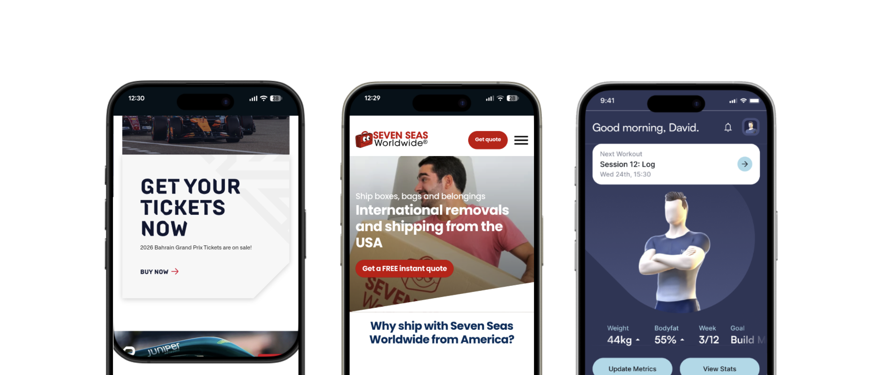
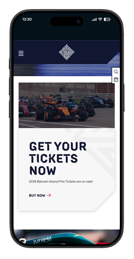
Bahrain International Circuit tested prototypes with real users, balancing event information with race content. Result: 43% increase in F1 conversions, 91% for other events. By observing real users navigating their mobile experience, we discovered that visitors wanted quick access to ticket purchasing without wading through extensive race history and circuit information. This insight led to a redesign of their mobile architecture around immediate conversion opportunities whilst still providing rich content for those who wanted it.
Design Around Points of Contact
It’s not just designing around behavior; mobile CRO is also about designing to encourage certain behaviors. This starts by making your mobile conversion architecture reflect how people actually hold phones. Position primary CTAs in the lower third. Make buttons large enough for confident tapping, a minimum of 48 pixels.
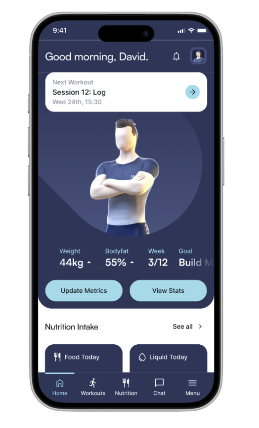
The soon to be released training app – Visual, positioned quick food logging, workout reminders, and their 3D avatar front and centre for thumb accessibility. Users could log meals in seconds without navigating away from their main task. The goal isn’t to force users into narrow lanes of use but build around the most common actions. This created a much easier behavior for the user to develop with their fitness journey.
Embrace Progressive Reduction
Effective mobile CRO demands progressive reduction: actively removing everything non-essential to the conversion path. For example; Multi-step forms outperform single-page forms because they reduce cognitive load.
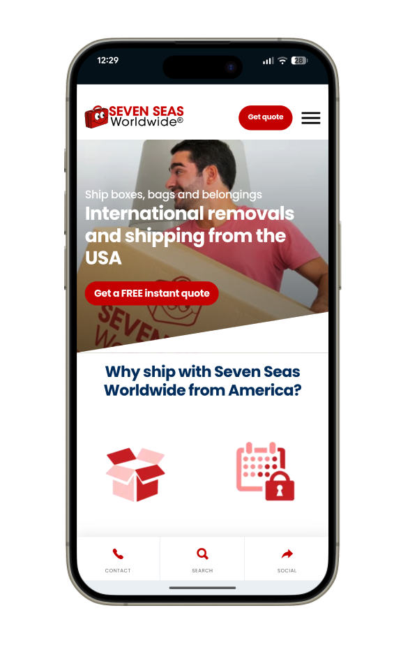
For our work with Seven Seas Worldwide, we integrated the mapping and location software Loqate for address validation, auto-completing addresses and dramatically reducing form fields. They added save and resume functionality, acknowledging that mobile users often face interruptions, especially when dealing with something as time intensive as a large move. When forms weren’t needed, we prioritised a mobile friendly UI that allowed for users to quickly add their items to their moving inventory.
Reward Momentum Through Quick Wins
Quick wins look different for every digital interface but they indicate the same thing: progress with the user’s task(s) and actions towards their goal. Show immediate feedback for every action. Sometimes there is an opportunity to celebrate these quick wins with celebratory language if its on brand. Sometimes the better course of action is a progress bar. They may look different but they are communicating the same thing: the user is successfully completing the task at hand. Small wins create big changes in mobile CRO.
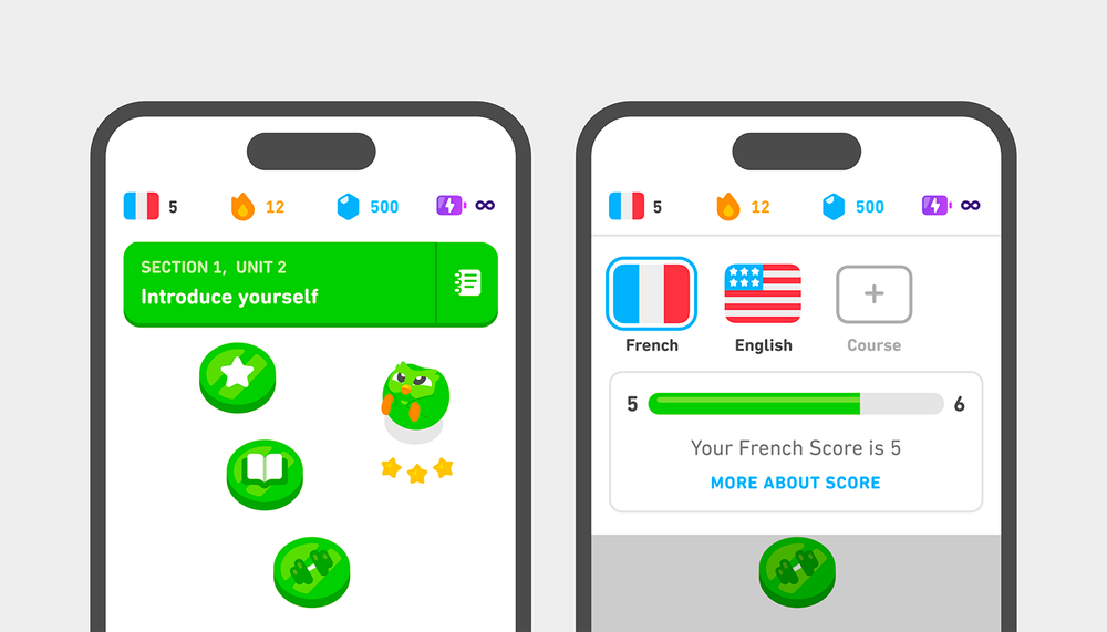
I’m a big fan of Duolingo, they built an empire in the language learning space which allows user to break down lessons into bite-sized modules that take just 5-10 minutes to complete, tailored for mobile users grabbing moments throughout their day. Each completed lesson triggers immediate visual and audio celebration: animated confetti, cheerful sounds, and XP points that fill up before the user’s eyes. The app’s streak counter, displayed prominently on the home screen, creates a powerful psychological incentive to return daily. When users complete their daily goal, they’re rewarded with encouraging messages and the satisfaction of maintaining their streak. This gamification approach has proven remarkably effective; Duolingo reports engagement rates that far exceed industry standards, with users returning day after day not just to learn, but to experience those small moments of achievement.
Leverage Mobile’s Unique Advantages

Mobile push notifications achieve a 90-95% read rate, usually within minutes. Email manages 20-25% open rates, usually within 24 hours. This dramatic difference reflects mobile’s intimate relationship with users: it’s always within arm’s reach.
Use push notifications for time-sensitive offers, abandoned cart reminders, or progress celebrations. But respect the privilege. One poorly-timed notification can lead to permanent opt-outs. The key is relevance and timing.
Domino’s Pizza might be one of the best examples of this practice. Their mobile app uses push notifications strategically throughout the ordering journey, from order confirmation to real-time pizza tracking updates. In 2022, they reported that over 75% of their sales came through digital channels, with their mobile app playing a central role. The notifications aren’t just transactional; they create anticipation and engagement. When customers receive a notification that their pizza has just gone into the oven, it transforms a passive wait into an active experience, building excitement whilst reducing the perceived wait time and anxiety about order status.
Design Trust Into Every Key Interaction
When it comes to crucial payment actions, establishing trust is paramount. Display security badges near payment fields. Trust badges can increase mobile conversions by up to 42%. But trust extends beyond security symbols to clear communication and respecting user context.
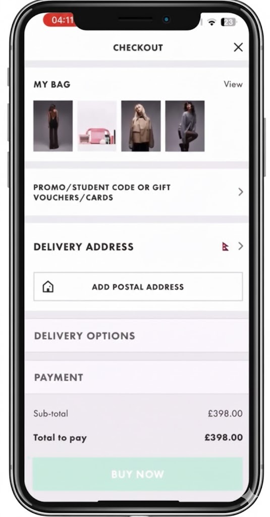
ASOS demonstrates this well in their mobile checkout experience. Beyond displaying standard security badges, they’ve built trust through transparency and user control. Their mobile payment flow clearly shows each cost component before users reach the payment screen, delivery charges, any discounts applied, and the final total. They offer multiple trusted payment options including Apple Pay and Google Pay, which leverage biometric authentication users already trust. This combination of security signals and cost transparency has contributed to ASOS maintaining strong mobile conversion rates in the highly competitive fashion retail sector.
Moving Forward
Mobile CRO isn’t about making desktop experiences fit smaller screens. It’s about understanding that mobile users inhabit a different psychological space, one defined by movement, urgency, and divided attention. The businesses that succeed in mobile conversion are those that stop trying to replicate desktop experiences and instead embrace the unique constraints and opportunities that mobile presents. This means designing for interruption, optimising for thumb zones, and respecting the fractured attention that characterises mobile usage. When you align your conversion strategy with how people actually use their phones, conversion stops being a battle against user behaviour and becomes a natural extension of it.
Return to that opening exercise. Feel the weight of your device. Notice your thumb position. Observe where your attention naturally flows. Now imagine your customers experiencing your mobile site in this exact posture, in this exact state of partial attention.Everything about effective mobile CRO flows from respecting that moment.
For further information about improving your mobile conversion rates, take a look at our dedicated Mobile UX page.
❤️ Big thanks to Duolingo, Email marketing newsletter, and Asos, for the images.