Do Design Tokens Really Make Design Systems Smarter?

For years, designers and developers have been chasing the same dream, a world where design intent translates cleanly into code.
Wow, imagine that.
Over time, tools have evolved, handovers have improved, but that gap has always been there. Figma Variables have helped, for sure. They brought structure to colour, spacing, and type inside design files. But what happens when that work needs to exist outside of Figma, when the design language needs to live in code? That’s where design tokens quietly step in.
What exactly is a design token?
A design token is simple: a name and a value that represent a design decision.
"color-text-danger": "#FF0000"That’s pretty much it. But that simplicity is what makes it powerful. Tokens aren’t trapped inside a design tool, and they don’t care whether your development team are working in React or Swift. They exist as data, portable, machine-readable, and universally understood.
For those designers already familiar with design tokens, you’ve probably heard your development team mention JSON files (JavaScript Object Notation). These files have become the natural home for design tokens, acting as a shared dictionary that both designers and developers can read.
One might argue that in many ways, tokens feel like the natural evolution of CSS, perhaps where CSS separated content from presentation, tokens separate design intent from implementation, they don’t just describe how something looks, they describe what it means. Terms such as “Primary button background” is no longer a Figma style or CSS class. It’s a value that can live anywhere, update everywhere, and stay consistent across every platform.
Why this matters
This shift isn’t theoretical, it’s already happening in some of the biggest design systems. We saw what might be considered the beginnings of design tokens being popularised in Google’s first iteration of Material Design. Now we see Material Design 3 integrate them as a fundamental part of its architecture. They’re no longer an afterthought, they’re the connection that holds themes, colour systems, and accessibility modes together.
Similarly, Contentful recently outlined how they built their token system around layers of meaning: primitive, semantic, and component-level tokens. It’s a layered approach that mirrors how we already think about design, from raw values to contextual meaning. These aren’t necessarily incremental improvements, moreover, they represent a fundamental shift in how we describe design.
As I mentioned previously, importantly they describe what it means – Instead of “this is how it looks”, tokens let us say “this is what it is”, turning design into data, data that can be versioned, validated, and integrated into development pipelines in the same way we (specifically the development team) manages code.
Using Design Tokens to Build Smarter Systems
Where tokens live in your design tool
In Figma, design tokens often start life as Variables, it’s easy to create tokens for colour, spacing, type scale, or component states, and group them into collections like Primitives, Semantic, and Components (as per Contentful).
A good starting structure might look like this:
| Layer | Example | Description |
|---|---|---|
| Primitive | color/brand/500 = #2A6DF4 | Your base palette and values |
| Semantic | color/bg/button = {color/brand/500} | Tokens with meaning (used in UI components) |
| Component | button/background/primary = {color/bg/button} | Specific to components or states |
You can then switch between light and dark modes simply by swapping variable collections, with no need to rebuild your components.
To make life easier, there are plenty of Figma plugins such as Tokens Studio or Design Tokens by Jan Six. These help you manage, export, and sync your tokens more efficiently, saving you a whole host of headaches in the process.
Why naming matters
As with all digital projects, a consistent naming convention is the backbone of a token system. It’s what allows designers, developers, project managers and even automation tools to speak the same language and remain consistent across every project.
A simple, readable format works best:
[category]-[type]-[state]For example:
color-text-primary
color-bg-button
space-button-horizontal
radius-card
If you stick to a shared naming convention, developers can map your Figma tokens directly to their code without manual translation or guesswork. Trust me, a solid naming convention will save you from a whole lot of bad vibes throughout the team, that’s for sure
How tokens travel from Figma to code
Here’s where things get interesting, when you publish or export tokens from Figma, using a plugin like Tokens Studio, they’re often saved into a JSON file which as I mentioned earlier, it’s essentially a structured dictionary of your design decisions.
{
  "color": {
    "text": { "primary": "#0B0B0C", "onBrand": "#FFFFFF" },
    "bg": { "page": "#FFFFFF", "button": "#2A6DF4" }
  },
  "radius": { "button": "8px" },
  "space": { "buttonX": "16px", "buttonY": "8px" }
}
Designers don’t need to write this manually, thankfully, the plugin handles it (unless there’s an error, which is annoyingly common). But understanding what’s inside is powerful as each line represents a design decision you made in Figma, now stored as data that your developers can import directly into their codebase.
That means your button colour, type size, and spacing values are no longer copy-pasted, or worse, manually typed. They’re synchronised, meaning no mismatched hex codes or rogue pixel values, that is unless, you mistakingly introduced them yourself.
The building bridge, Figma MCP and live design data
Figma’s new Model Context Protocol (MCP) integration takes this even further. It connects your Figma files directly to development tools like Visual Studio Code, turning your design variables and tokens into live, accessible data. In practice, designers can define colour systems, spacing scales, and component states in Figma, while developers can pull those exact values straight into code, no exports or plugins required. The result is a single, shared source of truth between design and development. And because MCP is open to AI agents, it unlocks a wave of automation: AI can now generate components, validate consistency, or even suggest design improvements based on your live system.
As mentioned in Figma’s own article, MCP follows a familiar client-server architecture, connecting LLMs to external tools like Figma, GitHub, or SQL databases. The host (for example, Claude Desktop or Cursor) manages permissions and communication, launching clients that connect to individual servers. Each server plugs into an external app, handling API calls or database queries and returning data in a standard format.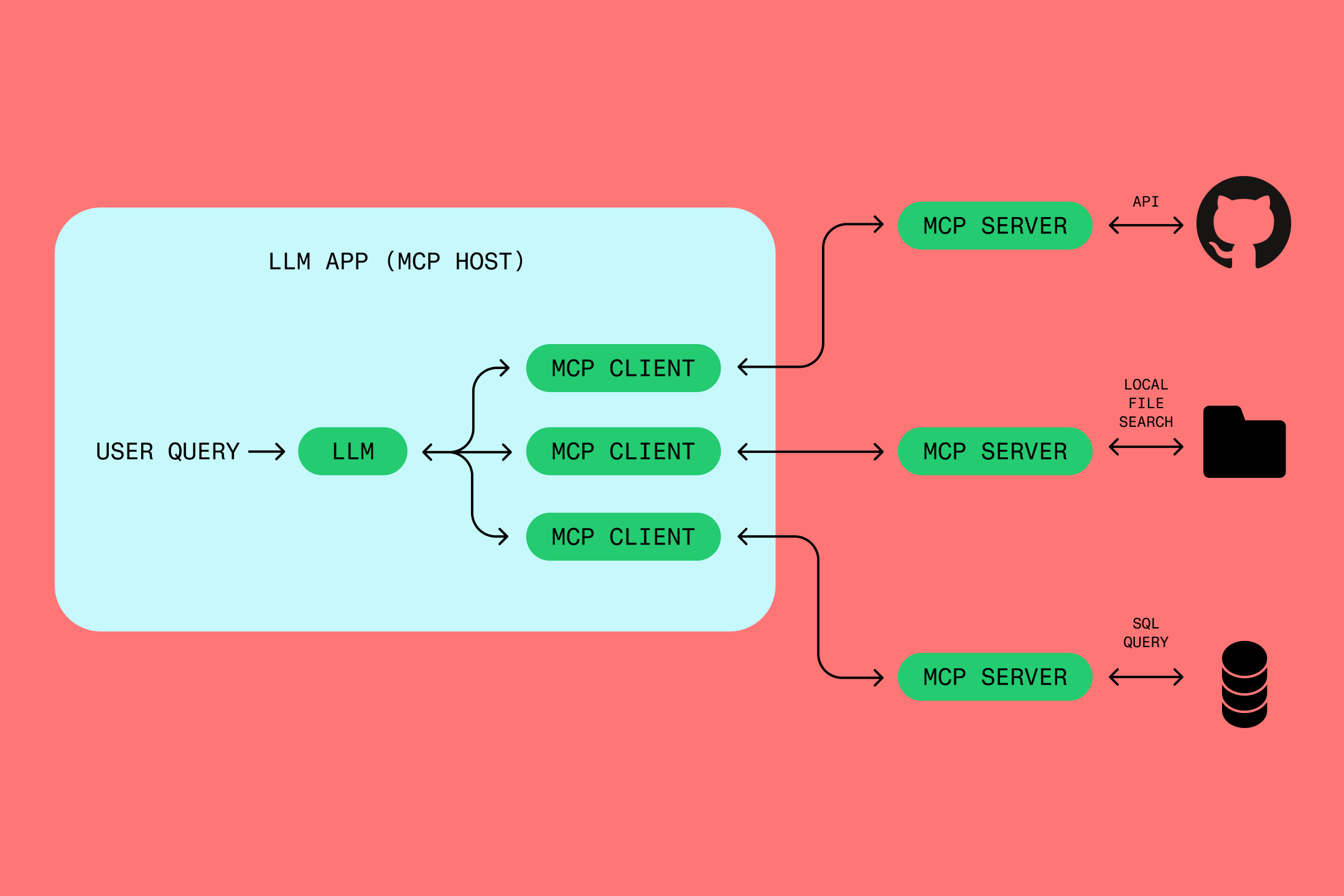
In practice, it means an LLM can securely request and use live data from other systems. For example, if a user asks Cursor to pull a Figma file into their codebase, the MCP host spins up a Figma server and client, retrieves the file through Figma’s API, and feeds that data back to the LLM so it can generate the right code with full context.
Building consistency into your design process
So where do we go from here? And how do you introduce design tokens into your workflow moving forward? Talking to my team, design tokens probably shine brightest when they’re used consistently from day one, which no doubtably means firstly getting to grips with the mindset and structures mentioned above. Beyond that, there are some simple steps to get you going, which we’ve collated into a handful of pointers:
- Be kind to yourself and start small. Begin with colours, type, and spacing, the atomic building blocks.
- Use variables everywhere. Replace those hardcoded values with variable references in components.
- Define semantic meaning with the wider team. e.g. Don’t call it “blue-500”, call it “brand-primary”.
- It goes without saying, but – group logically. Try organising variables into collections that mirror your design language.
- Synchronise as often as possible. Keep your token exports up to date with your development team’s repository.
- Employ version control. Treat tokens like code, change them deliberately, and document the “why”, helping to keep everything in order long term.
If you keep these pointers in mind, your structure should scale beautifully and without any hiccups along the way. Whether your system grows to include multiple brands, products, or accessibility themes, your foundation should remain stable, and your sanity intact.
Seeing everything come to life
Here’s what happens when your exported tokens are turned into CSS variables, something you’ll often see reflected in the product you designed:
:root {
  --color-text-default: #0b0b0c;
  --color-text-onBrand: #ffffff;
  --color-bg-page: #ffffff;
  --color-bg-button: #2a6df4;
  --radius-button: 8px;
  --space-button-x: 16px;
  --space-button-y: 8px;
}
And if you ever decide to tweak that client brand blue in Figma, you’ll know that change can flow through to production automatically.
The final bridge
Design tokens aren’t just a bridge between design and code, they are THE BRIDGE. They move design systems away from “this is how it looks” and towards “this is what it means”. Once that mindset clicks, then essentially everything else, themes, accessibility, consistency, falls neatly into place.
Of course, it’s not perfect, nothing ever is! Figma still doesn’t export a true token file natively, and most teams rely on plugins (such as those named previously) or even manual workflows to bridge the gap 🤯.
But, beware… Naming conventions drift, tokens fork, and human error still creeps in. Nevertheless, the principle still holds true. The future of design systems isn’t about tools syncing perfectly, it’s about shared structure between the whole team, one that transcends whichever design app or framework happens to be popular this year.
So, do design tokens really make design systems smarter?
Yes, absolutely, but not because they add more complexity or new tools. They make systems smarter because they make them simpler. Tokens turn style choices into structured decisions that everyone can share, version, and understand. They free designers from chasing pixel-perfect parity and let teams focus on meaning, not mechanics. In the end, a smart design system isn’t one that just looks consistent, it’s one that thinks consistently, and that’s exactly what design tokens enable.
Just as CSS once became the language of style on the web, tokens are fast becoming the language of design itself. The difference this time is that it’s not just for browsers, it’s for everything.
For more information on working with Design Tokens inside Figma, check out this introduction:
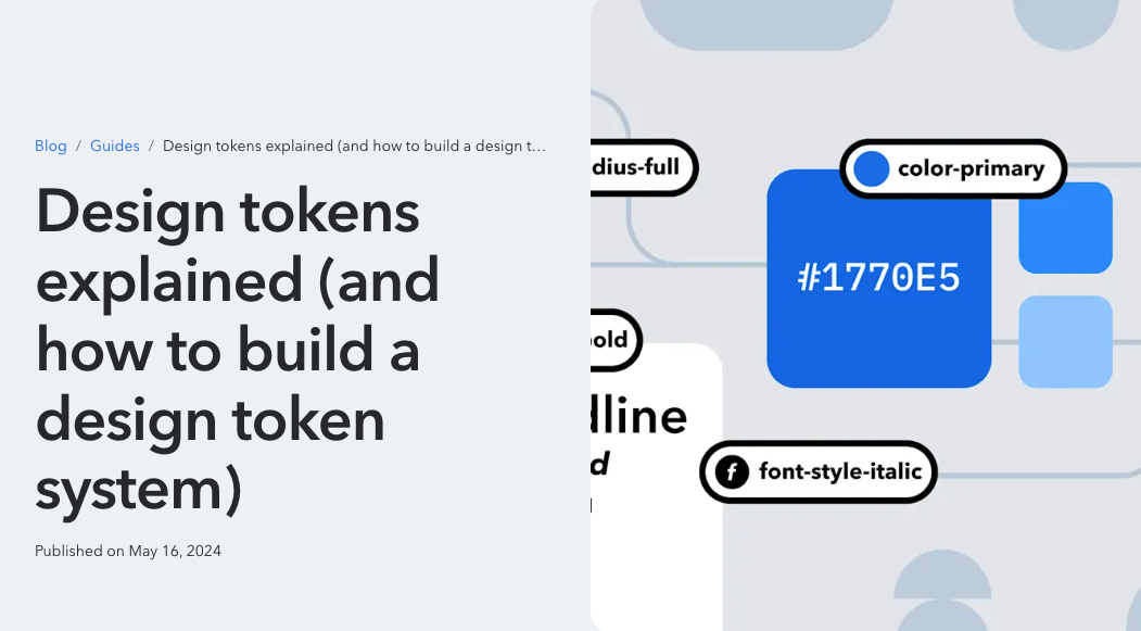
Big thanks to Olav Ahrens Røtne on Unsplash for the photo, and credit to Figma and Contentful for the product image ❤️