Designing User-Centric Forms: 4 Great Form Examples

As much as we don’t like forms (I personally like designing them, but filling them out is still a less than desirable experience) they are one of administrative adhesives that holds an organisation together.
Do you think we would have been able to get to the moon without forms? An engineer at NASA had to fill in a form for a “Request for Lunar Module Heat Shield Material Testing Protocol” during the Apollo project. Just because forms are a less than pleasant experience doesn’t mean that they have to go out of their way to be as difficult as possible.
Dear reader, if there’s one thing that I want you to know about designing forms, it’s that they’re always going to be a balancing act between the needs of the business, UX and UI. If you want to understand how to do that, keep reading.
The Balancing Act
According to the Interaction Design Foundation, 81% of people abandon forms after they start filling them out. That’s not just a user experience problem, that’s a direct hit to your bottom line. HubSpot’s research shows that companies like Imagescape increased conversion rates by 120% simply by reducing their form fields from 11 to four. The driving force behind detrimental or successful numbers is managing balance. Effective form design requires understanding competing priorities from product teams (who want comprehensive data), UX designers (who prioritise usability and accessibility), and UI designers (who focus on visual consistency and responsive design). Here’s a practical framework for finding that sweet spot:
1. Start with Stakeholder Alignment
Nielsen Norman Group’s stakeholder analysis research shows that effective engagement involves planning, communicating, aligning, and negotiating. Their research on stakeholder collaboration demonstrates that “user experience outcomes improve when UX is a team activity” and that stakeholder participation can “remove obstacles to doing future research.” Cross-functional alignment drives measurably better results. One of the best examples of this practice is with Turbotax 13 years ago.
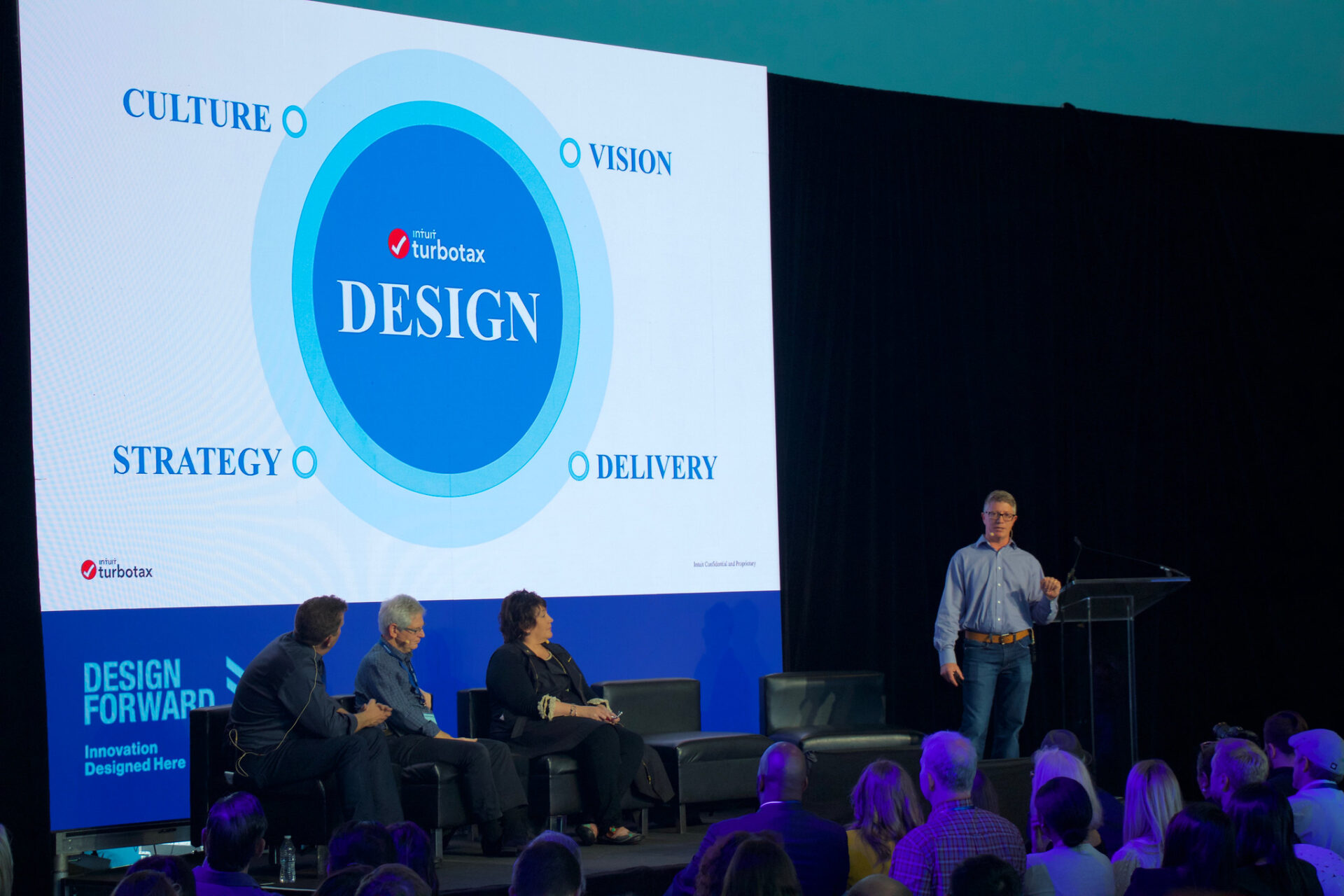
When Kurt Walecki joined Intuit as VP of Design in 2012, the company was struggling with several years of slowing growth and a fragmented design approach. His first major initiative was a company wide ethnographic research effort called “Ignite.” In 2013, Intuit shut down operations for two entire days and sent all 700 employees across San Diego to conduct face-to-face interviews with 1,400 residents about their tax filing experiences.
By ralling each department to engage with their user base, they were able to restructure the stakeholder experience around understanding the user which led to better designs. The complete redesign that followed included a complete visual overhaul with conversational language that made the software feel more approachable.
Create a shared success metrics document. Product cares about conversion rates, UX cares about completion rates and user satisfaction, UI cares about design consistency. Start your next form project with a cross-functional kickoff; get everyone in the same room, define shared success metrics, and commit to regular checkins.
2. Embrace Progressive Disclosure
One of the most effective strategies for balancing comprehensive data collection with user simplicity is progressive disclosure. Studies demonstrate that multi-step forms have a 14% higher completion rate than single-step forms. Venture Harbour’s case studies show even more dramatic results, with multi-step forms increasing conversions by 59% for Vendio and 214% for an astroturf company.
Catapult Connected Places needed to collect complex data about city infrastructure, economic priorities, and digital transformation goals from multiple stakeholders. Rather than presenting an overwhelming single form, the design team here at Browser London designed a form that leveraged progressive disclosure, breaking the complex data collection into manageable stages.
When implementing progressive disclosure, apply the “question funnel” approach, start with broad, engaging questions that feel more like a conversation starter than data collection. For example, instead of immediately asking for contact details, begin with “What’s your biggest challenge with [relevant topic]?” This approach leverages psychological commitment bias: once users invest time in early steps, they’re significantly more likely to complete the entire form, even when reaching more sensitive questions like email addresses in later stages.
3. Design for Conversations, Not Interrogations
Research consistently demonstrates that conversational language significantly improves form performance. CXL’s analysis shows that strategic microcopy revisions can increase conversions by 11.30%, while UXPin studies found that benefit driven copy improved click-through rates by 28%. Conversational, human centred language transforms form completion rates. Instead of asking “Enter your full legal name,” try “What should we call you?” This subtle shift makes the experience feel more human while collecting necessary information and reducing cognitive burden. Is it a small change? Yes, but add up enough small design wins and the odds of form completion improves.
One of the most celebrated examples of UX copy and interaction design comes from Mailchimp’s email sending process. When users complete and send an email campaign, they’re greeted with an animated chimpanzee giving them a high five, accompanied by celebratory copy like “High fives! Your campaign is on its way.” As Aarron Walter, former Director of UX at Mailchimp, explains: “As users of our own product, we knew the stress one feels before sending a campaign and joy that follows when your email lands in inboxes. It feels like someone should high five you for a job well done!” The design team’s approach was intentionally human centered, and this philosophy extends throughout their comprehensive style guide, which has become a gold standard for UX writing and brand voice consistency.
Sadly, microcopy is often overlooked. Designlab’s research emphasises that effective copy can significantly increase form submissions and business revenue. The difference between “Enter password” and “Create a password (8+ characters)” isn’t just clarity, it’s reducing cognitive burden and preventing error correction cycles.
4. Test Across All Dimensions
Don’t just test for usability, test for business impact, visual consistency, and conversational effectiveness. A/B testing, usability testing, and analytics review help determine which form versions perform better across multiple success metrics.
HubSpot’s approach to form testing exemplifies this comprehensive methodology. Through their analysis of over 40,000 customer landing pages, HubSpot tested not just usability, but business impact and conversational effectiveness simultaneously. Their research revealed that forms labeled with “Submit” had lower conversion rates than those with customised button text, while three specific types of form fields consistently killed conversion rates: requests for age, telephone numbers, and geographic information.
The key to HubSpot’s success was their systematic testing framework that tracked multiple success metrics across different dimensions. Their comprehensive form analytics measure conversion rates, user behavior patterns, and engagement metrics to provide a complete picture of form effectiveness. This multi-dimensional approach led them to discover that smart form fields, which progressively profile leads, significantly improved both user experience and data quality while maintaining their position as the highest-converting lead capture tool at 15% conversion rate.
Remember that research should uncover genuine user pain points, not validate pre-existing design assumptions. Focus your user interviews on past experiences with similar forms rather than hypothetical scenarios ask “Think back to the last time you filled out a form like this, what was frustrating?” instead of “What do you think about this design?”
FORMative Design
What, you thought there would be no form based puns? Save the best for last.
Great form design isn’t about choosing sides, it’s about finding the sweet spot where business objectives, user needs, design excellence, and conversational warmth intersect. When you nail this balance, you create forms that users actually want to complete and organisations can rely on for growth.
As you implement these principles, start small but think systemically. Focus on alignment first, then progressive disclosure, then conversational design, and finally comprehensive testing. The investment in thoughtful form design pays dividends not just in conversion rates, but in user satisfaction, data quality, and long-term customer relationships that drive sustainable business growth.
Thanks to Glenn Batuyong, and Aarron Walter for the photos ❤️
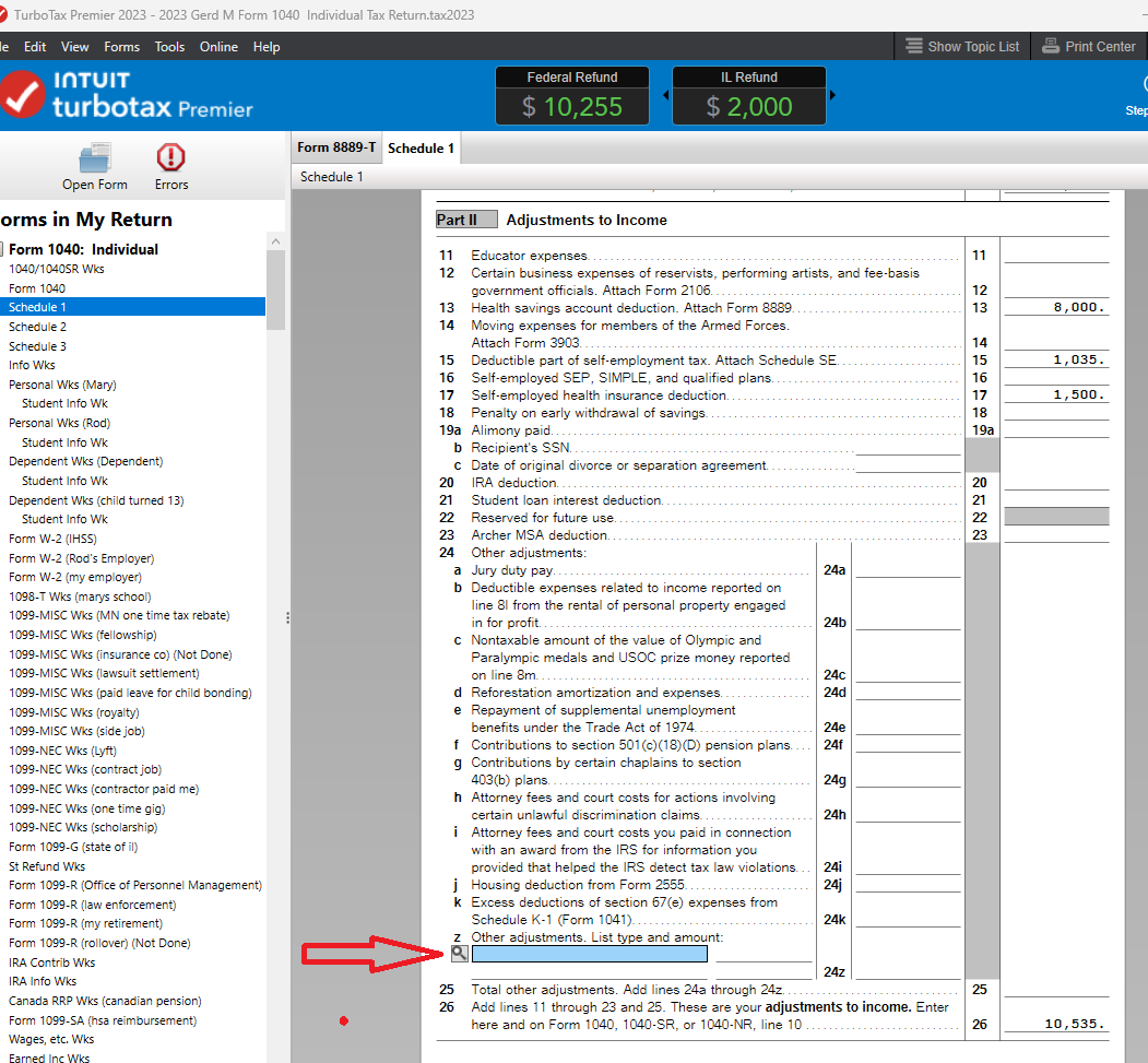
Note from the author: I call upon this TurboTax example because of its commitment to UX and stakeholder engagement, not because of the business’s practices.