Muslim Hands – A Global Giving Platform
Reimagining The Entire Digital Giving Experience Through UX Strategy, UI design, and development
Muslim hands are an international charity that operates throughout the world but with fundraising headquarters in both the UK and USA. The team at Muslim Hands knew their digital platform needed modernisation, specifically around the donation but lacked clarity on where the most impactful improvements could be made. They needed an outside perspective to examine, overhaul, and ultimately reinvigorate their donor experience.
*We’re really proud to announce that this project was recently recognised with a Web Excellence Award for UX design and front-end development.
The Brief
With millions of beneficiaries worldwide depending on their humanitarian support, Muslim Hands needed to re-examine how they facilitated charitable giving online. Their existing platform, while functional, had room for improvement. The donation process had some unnecessary friction, impact reporting wasn’t effectively integrated into the donor journey, and the content architecture struggled to support their growing needs.
User research and focus groups
When tackling complex user experience challenges like this, we turned to our structured design sprint process. We ran user research interviews and questionnaires to gather the data about the donors intent. This intensive workshop approach brought together Muslim Hands’ marketing team, technical stakeholders, and content strategists in a series of remote collaborative sessions. Through these workshops, we could collectively process and prioritise our research findings – particularly around transparency and technical needs. This collaborative approach meant we could move quickly from insight to action, with stakeholders aligned on both the problems and potential solutions.
Competitive & Comparative
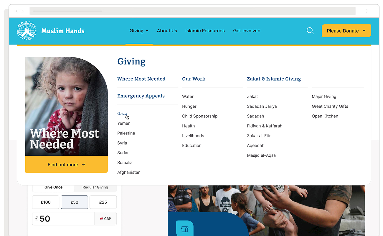
We analysed other charities (and non-charities) to identify established patterns in content navigation and donation flows. Particular attention was paid to micro-copy supporting the donation process – how organisations provided context and reassurance for contributions of any size. Looking beyond faith-based organisations, we examined e-commerce platforms and niche non-profits, studying how they guided users through complex decision trees. A crucial early insight was understanding that Zakat represented more than a faith-based obligation – it was fundamentally about ensuring society’s most vulnerable members received support. This cultural understanding shaped our entire approach.
Our research survey generated an overwhelming response, providing rich insights into donor motivations and pain points. We used the “Jobs To Be Done” (JTBD) framework to highlight and itemise the tasks users wanted to complete. Key findings included:
- Desire for clear impact reporting and project updates
- Need for better transparency around fund allocation
- Importance of connecting spiritual obligation with practical impact
- Strong preference for simple, flexible donation options, especially on mobile
Content Strategy & Implementation
Our research highlighted that content wasn’t just supporting the donation process – it was fundamental to building donor trust and maintaining long-term engagement. We developed a content strategy that addressed both immediate giving needs and longer-term donor relationships. The strategy was built on three interconnected pillars:
- Immediate Engagement
- Clear, action-oriented pathways to donation
- Flexible giving options that acknowledged different donor capabilities
- Simple, fast donation processes optimised for mobile
- Real-time updates on emergency appeals and urgent needs
2. Trust Building
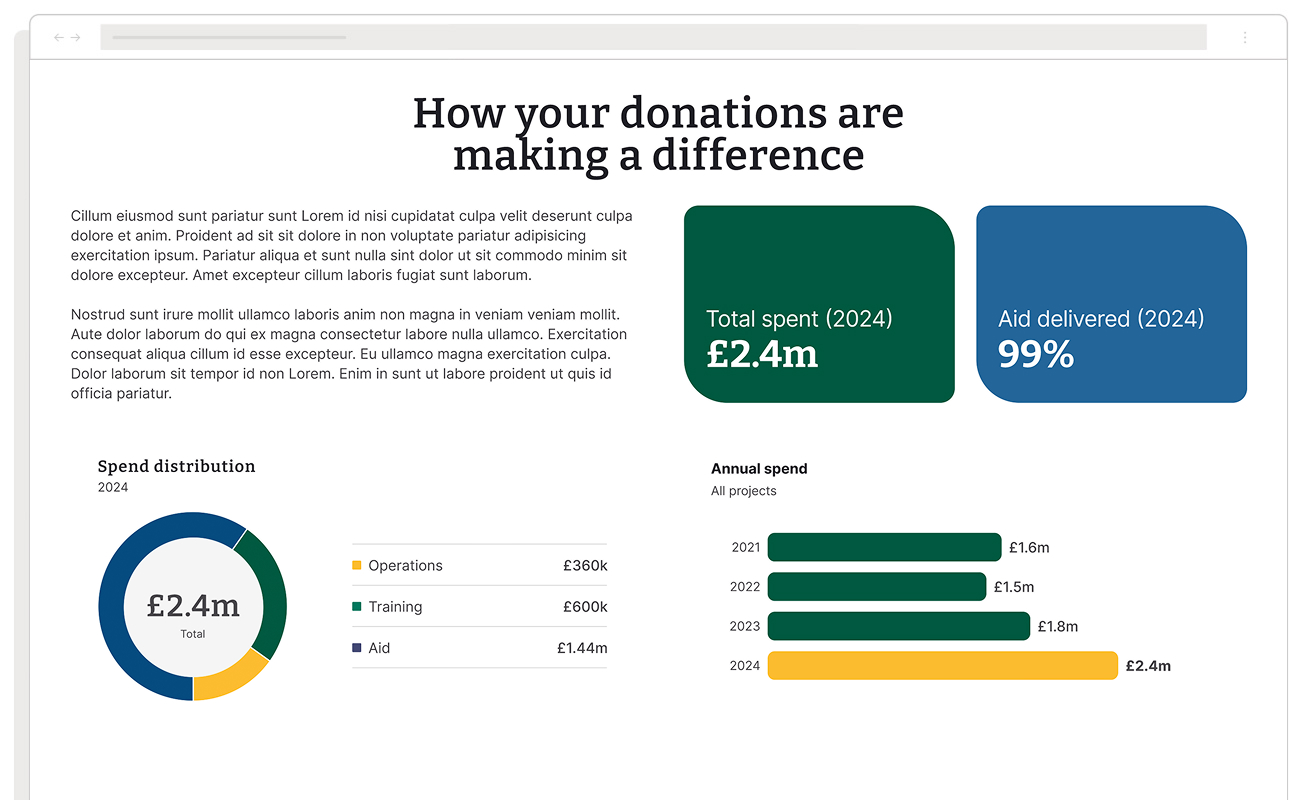
- Transparent reporting on fund allocation and impact
- Regular project updates with clear progress metrics
- Detailed breakdowns of administrative costs
- Evidence-based impact reporting that connected donations to outcomes
- Clear explanations of how Zakat calculations were determined
3. Community Connection
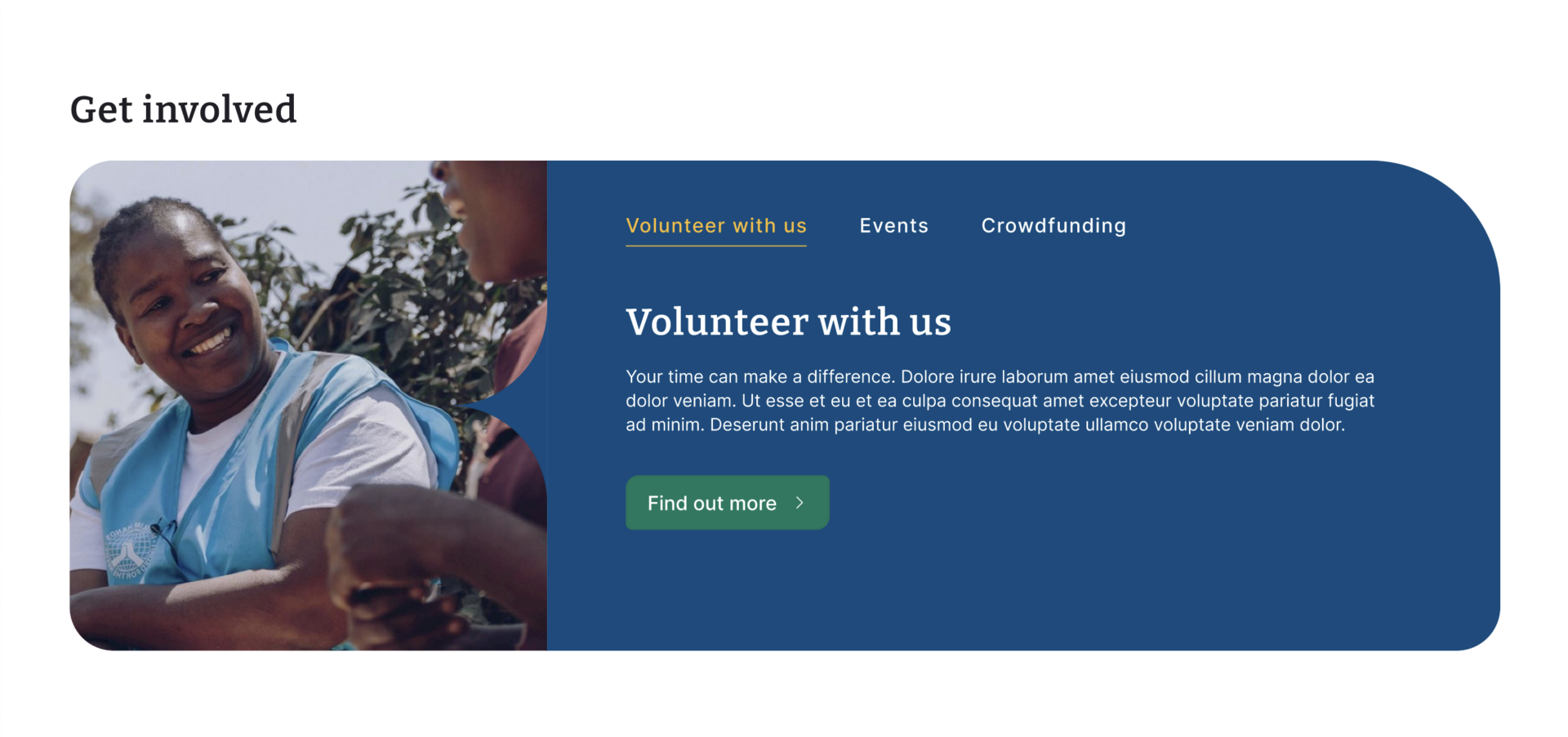
- Volunteering and engagement opportunities
- In-person and online event calendars
- Community success stories and testimonials
- Educational resources about Islamic giving principles
- Updates on causes, tracking, and community impact
We identified and interpreted user needs by focusing on the tasks users aim to accomplish. For us it revealed the motivations and desired outcomes behind their actions, providing deeper insights. By understanding these “jobs,” we created a list of ”pains” and “gains” and then features (aka products and services) that directly address users’ goals, ensuring the site facilitates their needs effectively by aligning design with intent.
The ‘Go To Market’ (GTM) strategy
Using all of the information gathered through discovery, we then proceeded to map everything out onto a ‘Go To Market’ strategy. This framework was specifically designed to address the pain points revealed in our research. For instance, donor concerns about transparency were met with clear tracking systems for donations and regular impact updates. The desire for easier mobile giving was addressed through streamlined content hierarchies and context-sensitive help text.
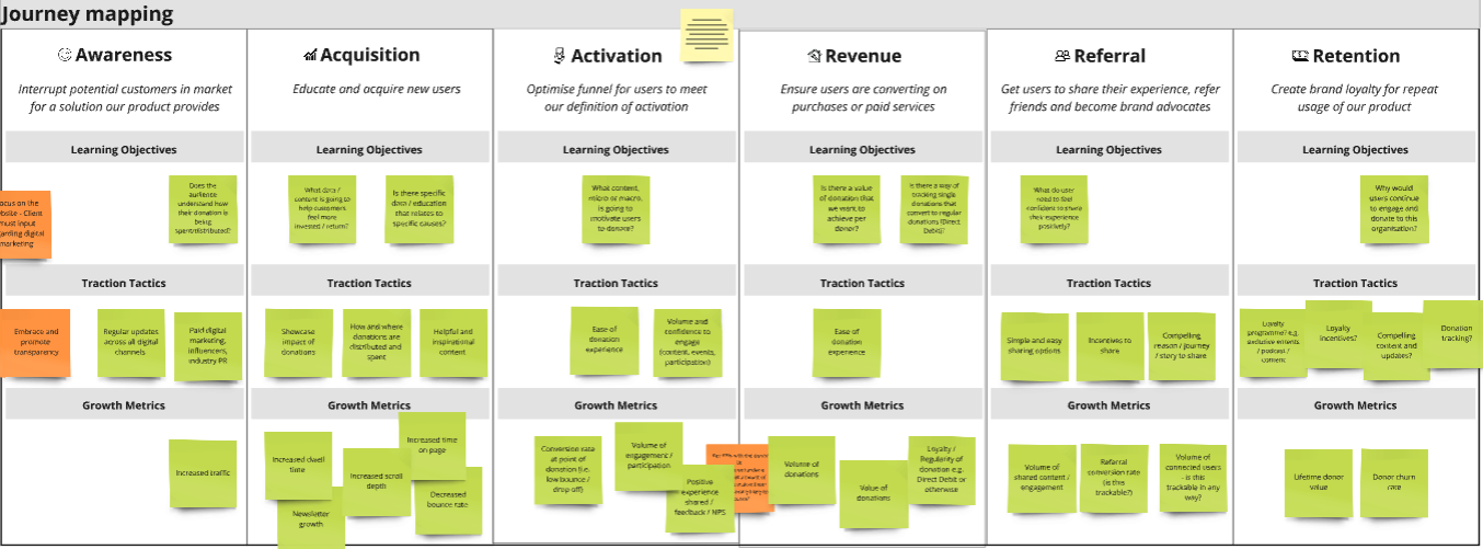
Our GTM strategy also helped define the environments and channels our users operated in and how to reach them, and the key messages amongst many other things. Importantly we also mapped out the KPIs for measuring success.
As we continued through the strategy process, we agreed on and began exploring modular content templates that could flex between everyday giving and emergency appeals, ensuring consistency in messaging while allowing for rapid deployment during urgent situations.
We also began exploring options to allow the system to also support different levels of donor engagement – from first-time givers making small contributions to regular donors managing substantial Zakat obligations.
UX ideation and wireframes
We leveraged insights from the discovery phase and the Go-to-Market Strategy Canvas to begin creating wireframes for both mobile and desktop platforms. The information gathered helped us understand user needs, business goals, and market positioning, guiding the layout and structure of each wireframe to align with key objectives. The purpose of these wireframes was to explore and establish a clear visual framework for content placement and user interactions, providing a blueprint for designing an intuitive and seamless user experience.
To ensure the wireframes met real-world requirements, we conducted check-ins with the team every two days. These sessions allowed us to validate design decisions and gather feedback for continuous refinement. Whenever possible, we tested the wireframes with actual users, gaining valuable insights into how effectively they addressed user needs. This iterative process ensured that any issues were identified early, enabling us to adjust the design before moving into development.
UI ideation and design
This was one of the most exciting parts of the project as we began to see all the hard work materialise into a visual entity. We used information from the wireframing process to guide the UI design exploration and development, aligning closely with their evolving new brand design. Starting with the wireframes, we ensured that the layout and content structure informed the visual style, allowing the UI design to address both user needs and brand requirements. The wireframes served as a foundation, shaping the design elements to ensure consistency across mobile and desktop experiences.

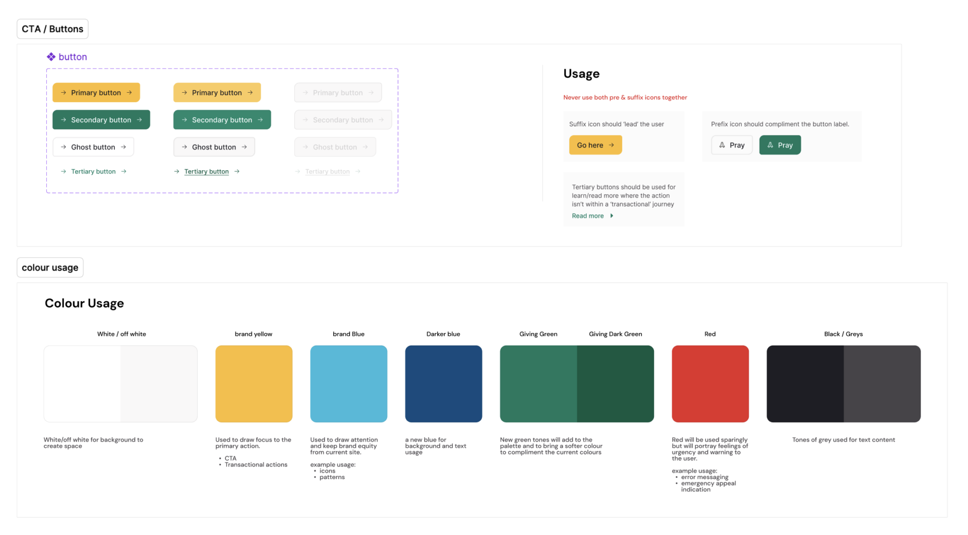
Our approach was modular, focusing on creating a component-based design system. Each UI element was developed as a reusable component, enabling a flexible and scalable system that could be easily adapted for future content creation within the CMS. This modular strategy allowed for consistency across different pages and made updating or creating new content straightforward, as components could be assembled and rearranged efficiently. Once again we held regular check-ins every two days, refining the design based on team feedback and user testing.
User testing
We employed a range of user testing techniques to thoroughly evaluate the usability and usefulness of both the UX and UI designs, focusing on real-world feedback from representative users. These included structured focus groups where participants interacted with prototypes to provide insights into the donation experience, as well as usability testing sessions that allowed us to observe how users navigated the designs, highlighting pain points and opportunities for improvement.
To ensure a seamless process, we used Google Workspace to organise the testing and manage schedules, documentation, and feedback. We leveraged Great Question to deliver the testing framework, integrating it with Figma to create and present interactive prototypes for user testing. Additionally, we used ChatGPT-4 to analyse qualitative and quantitative feedback, identifying key patterns and themes in the data. This combination of tools and techniques enabled us to gain a comprehensive understanding of user behaviors, preferences, and pain points, allowing us to iteratively refine the designs to ensure they were intuitive, accessible, and aligned with the needs of the end users.
Modular front-end development
We took the UI designs and screen layouts and developed them into a modular, coded front-end design system using HTML, CSS, Vanilla JS and React JS. Each UI component created during the design phase was translated into reusable React components, allowing for a consistent and flexible implementation across the website. These components were built with a modular approach, meaning they could be easily combined, rearranged, and reused to create various page layouts and features.
Using a component-based architecture enabled us to maintain a scalable and efficient codebase, with each module designed to be independent yet interoperable. This structure facilitated rapid development and seamless updates, ensuring that new content or features could be integrated without disrupting the existing system. The design system also provided a standardised approach for styling and interaction, maintaining visual consistency throughout the site while allowing for customisation when needed. When we handed over to their in-house IT team, the CMS of choice was Umbraco which allowed for flexibility and integrations with many of the custom and 3rd party services that were used to power the organisation’s digital ecosystem. Umbraco was chosen by the Muslim Hands internal IT team because of its BAU preference and use throughout the organisation in the UK and USA.
The Outcome
The refreshed platform transformed how Muslim Hands connected with donors online. Beyond the improved technical infrastructure, it created stronger emotional connections between donors and impact through two key innovations:
Refreshed Visual Language
The visual refresh centred on creating a system that could support both everyday giving and urgent appeals while maintaining cultural authenticity. Working from Muslim Hands’ existing brand foundation, we expanded their colour palette to support clearer information hierarchies and developed modular systems for presenting complex project information.
Dynamic Content Engine
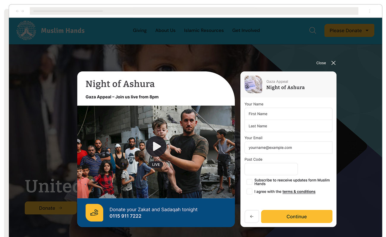
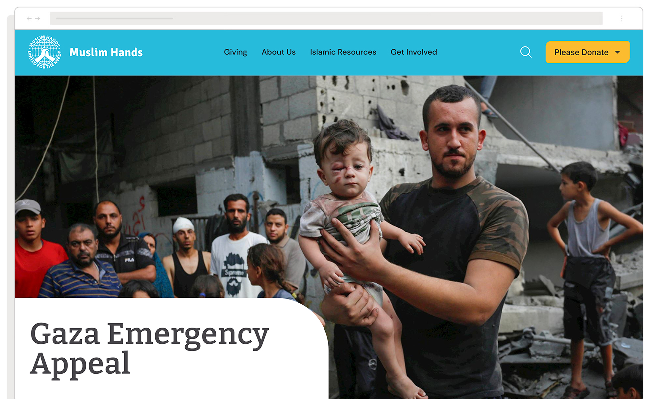
We developed a dynamic content system that automatically surfaced relevant projects and appeals based on donor behaviour and preferences. This meant that whether someone was a first-time visitor or a regular contributor, they received personalised content that matched their interests and giving patterns. The system also helped Muslim Hands rapidly deploy emergency appeals while maintaining ongoing campaign momentum.
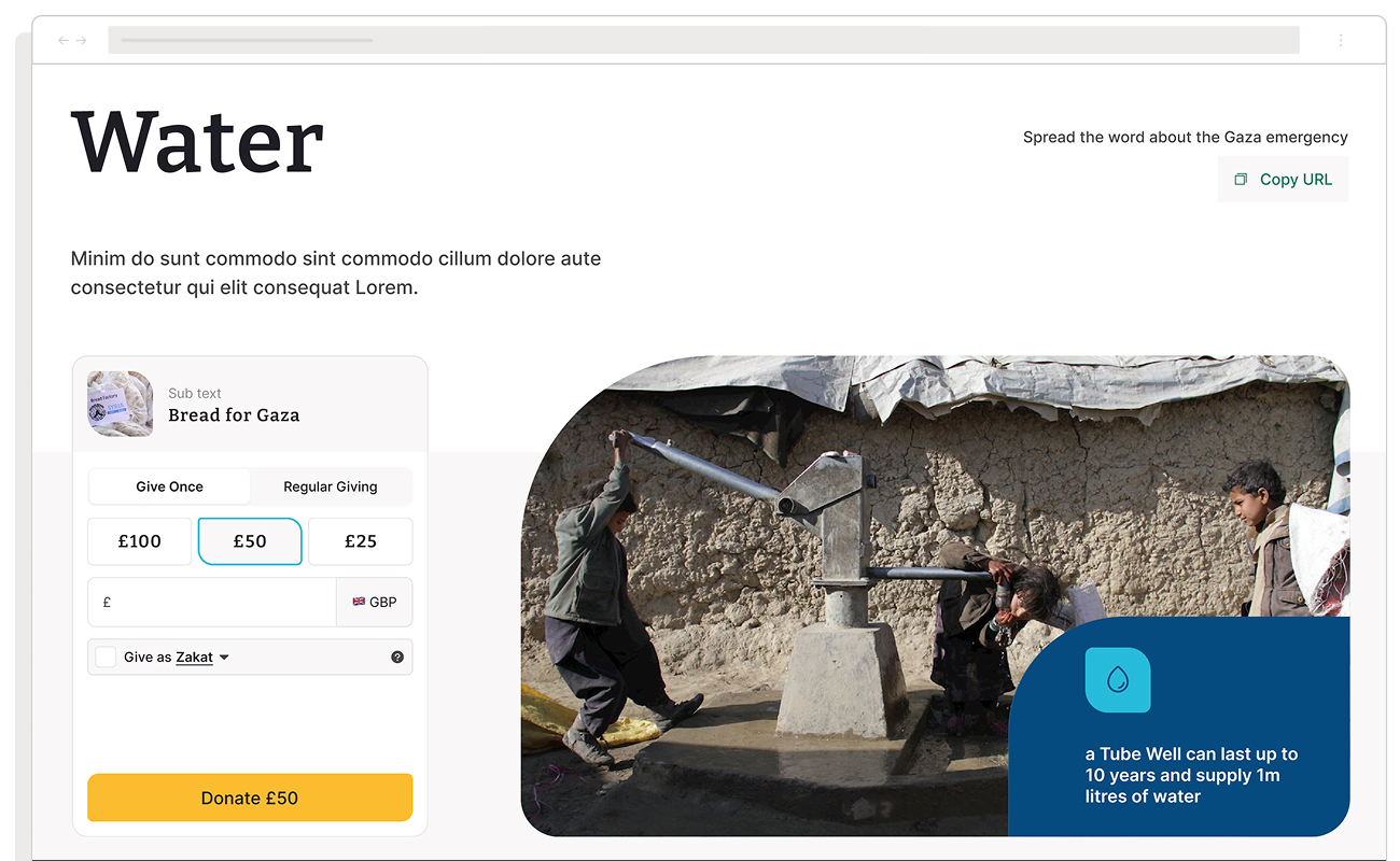
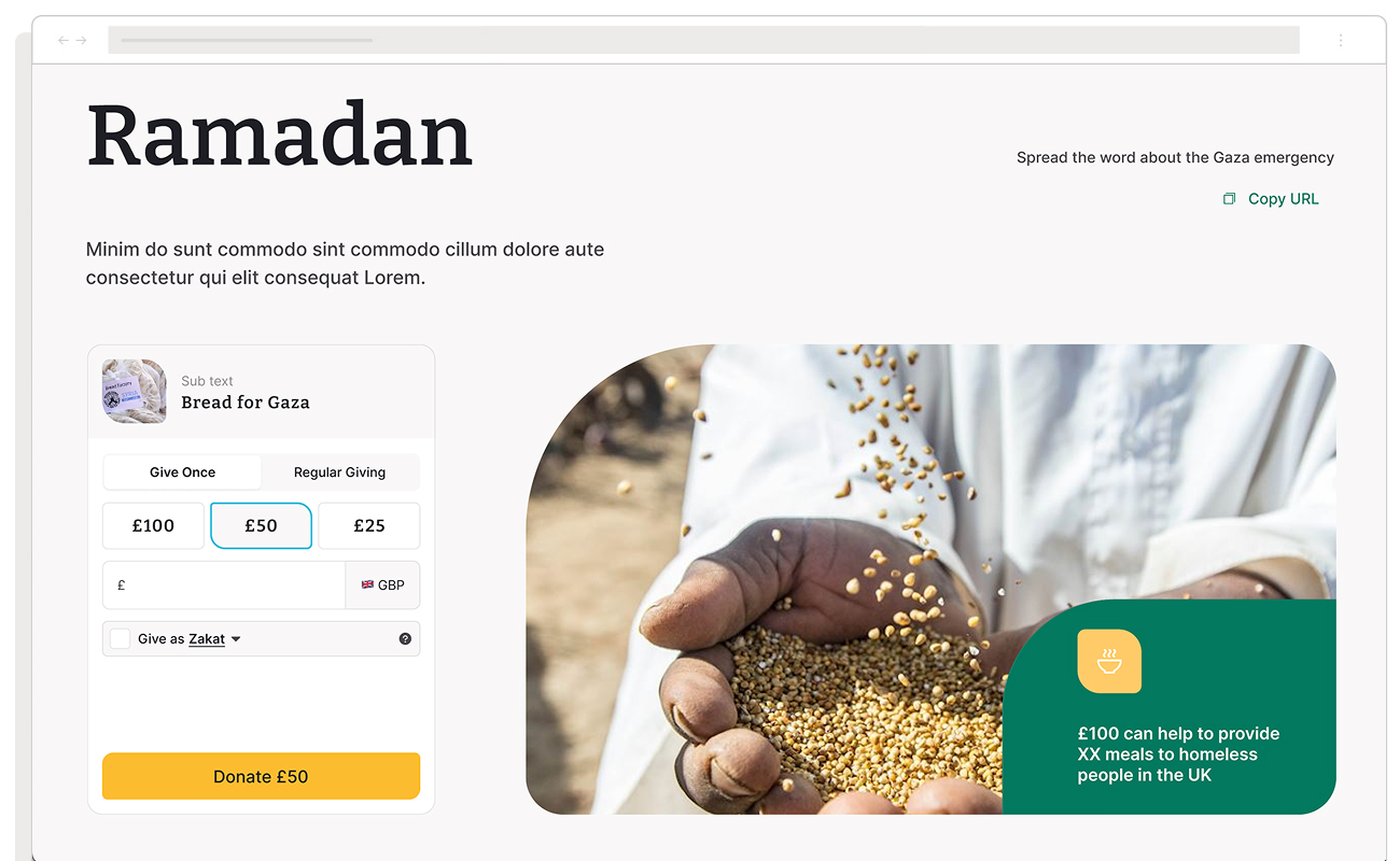
Custom Donation module and Payments
We explored various donation modules and their potential benefits. Since Muslim Hands has an in-house IT team, they preferred to keep full control of the payment system and its management. This approach enabled us to design and help develop a custom donation module that aligned closely with their internal needs and, importantly, was tailored to their users’ needs.
With this setup, we were able to help design and deliver a dynamic donation module capable of supporting various campaigns and fundraising activities. Built using ReactJS, the module operates as an independent application, meaning a custom donation module can be embedded on third-party websites with a simple code snippet, while all payments are securely routed through Muslim Hands’ payment system API.
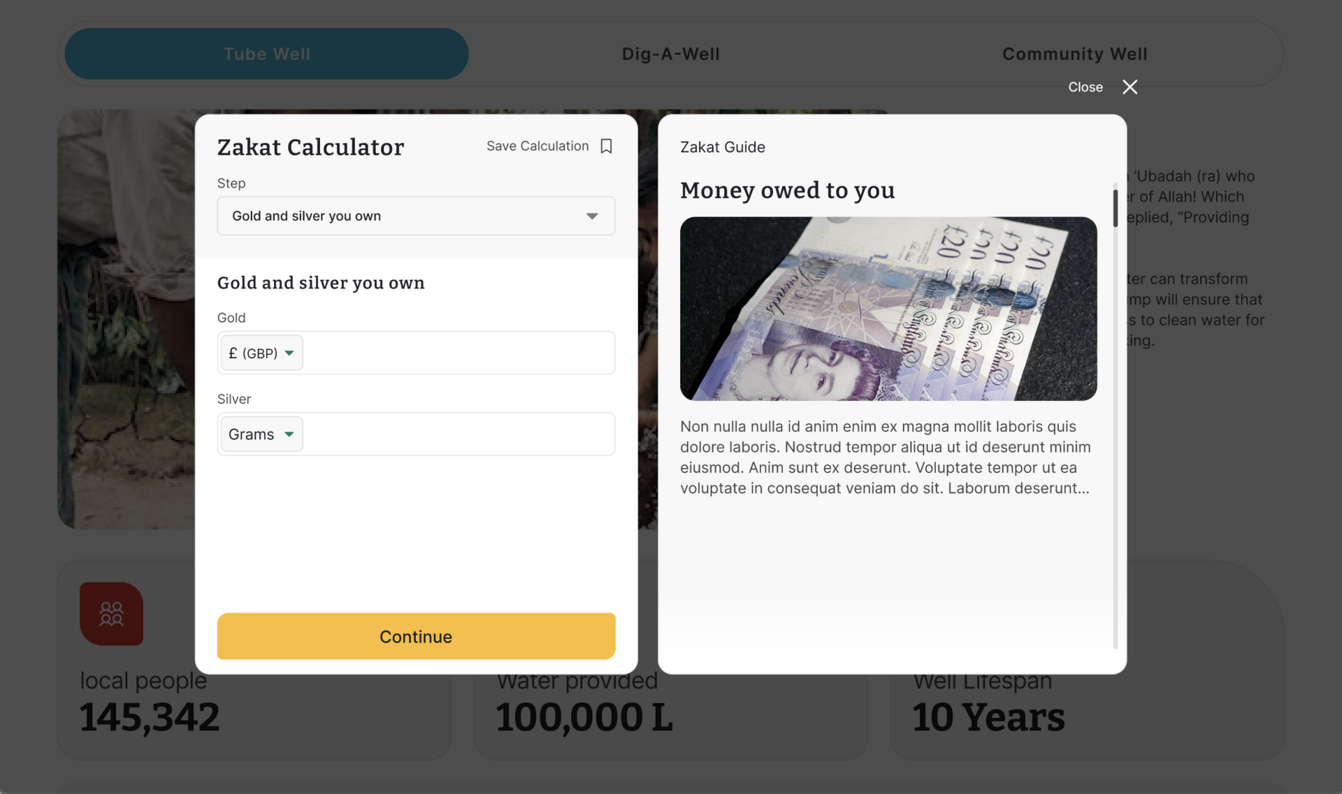
We also helped design and build out the Zakat calculator which borrowed many of the features from the donation module, again it was fully customisable to allow for a number of options and payments.
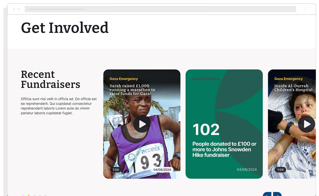
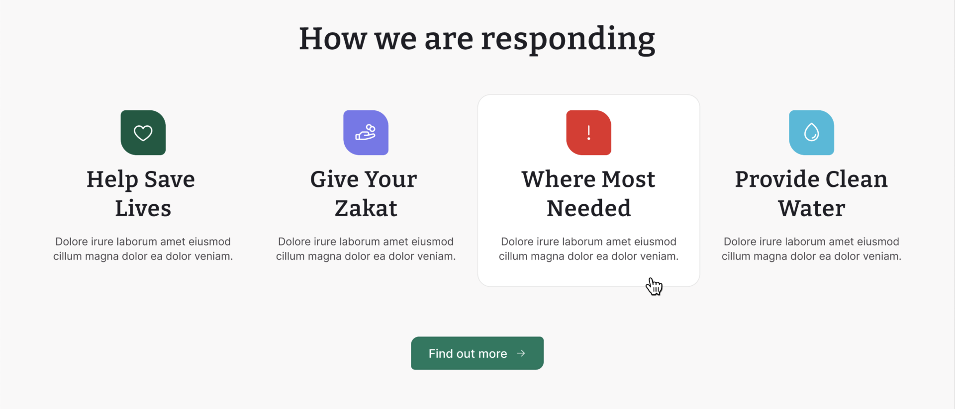
Improved Donation Experience
One of the core UX changes to the Muslim Hands site was the improved donation experience. This applied to both single donations and collective donations, the biggest design shift happening with larger projects. Instead of capitalising on one large donation for a tube well, the new design allows for collective donation, highlighting how close they are to the goal so more donors can mobilise behind causes that they may not have been financially able to afford in the past.
This design provided Muslim Hands with a foundation for building even stronger donor relationships in the future, capitalising on community connection both locally and abroad.
This combination of personalised content delivery and the improved donation experience helped create a more engaging, transparent, and ultimately more effective digital giving platform.
Improved features
Among its many features, the core modules and pages included a powerful search function integrated with Algolia Search for indexing, a global map powered by Mapbox, and event scheduling, donation calculators, and volunteering forms and modules linked with back-office tools and the CRM – the intent was to streamline the entire process.