Front-end developers, pick your battles wisely
The front-end landscape is constantly shifting, with new tools and frameworks popping up daily. Whether you’re enhancing an existing feature or adding an entirely new one, sooner or later you’ll be faced with the decision of whether to overhaul the entire system.
We recently faced this challenge while working on an icon set up for Twine, we had to decide between adopting an entirely new approach or improving the existing one.
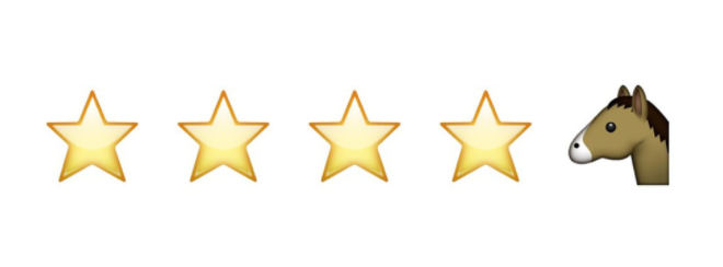
Four & a horse stars
Twine currently uses a custom ‘icon font’, which is simply a font that uses symbols and glyphs instead of the usual letters and numbers. This makes it extremely easy to ‘type’ an icon (provided you know the character) and, unlike images, allows for a greater level of customizability and scalability. It’s easy to see why icon fonts became so popular, especially in the wake of responsive design.
Yet they’re not without quirks. Accessibility issues abound, glyphs are often subject to poor rendering, and fonts don’t degrade gracefully, leading to the hilarious four stars and a horse stars bug. Icon fonts are an extremely clever ‘hack’ – a way of exploiting widespread support for web fonts. Yet like all hacks, they lack the resiliency of purpose-built solutions.
Enter SVG, or Scalable Vector Graphics. SVGs have existed since 2000, but have only recently found widespread adoption and support on the web. Since an SVG only contains instructional information, such as points and co-ordinates, each SVG is infinitely scalable while remaining compact — perfect for icons. We already use SVG icons in a variety of ways, including iconography for projects such as BA Flying Start. It only felt logical for Twine to follow suit. This would provide consistency while letting us leverage new technology to actively improve our flagship product — a surefire win.
The quirks of SVG icons
Unfortunately, it quickly became apparent that this would be easier said than done. While icons are a visually small thing, they’re scattered across every page of most modern apps. Changing our method of inclusion would mean refactoring every single page of Twine (no small undertaking) and a rethink of our build process to allow for integration with our existing setup.
We also discovered several problematic cross-browser issues. SVG itself enjoys widespread support, but (unlike traditional <img> tags) there are plenty of browser idiosyncrasies to work around. Even keeping a consistent aspect ratio can become a challenge, and creating reliable fallbacks is even harder. Since icons are so prevalent in Twine, testing and checking for consistency risked turning into a huge undertaking for QA. It became apparent that using SVG icons was one thing, but providing adequate fallbacks and cross-browser support was going to be far more involved than we had initially thought.
The cost of adoption
By adopting a new tool or framework you’re usually accepting an up-front cost — adoption will take time and initially slow things down. We often assume it will eventually pay off, but it’s just as likely by that point a new tool will have emerged and you’ll be back to square one.
Starting a fresh project today we’d be very likely to choose an SVG icons system. The advantages are clear and support is getting better (and more consistent!) by the day. However, when approaching a large-scale application such as Twine, it simply didn’t make sense to overhaul the entire system, workflow and build process. One of the hardest things in front-end development is picking your battles. Every day there is a new tool, method or framework, and it’s easy to get lost chasing the bleeding edge. As professionals, we pride ourselves on the stability and reliability of our applications and adopting a less-well supported solution to an already solved problem felt like a misallocation of resources.
Before introducing something new, it’s important to ask:
- How stable is the technology? Some plugins and tools undergo constant breaking rewrites, requiring re-learning and even rebuilding large portions of your application.
- Does it solve a real problem that users (or the team) are experiencing?
- If so, is there a way we can address these issues without overhauling the entire setup?
In the case of Twine’s icon system, we decided it would be more productive to improve the existing setup, rather than scrap it entirely. Instead of spending days starting from scratch, we spent a couple of hours addressing our biggest pain points with the current setup. In the end, we found great solutions for each issue and managed to improve the user experience while leveraging our existing setup.
The hardest part of front-end development today is not, despite popular belief, keeping up with modern frameworks and technology. It’s having the discipline to take a step back and assess the real-world value of each new tool for both your users and your team. Often there are bigger issues to solve, or improvements to be made, that may be less exciting but provide greater value for everyone involved.