How our user experience design improved performance for BA
Comic Relief came to us in need of a new user experience design for its Flying Start partnership with British Airways. The campaign is a global initiative with the simple aim of raising money to help children living incredibly tough lives. Now in its sixth year, the campaign has raised a staggering £12.5 million.
The problem
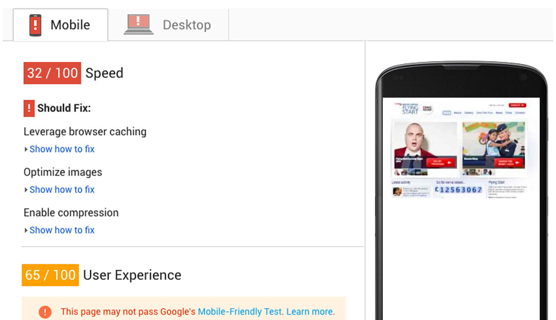
The existing system was slow, outdated, and had become labour intensive to maintain. Its performance didn’t live up to the campaign’s demands which meant that fundraising efforts were often negatively affected.
After an initial investigation, it became clear that many of the system’s tasks could be automated using an array of modern web services, all of which could be connected via a website that allowed all types of users, be it campaign admins, fundraisers or donors to engage. In order to do this the website would need to perform three key functions:
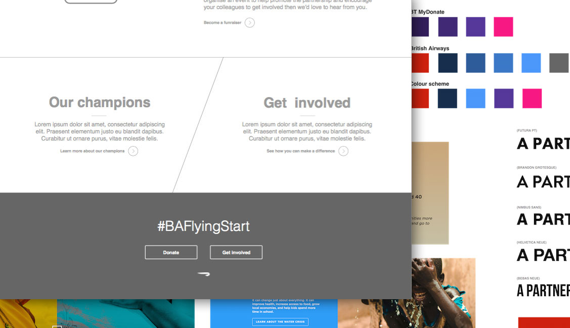
- Be a fun and engaging way for British Airways staff to discover information about the campaign; including upcoming events, photo galleries of fundraisers as well as acknowledgement areas for “Champions” – aircrew members going above and beyond to raise as much money for the campaign as possible.
- Be an effortless pathway for public users to make donations to the Flying Start campaign.
- Be a responsive and lightweight solution that will load and perform as smoothly as possible even on poor connections.
The solution
Utilising modern web features
Thanks to new web browser features, such as Flexbox (for unique layouts that adapt to the content within them), SVG sprites (for snappy and accessible icons), and path clipping (for creating fun grid systems), the Flying Start website had an ideal foundation for both attractive and engaging user experience design.
Knowing from the outset that we had such features in our tool kit, the design of the website flourished without the browser constraints of the past and allowed for the impressive array of photography provided by British Airways to do much of the communication.
Considered information architecture
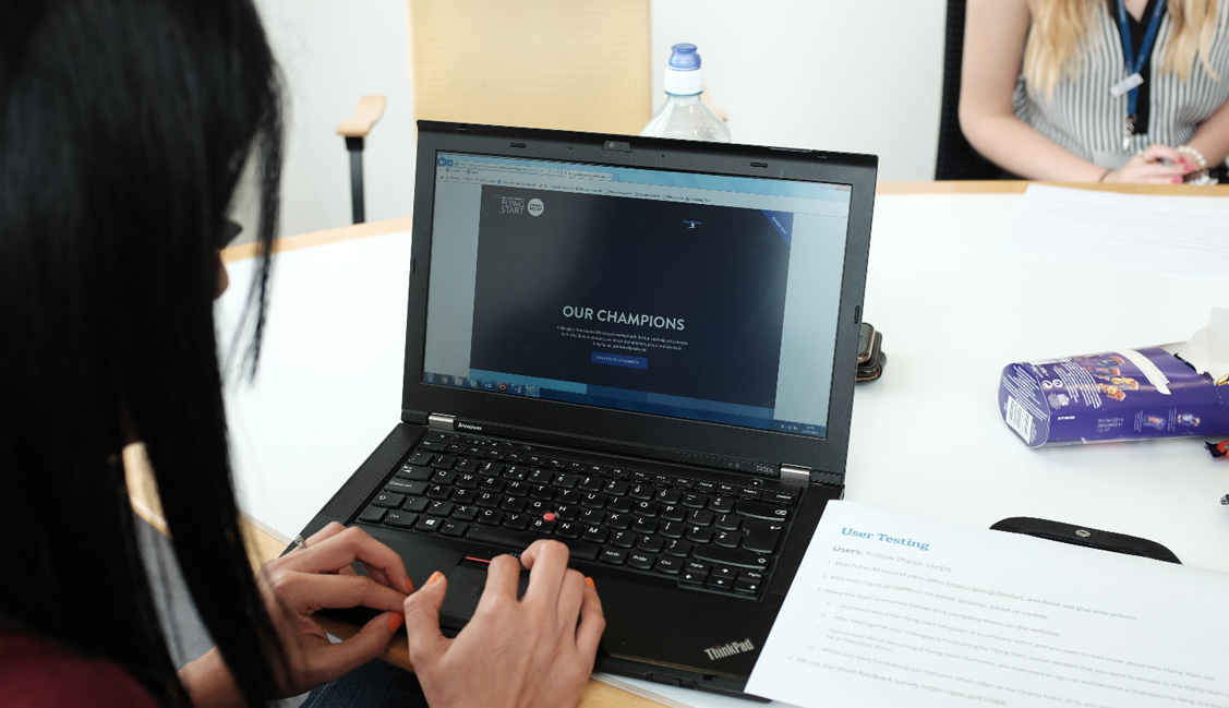
For any charity website, it is crucial that the user needn’t struggle to find: A, information about the charity and B, where/how to donate. The information architecture (IA) should be clear and concise, and important areas should be given prominence to avoid user frustration. To ensure this was the case and the end result would be as intuitive as possible, we firstly focused on creating quickfire wireframes around real content. Using Sketch as the tool of choice we were also able to begin introducing mood boards and colour profiles that would help users navigate.
These were then presented to users who in turn could scribble over any confusing areas as well as highlight any areas of improvement. With such valuable feedback (including data from analytics), the wireframes were able to quickly evolve “on screen” into prototypes that could be shared with even more users for testing.
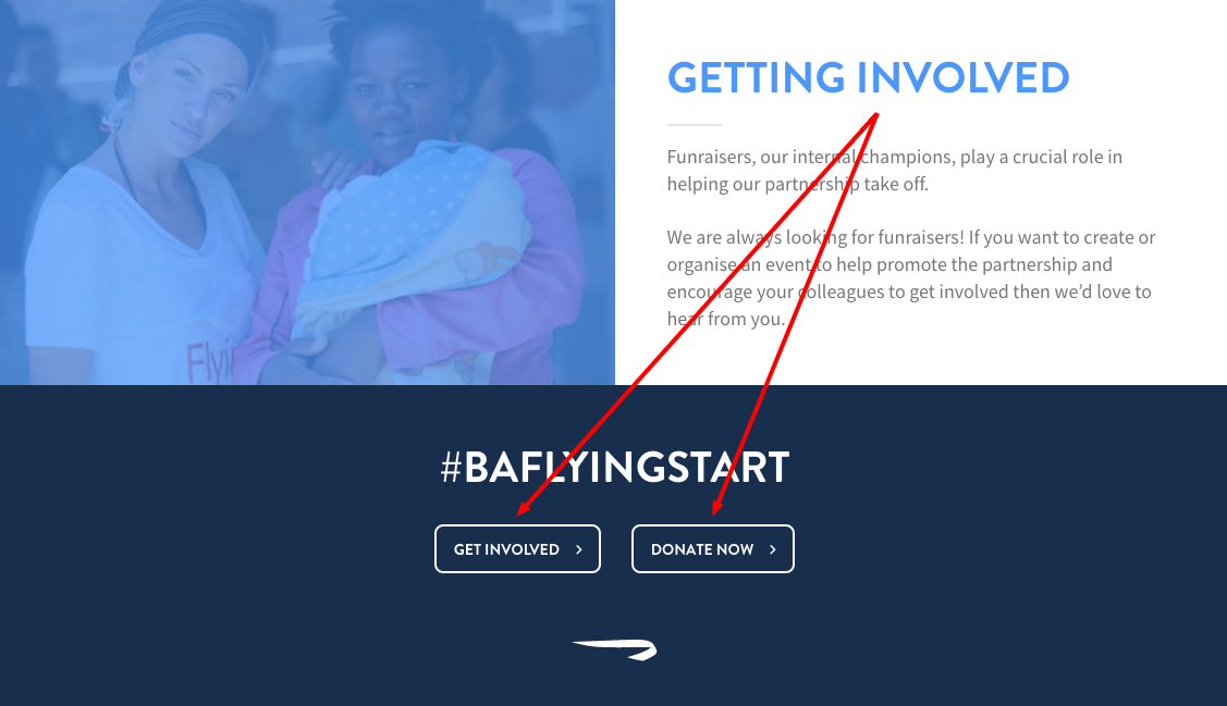
We found this agile approach enabled us to develop a website that not only catered for British Airways staff already knowledgeable about the campaign, but also the general public who may have arrived at the website from the British Airways main website (a user group attested by analytics). By ensuring every page had a prominent ‘Donate now’ button both in the header and the footer of the page, in addition, to clear signposting, we found users were confident when navigating through the website and thus were more inclined to donate to the campaign.
Performance around the globe
As the website would predominately be used by British Airways staff across the globe, it was a necessity that the website we developed would not only work responsively (analytics had shown that a sizeable chunk of people had been using tablet devices) but equally would load as quickly as possible irrespective of the person’s internet connection. It is important to remember that despite internet speeds in the UK averaging 13.9 Mbps, the global average internet speed comes in at 5.6 Mbps with countries such as the Philippines and India having averages as low as 3.2 Mbps and 2.8 Mbps.
Combining this with the growing expectation of modern internet users for app-like experiences on the web, performance was at the forefront of our minds throughout development and user experience design, whether it be on minimising load time or ensuring the website runs as close to 60 frames per second (fps) whilst being scrolled.
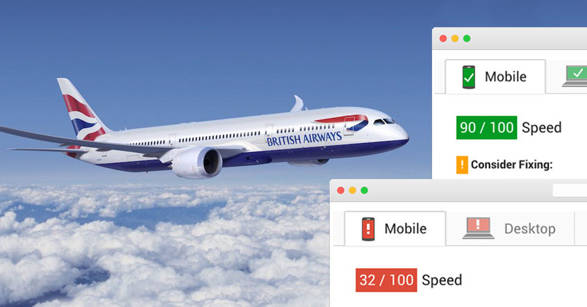
To achieve our goal, we disabled domain cookies being sent to the user to remove a latency overhead, and served static assets from an Amazon Web Services CDN (meaning assets would not need to be loaded from servers thousands of miles away from a person’s location) in addition to only serving content appropriate to the situation; whether that be by sending appropriate image sizes down the wire based on the device being used, or by deferring the loading of JavaScript files until the rest of the page had finished loading; the results speak for themselves.
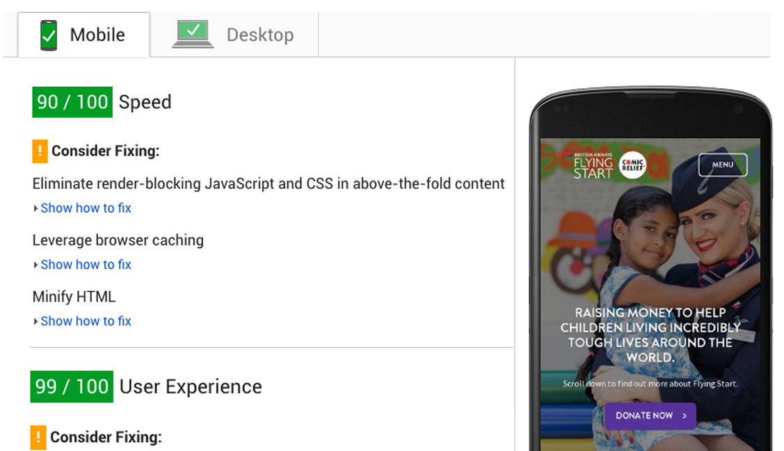
Using Google PageSpeed Insights as a performance measuring tool we saw a three-fold improvement in performance on mobile devices, with desktop performance close behind.
The results
Take a look at the new website and fundraising system, and don’t forget to make a donation!