How to fix PDF’s and tables in Responsive web design

There’s no question that responsive web design is here to stay – online content should be accessible whatever size your screen – and this has been our philosophy at Browser for many years.
Most web content, text, images, video, can be resized, reformatted, and rearranged to work extremely well on smaller devices, but how do you deal with large-format content that can’t be treated with the same solutions?
Tables of data with many columns, and detailed graphical content (such as infographics), are two of the trickiest subjects to tackle in responsive web design. When Energy UK asked us to redevelop their instructional Interactive Energy Bill as part of their new Energy Made Clear website, we had to get our thinking caps on.
The Problem
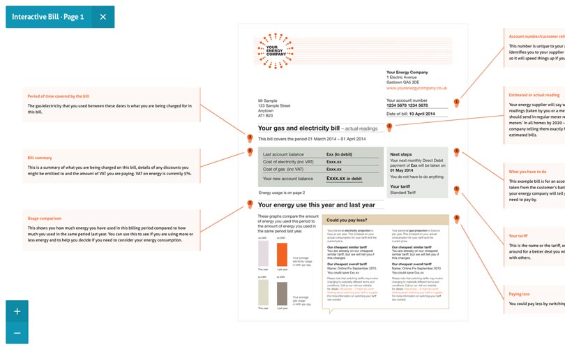
The Interactive Energy Bill is a three-page document that looks like your typical household energy bill, but with jargon-busting descriptions of each section surrounding it. It needs to maintain its proportions as an A4 piece of paper whilst remaining readable, even on a mobile screen, so we can’t take the text and re-flow it as we would with other web content.
You shouldn’t be penalised for visiting a website on a mobile phone. Therefore, when designing, a temptation – and an easy way out – is to hide content that’s difficult to display on small screens. This is occasionally appropriate for extraneous content, but certainly not for the Interactive Energy Bill.
The previous version of the Interactive Energy Bill worked well on desktop-sized computer screens with mouse-hover interactions but wasn’t compatible with tablet and phone-sized screens, or when mouse interaction wasn’t an option.
The Solution
Our research led us to investigate similar problems and solutions. Dave Bushell’s responsive tables post and Bootstrap’s responsive tables solution cast light on a similar problem within the responsive web design community. In both cases the solution lets users scroll horizontally when on a mobile screen, useful research but it didn’t lend itself to our problem.
Next, we looked at Google Maps, it allows users to pan and zoom when exploring a map document, this means it’s readable while not having to show everything at once.
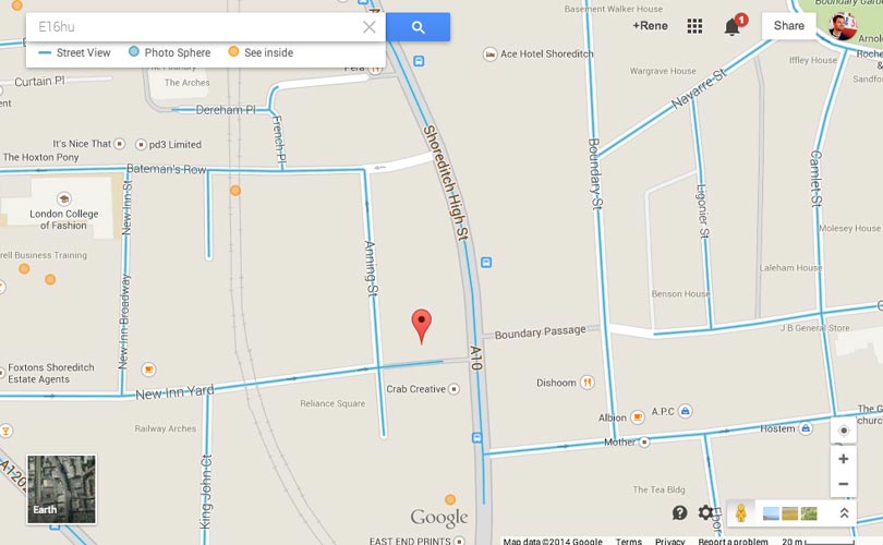
So we decided to take a similar approach so that users were able to do the same, it also allowed us to deploy pretty much the same solution to mobile right through to desktop, with a good experience across the whole range.
Conclusion
As per the responsive images debate, finding a fit for purpose solution to rendering static content is one of the trickiest things in responsive design. Our approach had to cater for a wide range of users, it also had to remain within budget – for both us and our client it was all about balancing cost with the user experience.
Have a play around with our pan and zoom solution and let us know what you think.