Colour trends for 2014
Colour trends are on the rise – early last year we saw the rise of the bold and bright with the Metro colour palette storming the scene and seeming to influence everyone in its path.
As we move steadily through this year there seems to be a move away from Metro and a lean towards a more subdued colour palette, take your #e4a654, #50595c, #428bca, #952715, #6da79b, #443d47 and you know what – I quite like it.

But why the shift in style? To me, the most obvious answer is a greater desire for subtlety. It seems the days of the ‘Hey I’m here, look at me!’ with it’s big, bright and bold palette have passed and perhaps it’s because there’s an understanding that users today don’t want to be shouted at; they want a conversation.
I think that there’s a wave of brands that are now wise to the fact that subtlety in their colour choices can help generate an empathetic feeling of being a part of something and communicate the right message.
So what are we using here at Browser? Well, with an ongoing client product we’ve been using an array of blue tones such as #2db0b6, #27a1b4, and #0f92bd with dashes of #f57f32 to highlight interaction points, complement these with a generous amount of whitespace that allows these colours to breathe – it all works rather well.

What about other organisations in the digital industry, well I posed the question to a handful of friends.
Murat Mutlu at Marvelapp
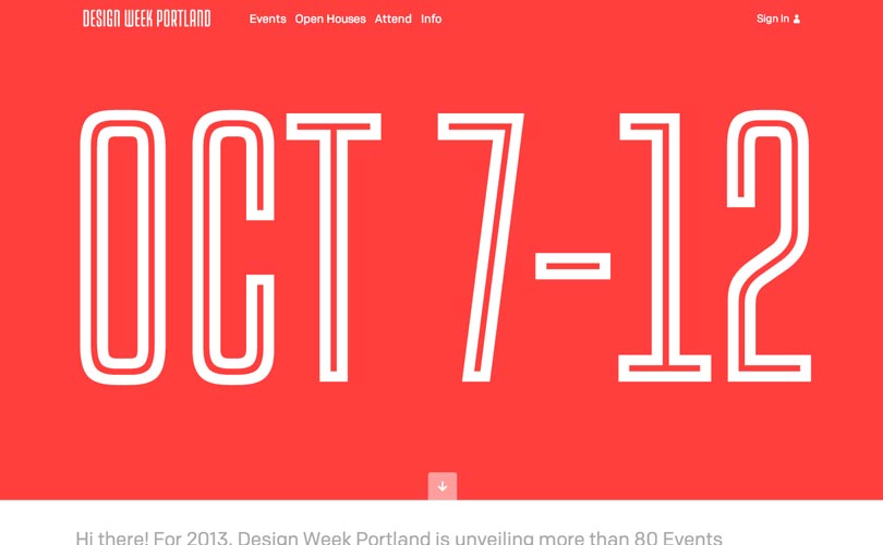
“I think we’re still seeing a lot of the ‘flat design’ colour palette made famous by the guys at Design Modo and a few others. Recently it seems that bold iOS 7 style colours and gradients are making their way into web design a lot more. My personal preference is more along the lines of the Design Week Portland Site, a few bold colours and plain white background.”
David Bushell at David Bushell Design
“There’s definitely been a trend towards large areas of flat colour and subtly. This can look nice and has many benefits but it’s often overdone to the detriment of accessibility. LayerVault, for example, has been very influential in the web design world and yet its light greys used for text are very difficult to read. Personally, I prefer one strong brand colour with alternate accents used sparingly.”
Leigh Brown at Head
“50 shades of grey was trending pretty heavily last year, wasn’t it? The biggest digital colour duo of the moment though has to be your #ff5a5f (Slightly desaturated reds) & its opposing #02b9b2 (Turquoise blue/greens). Almost as trendy as beards.”

Harris Nukem at Play Nice Co
“The subtle complexities of texture and likeness used to inspire us to engage. The forward-thinking design has since helped us place value in simplicity. Paired with clear symbols, colour has never been more important in communicating direction. A subtle palette for a brand can help keep things comfortable for it’s market. Personally, I’m keen on striking colours but everything sits on the scale between brand objective and usability.”
Emma Corkill at Ultra Violet Design
“The flat colour theme has been a very prominent digital trend recently, after the release of IOS7 it seems colour swatches are only getting bolder and brighter. Personally, I am a huge admirer of flat colour and illustrations, however, I feel it is being slightly overused and could soon become tedious if most websites adopt this style. “